Skip to content
Services
Appraisals
Consulting
Resources
Market Reports
Charts
Matrix Blog
Articles & Research
Press
About
get in touch
Charts
› Hamptons/North Fork
December 2, 2021
Aspen
,
Douglas Elliman
,
Greenwich
,
Hamptons/North Fork
,
Los Angeles
,
Manhattan
,
Miami (Beach + Mainland)
,
Palm Beach
Listing Inventory Trends In The Time Of COVID
read more
August 20, 2021
Brooklyn
,
Charts, Maps, Images, Infographics, Video
,
Fairfield County, CT
,
Hamptons/North Fork
,
Housing Trends & Cycles
,
Long Island
,
Manhattan
,
Queens
,
Westchester County, NY
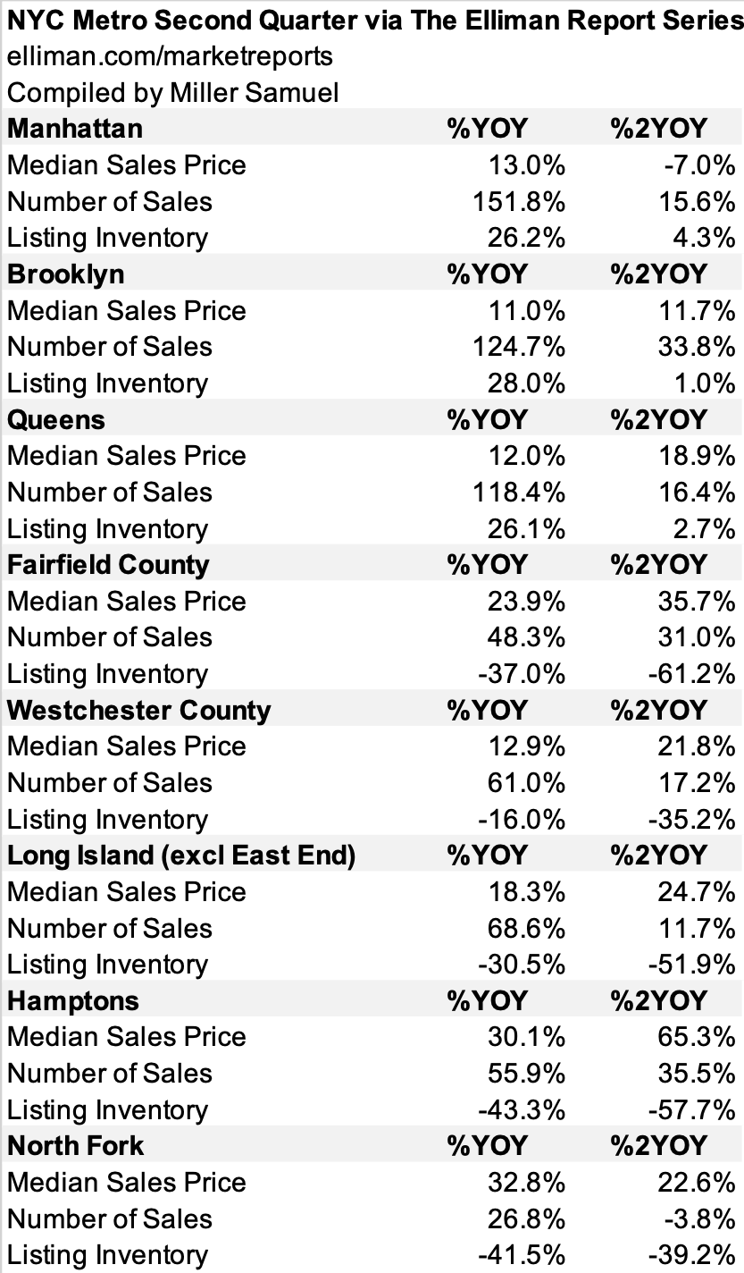
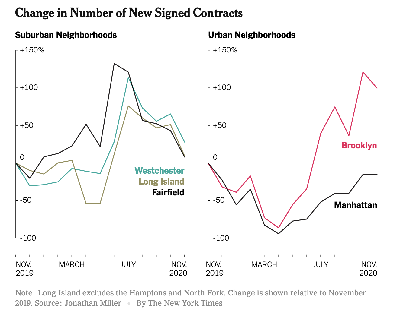
NYC Metro Conditions Much More Robust Than Two Years Ago
read more
December 28, 2020
Bloomberg News
,
Brooklyn
,
Charts, Maps, Images, Infographics, Video
,
Douglas Elliman
,
Elliman Reports
,
Fairfield County, CT
,
Greenwich
,
Hamptons/North Fork
,
Housing Trends & Cycles
,
Long Island
,
Manhattan
,
New York Times
,
Rentals, Investing
,
Sales
,
Westchester County, NY
Peak Suburb Has Passed
read more
December 28, 2020
Brooklyn
,
Douglas Elliman
,
Elliman Reports
,
Fairfield County, CT
,
Hamptons/North Fork
,
Housing Trends & Cycles
,
Long Island
,
Manhattan
,
The Real Deal
,
Westchester County, NY
TRD Quick Question: Jonathan Miller “What’s Happening in the NYC Real Estate Market?”
read more
May 20, 2020
Charts, Maps, Images, Infographics, Video
,
Dutchess County, NY
,
Government, Politics, Regulations & Policy
,
Hamptons/North Fork
,
Manhattan
,
New York City
,
Putnam County
,
Weather & Natural Disasters
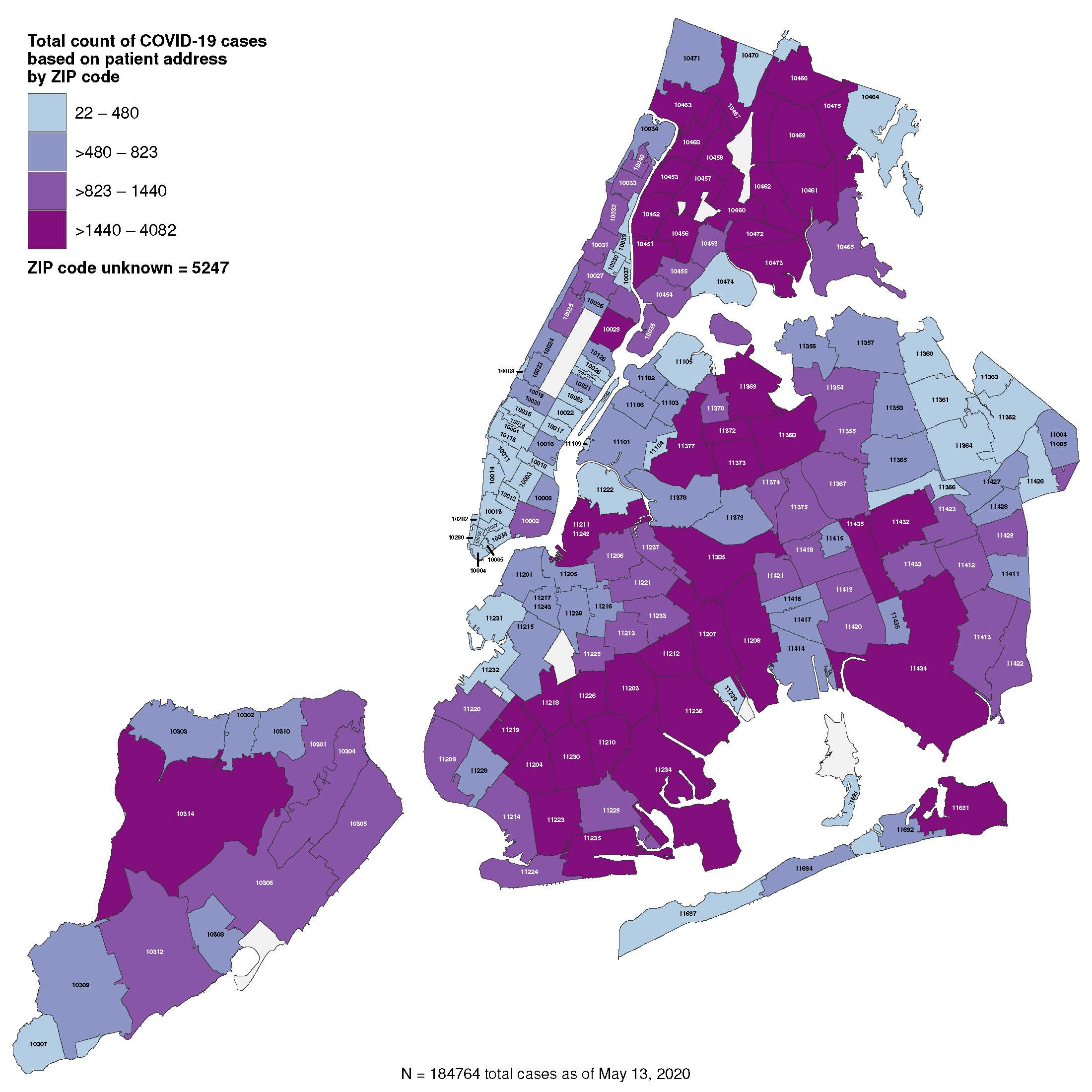
The Overstated COVID-19 Blame on Urban Density in Favor of Suburban Living
read more
May 16, 2019
Charts, Maps, Images, Infographics, Video
,
Elliman Reports
,
Hamptons/North Fork
,
Luxury, Super, Ultra, Mega
,
New York Times
,
Statistics, Metrics & Data
Hamptons Sellers Are Starting To Get The Message
read more
September 18, 2017
Analysis & Research
,
Charts, Maps, Images, Infographics, Video
,
Douglas Elliman
,
Greenwich
,
Hamptons/North Fork
,
Housing Trends & Cycles
,
Los Angeles
,
Manhattan
,
Miami (Beach + Mainland)
Real Estate ChartArt in Elliman Magazine’s Fall 2017 Issue
read more
July 27, 2015
Bloomberg TV
,
Charts, Maps, Images, Infographics, Video
,
Elliman Reports
,
Hamptons/North Fork
,
Media
,
Wall Street, Financial Services
[VIDEO] Boomberg TV ‘Market Makers’ 7-27-15
read more
July 8, 2015
Celebrity, Pop Culture
,
Hamptons/North Fork
,
Humor or Whimsy
,
Language, Jargon & Quotes
Aspirational Marketing: Best Hamptons Magazine Cover Ever
read more
June 3, 2015
Charts, Maps, Images, Infographics, Video
,
Curbed
,
Douglas Elliman
,
Hamptons/North Fork
,
Housing Trends & Cycles
,
Manhattan
,
Market Reports
,
Sales
,
Statistics, Metrics & Data
,
Suburban, Urban, Commuting
,
Wall Street, Financial Services
[Three Cents Worth #288 Hamptons] Comparing Price Trends in the Hamptons and Manhattan
read more
May 6, 2014
Hamptons/North Fork
,
Housing Trends & Cycles
,
Los Angeles
,
Luxury, Super, Ultra, Mega
,
Manhattan
,
New York City
,
Records, Thresholds and Outliers
The $100M+ US Home Sale Trifecta – Without NYC – 2014 Edition
read more
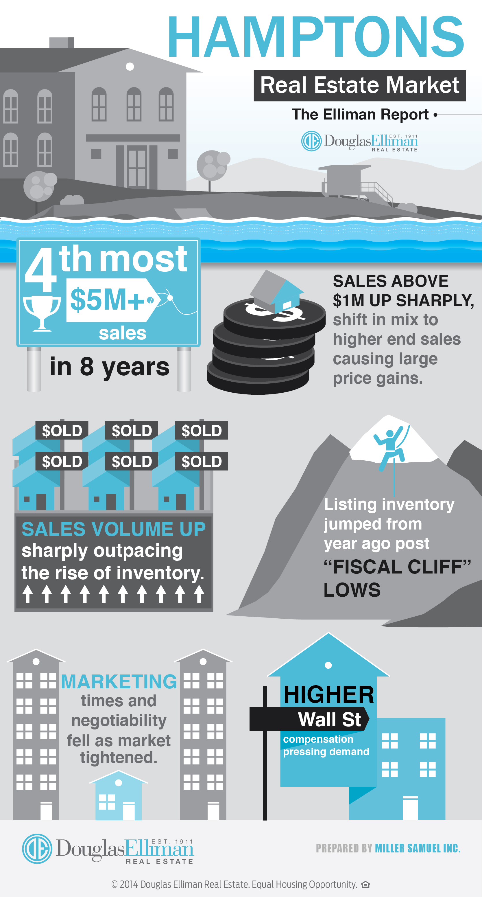
April 24, 2014
Charts, Maps, Images, Infographics, Video
,
Douglas Elliman
,
Hamptons/North Fork
[Infographic] 1Q14 Hamptons Snaps Back from Fiscal Cliff Lull
read more
1
2
Next
Load More Posts
Page load link
Go to Top