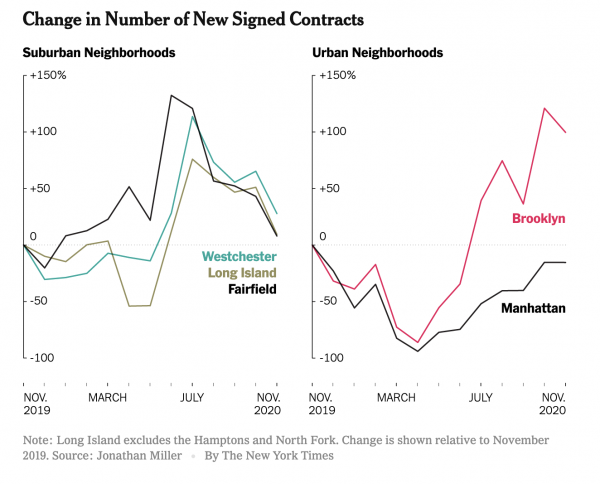
The New York Times got the market nuances right in their epic end of year The Real Estate Collapse of 2020.
And including epic charts makes it even better.
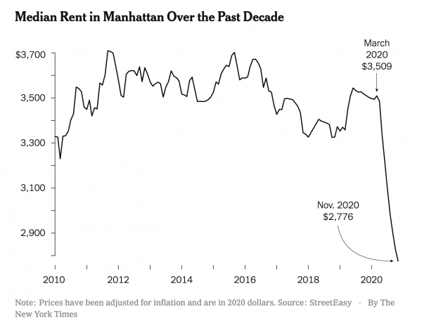
I noticed that the Streeteasy median rent chart used in the piece shows the same pattern as my recent chart in Bloomberg. That drop in rent is gigantic.
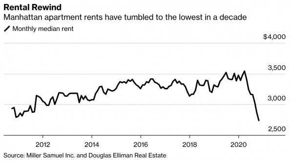
[Source: Bloomberg – click image to open article]