Matrix Blog

Charts, Maps, Images, Infographics, Video

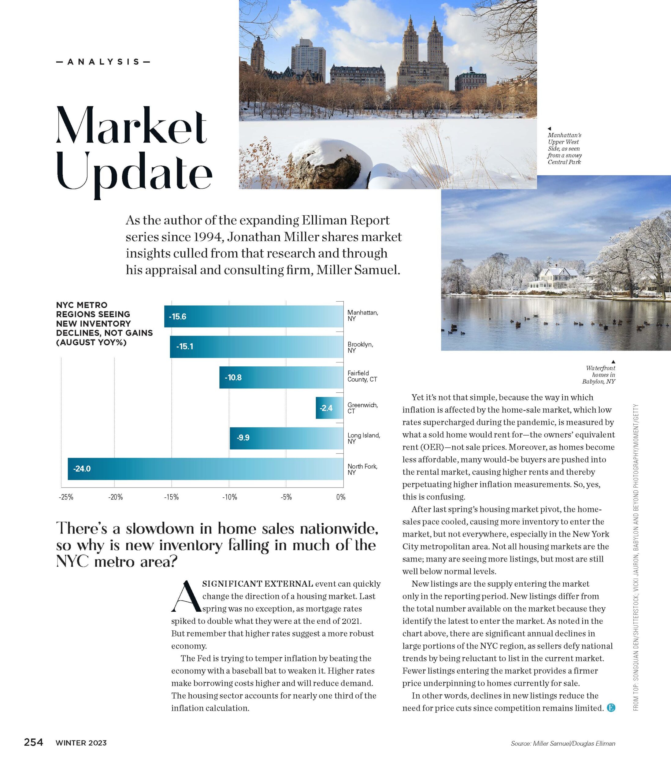
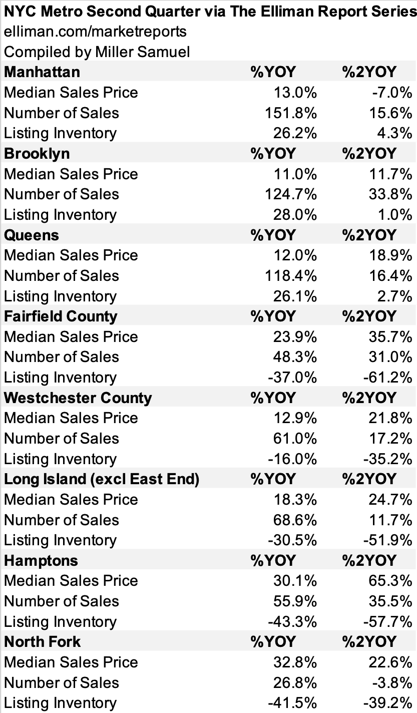
Elliman Magazine Column “Market Update” – New Inventory Is Falling

December 8, 2022 | 2:12 pm | |

I write a column for Elliman Magazine called “Market Update” that presents a chart and context around it. Its kind of like my nine-year column “Three Cents Worth” at the old Curbed but more grown-up and without the snark.


Tags: , , ,


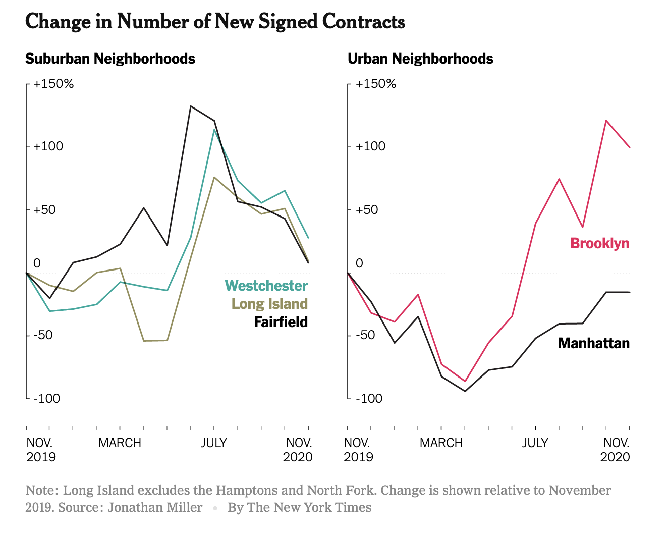
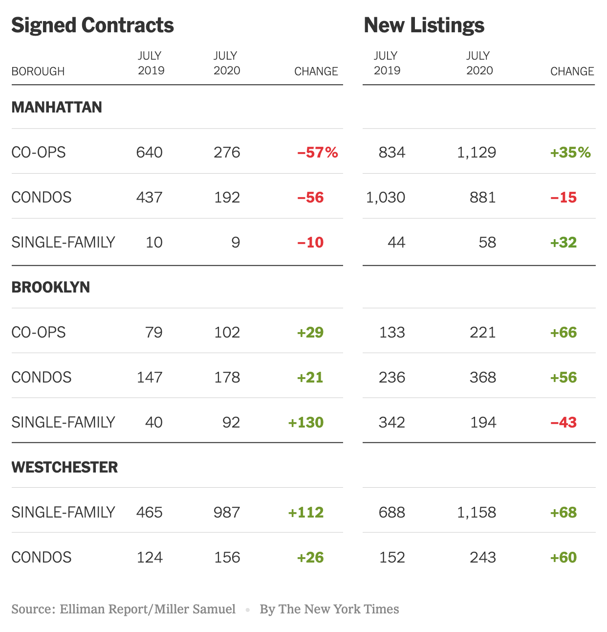
NYC Metro Conditions Much More Robust Than Two Years Ago

August 20, 2021 | 12:56 pm | Infographics |

One of the problems with my normally preferred year-over-year comparisons with metrics to diffuse seasonal impact is that the year-ago period happened to be the pandemic lockdown.

I went through the region using our market report series for Douglas Elliman, comparing the same period two years ago to capture the pre-COV ID market and prices. and sales are up with the exception of Manhattan and North Fork. Listing inventory is up slightly within the city boroughs and plunged in the suburbs.

Tags: ,


[WNBC] The State of New York Real Estate

May 18, 2021 | 9:55 am | | TV, Videos |

Adam Kuperstein at WNBC reached out to do a story on the state of the Manhattan housing market for Douglas Elliman. He got all the nuances right and featured the results of our market research. It was my first tv interview back in my Manhattan office and afterwards I realized I need to warm up my background after using my home office for the past 14 months!


Tags: , , , ,


I Discuss The Florida-New York Housing SMACKDOWN On Bloomberg TV’s Surveillance March 12, 2021

March 17, 2021 | 1:08 pm | | TV, Videos |

Last Friday I had a fun discussion with Lisa Abramowicz on Bloomberg Surveillance. It’s been bedlam in Appraiserville so I’ve been slow to post it. The New York to Florida housing migration story has been a bit one sided with optics that suggest 9 people will be left in Manhattan by the summer time despite that Manhattan contract activity beginning to surge. On the other hand Florida sales activity continues to be frenzied.

I don’t have the short clip so you have to go to the end of the full show at the 2:10:50 minute mark to pick up my interview with Lisa (but I think its worth it):


Tags: , , , ,


Peak Suburb Has Passed

December 28, 2020 | 2:22 pm | | Explainer |

The New York Times got the market nuances right in their epic end of year The Real Estate Collapse of 2020.

And including epic charts makes it even better.


I noticed that the Streeteasy median rent chart used in the piece shows the same pattern as my recent chart in Bloomberg. That drop in rent is gigantic.


[Source: Bloomberg – click image to open article]

Tags: , , , , , ,


The ‘Urban To Suburban’ Narrative Is Really ‘Manhattan To Suburban’

August 19, 2020 | 1:26 pm | | Charts |

This post previously appeared in the August 14, 2020 edition of Housing Notes. I’ve been writing these weekly summaries on housing topics for more than five years. To subscribe for free, you can sign up here. Then you can look forward to each issue every Friday at 2pm New York Time.

The New York Times created a terrific graphic on our Elliman New Signed Contract Report by illustrating the performance of Manhattan and Brooklyn versus Westchester County. Brooklyn’s sales market performance is closer to Westchester than it is to its city counterpart.


Tags: , , , ,


[Bloomberg TV] Bloomberg Markets 7-6-20: A Busy Housing Market This Summer

July 6, 2020 | 5:17 pm | | TV, Videos |

Had a wonderful, nearly 7.5-minute conversation with Vonnie Quinn on Bloomberg Television’s Markets today discussing how the housing market will likely look over the summer. The interview touched on the analysis in the Douglas Elliman Report series I author.

Some ‘inside baseball’ fun. I was connected to Bloomberg via Zoom from my home for this. If you look closely at the 5:15 mark, you can see my garage door open as my wife drives in. My wife panicked when watching this clip, thinking she would be on TV as she walked out of the garage, but randomly ended up using the other door.


Tags: , , ,


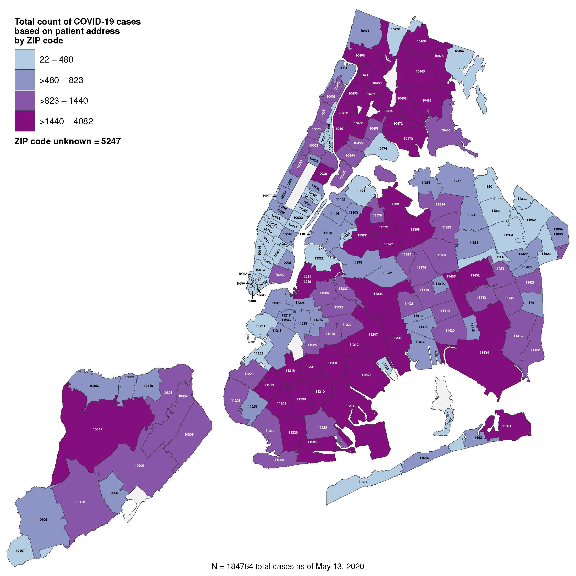
The Overstated COVID-19 Blame on Urban Density in Favor of Suburban Living

May 20, 2020 | 1:06 pm | Explainer |


[NYC.gov]

One of the pieces of conventional wisdom we have picked up during the COVID-19 crisis is that high-density residential living will be less favored. The city to suburban migration pattern is already beginning in New York City and could last several years. The rising number of suburban single-family rental inquiries from the city has provided the initial evidence of a trend. City residents seem to be looking to test drive the suburbs and commute to their city job when “shelter in place rules begin to ease.”

Unfair Reputation?

New York City has developed a national reputation as a hotbed of Coronavirus infection because of our higher density. We live a lot closer together than a sprawling suburb in Dallas and have a greater dependency on public transportation such as the subway and buses instead of driving cars. I live in Fairfield County, Connecticut, a bedroom suburb of New York City with a county-wide COVID-19 ratio of 1068 deaths per its 943,332 population. Dallas County, Texas, had 153 deaths per its 2.636 million people. My county has a wildly higher death rate than a county that contains an urban core like Dallas.

Is the city to suburban trend sustainable?

New Yorkers buy into the urban to the suburban narrative, so I believe the push to the outlying NYC metro suburbs could be quite significant in the near term. While the outbound migration began a few years ago, it is not clear whether the trend can continue for more than a few years. The pattern could ultimately be different from what is currently expected including:

  • A boost for second-home markets: There might be an influx of demand to areas the Hudson Valley, Northern Connecticut The Hamptons, and the North Fork, to name a few. Consumers made begin to view a second home as an equal asset to the primary home to have similar quality options. This potential trend would be contrarian to other significant economic downturns as second-homes are not considered “second-priority.”

  • And because the implications of the SALT tax will remain in place on the other side of the COVID-19 crisis, Florida and Texas can make a compelling pitch to New York City couples with small children cooped up in 1,000 square foot 2-bedroom apartments right now. They are realizing they aren’t as tethered to their work location as they once thought – and schooling via Zoom is not all it’s cracked up to be.

I think that the high-density lifestyle of New York City is what makes living there so great. I’ve lived in or around New York City since the mid-80s. Before we moved to the city, my dad used to proclaim:

Where else can you buy strawberries at 3 am in the morning?!?!?

Placing strawberries aside, I remain skeptical that the urban to suburban outbound migration can be sustained long term. We saw the same outbound pattern after 9/11 and then an inbound return only a few years later.

Density is not the only reason

Urban density is just one reason for the high COVID-19 infection rate that is driving outbound migration. It is not the reason. Other factors influencing the disparity in the infection rate include neighborhood characteristics such as wealth, commute time, and the concentration of multi-generational households.

The map above confirms the argument that it’s not all about density – the highest infection rates are in the “suburban-like” areas of the city including Staten Island and the outer reaches of Brooklyn and Queens. Manhattan, home for many of the tall commercial and residential towers the city is famous for, has the lowest infection rate.

These Manhattan results might help maintain the enthusiasm for that occasional 3 am strawberry run to the corner market.

Tags: , , , , ,


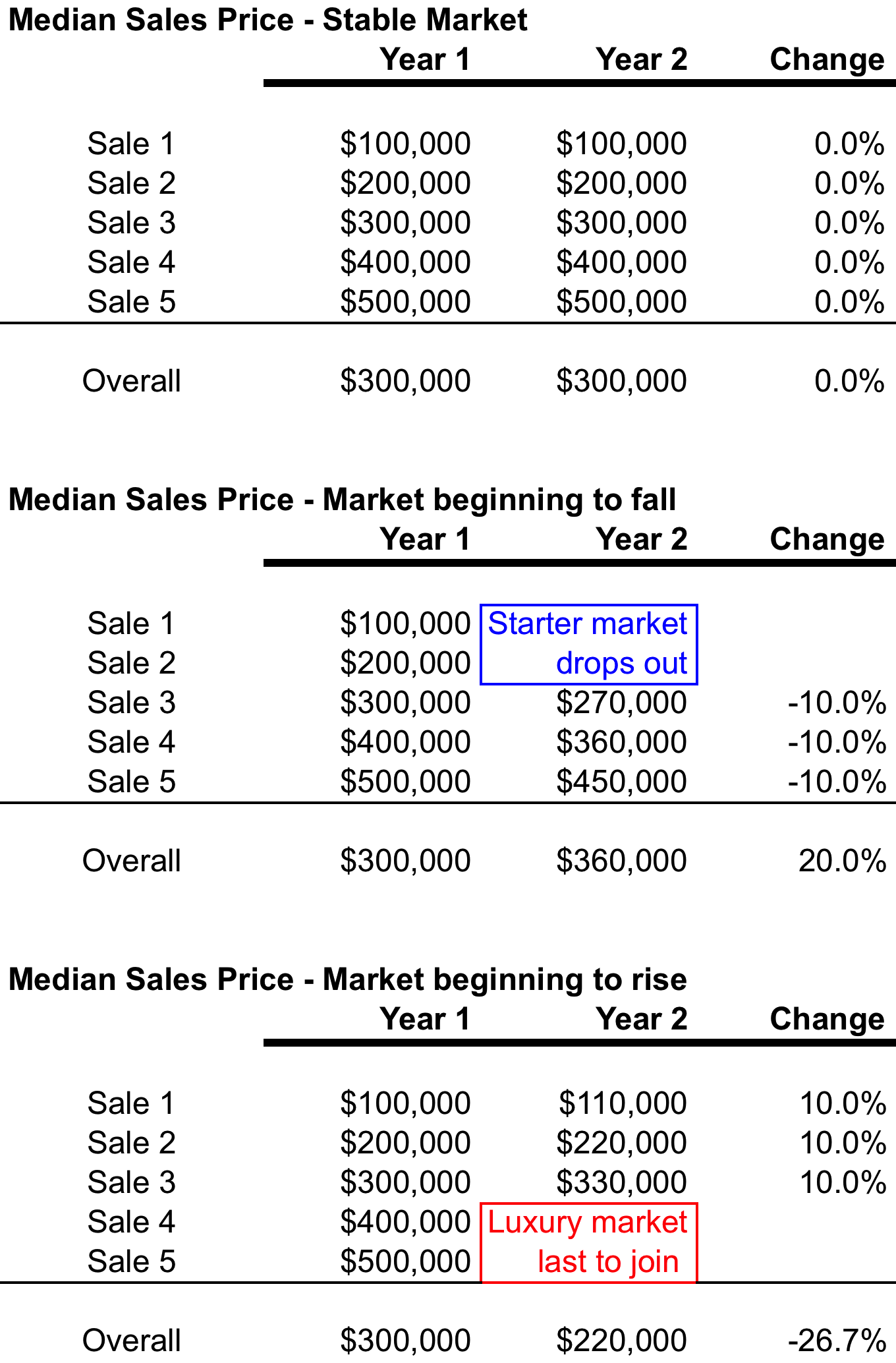
Median sales price can be subject to skew by consumer behavior more than math

May 12, 2020 | 11:19 am | Explainer |

Here’s an updated excerpt from my Housing Note newsletter dated October 28, 2016, digging into the median sales price. You can subscribe to Housing Notes and other housing resources for free.


I wrote about the median sales price a decade ago, and the message still holds. A couple of years ago, I whipped up a table that shows how median sales price can perform in a changing housing market. The median sales price is the default price trend indicator of real estate because it eliminates the extreme highs and lows of a data and merely represents the middle number. However, it is also subject to skew by consumer behavior that can overpower the math. So I always provide two to three price trend indicators depending on the quality of available information (average sales price, median sales price, median sales price) for all of the reports in my Elliman Report Series. The relationship between median and average sales price can also tell a story.

Click on the graphic below to expand.

medianexplained

Tags: ,


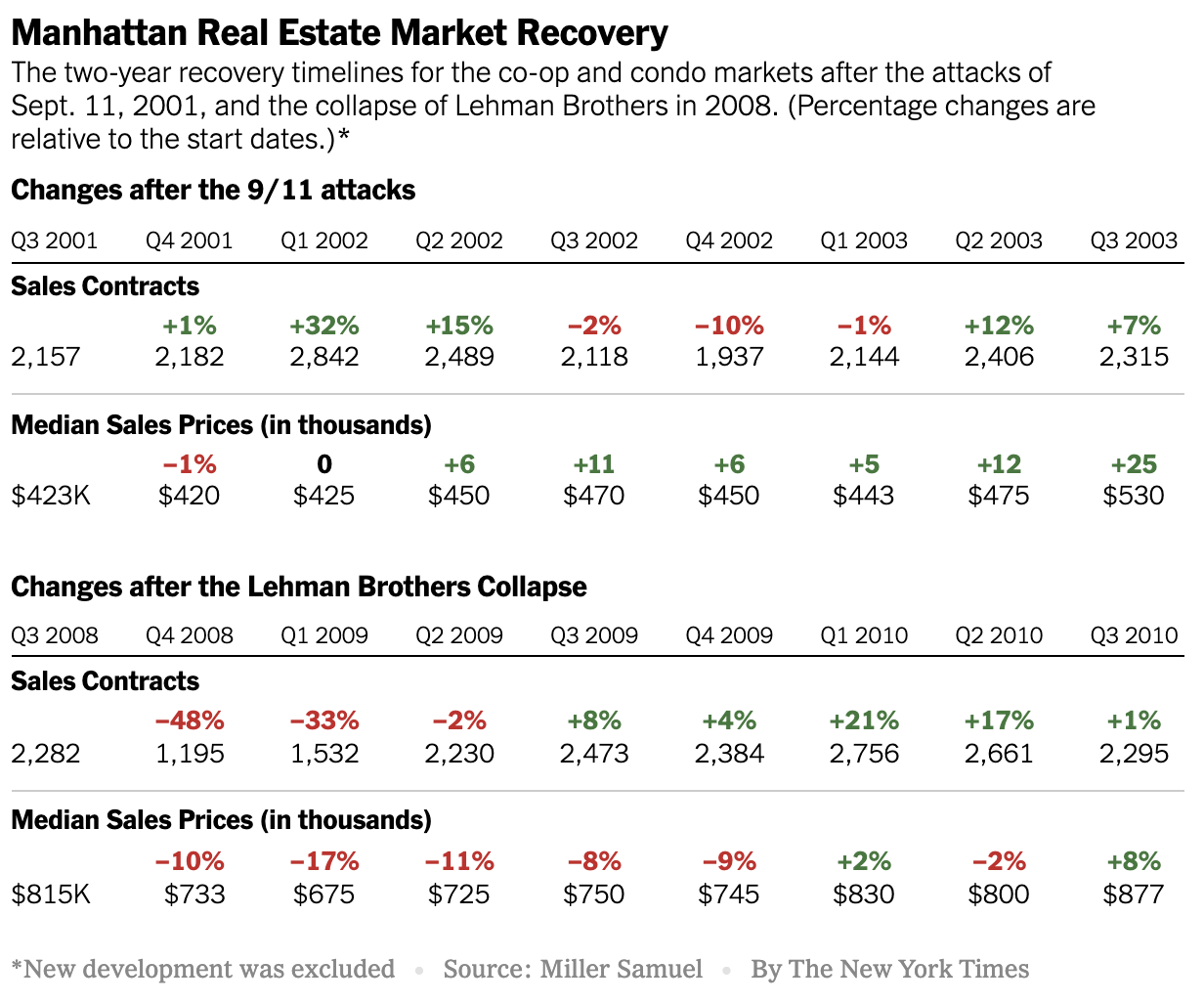
Manhattan Crisis: What Does Our Housing Past Tell Us About Our Housing Future?

May 7, 2020 | 1:02 pm | |

In this Sunday’s New York Times Real Estate Section (online now), the Calculator column featured some data trends I’ve gathered during two significant prior housing market events: What Can 9/11 and the Great Recession Tell Us About Coronavirus Recovery?

Tags: , , , , , , ,


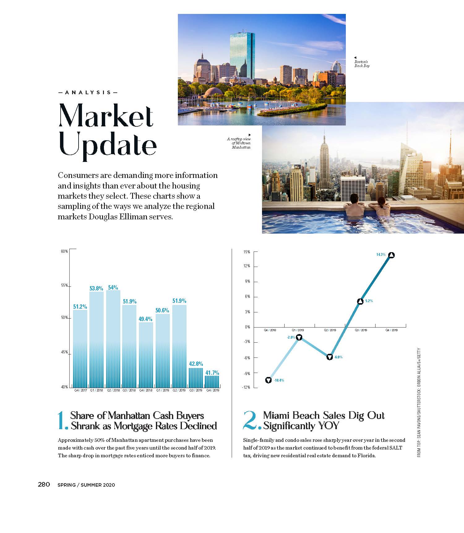
Elliman Magazine: 8 Regional Housing Market Charts

April 2, 2020 | 12:01 am | | Articles |

I whipped up eight charts using data from our expanding Douglas Elliman Market Report Series to touch base on a wide array of U.S. housing markets. These charts appeared on pages 280-282 in the 2020 Spring/Summer edition of Elliman Magazine. Click on each graphic to expand.

Tags: , , , , , , , , ,


Staying Put Locally = Saving Lives Globally

March 28, 2020 | 9:05 am |

Visual Capitalist created a terrific infographic of 41 cities around the globe comparing the outbreak trend against the commuter activity trend. Incredible

Tags: ,

Get Weekly Insights and Research

Housing Notes by Jonathan Miller

Receive Jonathan Miller's 'Housing Notes' and get regular market insights, the market report series for Douglas Elliman Real Estate as well as interviews, columns, blog posts and other content.

Follow Jonathan on Twitter

#Housing analyst, #realestate, #appraiser, podcaster/blogger, non-economist, Miller Samuel CEO, family man, maker of snow and lobster fisherman (order varies)
NYC CT Hamptons DC Miami LA Aspen
millersamuel.com/housing-notes
Joined October 2007