Matrix Blog

Posts Tagged ‘Michael Kolomatsky’

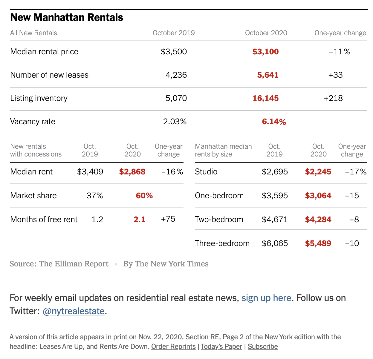
NYT Real Estate: Signs of a Manhattan Rental Market Recovery

November 21, 2020 | 12:49 pm | | Charts |

This weekend’s New York Times Real Estate Calculator column provides a visualization of the recent rental market results in The Elliman Report: October 2020 Manhattan, Brooklyn & Queens Rentals

The Manhattan changes were the most interesting to me – record highs set for the vacancy rate, concession market share, concession amount, yoy% change in median net effective rent overall, studio, 1-bed, & 2-beds. Yet we saw for the first time in fourteen months, a jump in YOY% new lease signings and the highest October new lease signing total on record.

The significantly weaker rental market final hit a point that caused demand to begin to flood back into the market.


[click to open article]

Tags: , , ,


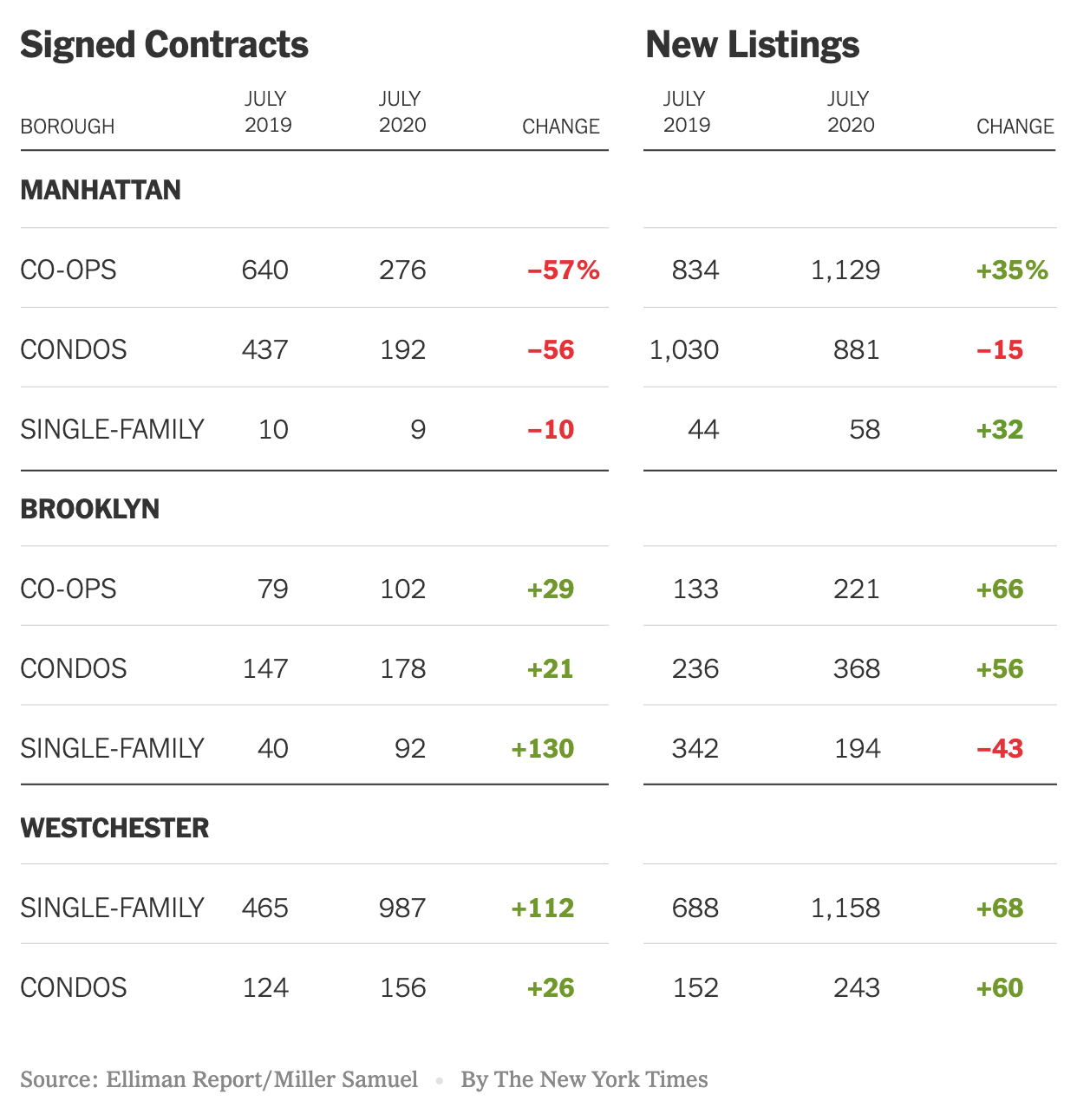
The ‘Urban To Suburban’ Narrative Is Really ‘Manhattan To Suburban’

August 19, 2020 | 1:26 pm | | Charts |

This post previously appeared in the August 14, 2020 edition of Housing Notes. I’ve been writing these weekly summaries on housing topics for more than five years. To subscribe for free, you can sign up here. Then you can look forward to each issue every Friday at 2pm New York Time.

The New York Times created a terrific graphic on our Elliman New Signed Contract Report by illustrating the performance of Manhattan and Brooklyn versus Westchester County. Brooklyn’s sales market performance is closer to Westchester than it is to its city counterpart.


Tags: , , , ,


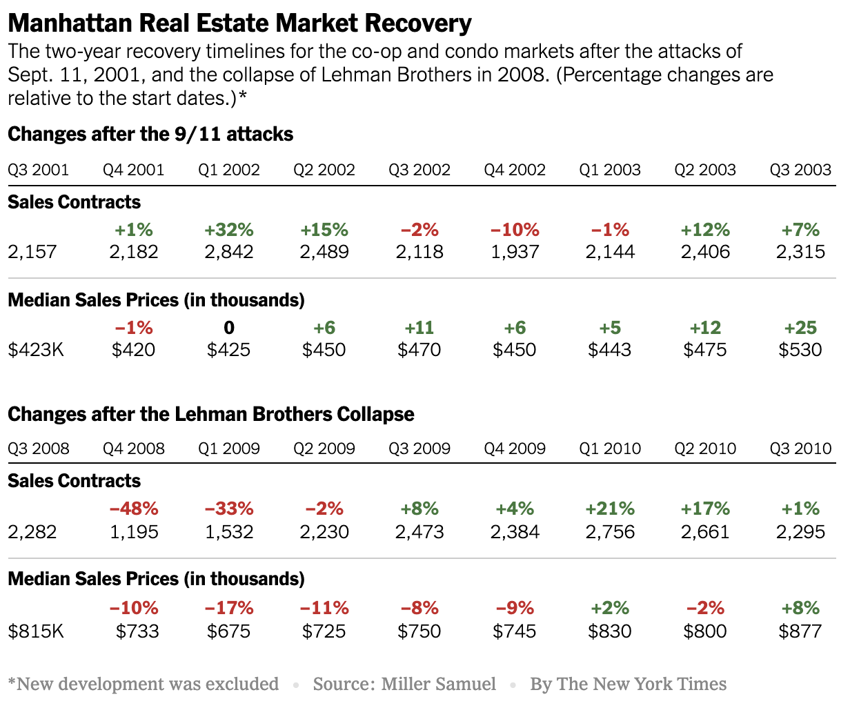
Manhattan Crisis: What Does Our Housing Past Tell Us About Our Housing Future?

May 7, 2020 | 1:02 pm | |

In this Sunday’s New York Times Real Estate Section (online now), the Calculator column featured some data trends I’ve gathered during two significant prior housing market events: What Can 9/11 and the Great Recession Tell Us About Coronavirus Recovery?

Tags: , , , , , , ,


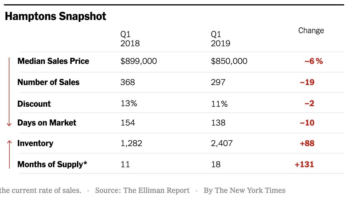
Hamptons Sellers Are Starting To Get The Message

May 16, 2019 | 2:01 pm | | Infographics |

Michael Kolomatsky of the Calculator column in the New York Times real estate section crafted a cool infographic for this weekend using data from the Douglas Elliman‘s Hamptons Sales report that I author. The gist of it is that sellers are slowly pricing closer to market causing days on market and the listing discount to compress somewhat. This faster moving pattern is in sharp contrast to sliding price trends, declining sales, and rising inventory. The narrative in this market clearly reflects a slowdown, but with a vibrant regional economy, the buyers are here, but unwilling to pay at price levels of a few years ago.

Tags: , , ,


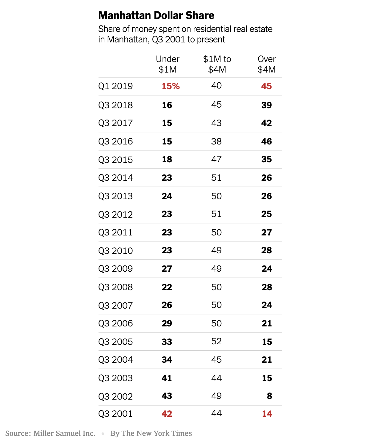
NYT Infographic: Manhattan Real Estate Shift To High End, Illustrated

May 4, 2019 | 11:03 am | | Infographics |

There is a cool graphic from the New York Times Calculator column by Michael Kolomatsky in this Sunday’s print edition of the Real Estate section that illustrates Manhattan’s dependence on high-end real estate. Using the data from a chart I began right after 9/11 and we continue to update, he illustrates this point:

Almost half the money spent by New York City home buyers in the first quarter of 2019 went toward the most expensive properties. That wasn’t always the case.


Tags: , ,


2017: The Year The 2015 Manhattan Market Shift Became Conventional Wisdom

January 1, 2018 | 11:00 am | | Charts |

After controlling the Manhattan housing market for quite a while, sellers and landlords exchanged roles with buyers and tenants circa 2015.

After peaking in 3Q 2015, the market share of bidding wars fell by two thirds. Bidding wars remain more common at lower price points. After bottoming in the 3Q 2015, the market share of rentals with landlord concessions has expanded sharply due to high-end rental development over-building. But like the sales market, the oversupply remains at the upper end.

Aside

Sunday, December 31, 2017, was a trifecta of my New York Times Real Estate market insight goodness before the year ended:

Landlords and Sellers Adjust [New York Times: Calculator column]

Manhattan Prices Stable in 2017, Even as Luxury Takes a Breather [New York Times: Big Ticket column]

Ditching the Tub [New York Times]

Tags: , ,


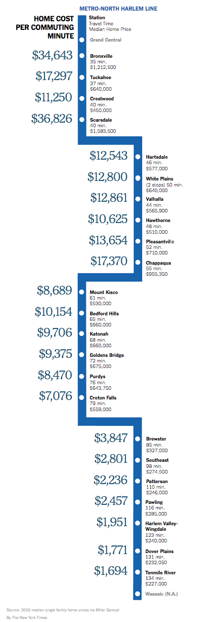
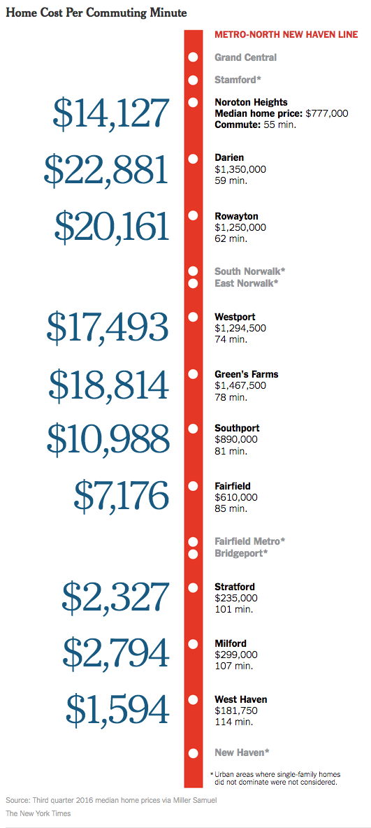
Westchester to Manhattan Commute Time by Housing Cost

April 7, 2017 | 10:34 am | | Infographics |

Because I’m a little behind, the awesome infographic below by Michael Kolomatsky appeared in the New York Times real estate section a few weeks ago: How Much Is Your House Worth Per Minute?.

My original version covering Fairfield County was so popular they wanted me to do recurring versions. This one was much harder since there wasn’t an obvious “sweet spot” but the concept was the same. And best of all, it’s pretty darn cool.

Tags: , ,


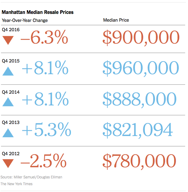
NYT Calculator Chart: The Resale Pendulum Swings Toward Middle

January 21, 2017 | 2:50 pm | | Charts |

I love the way the NYT Real Estate section handled the data from our Elliman Report series to present the Manhattan resale market.

2017-1-22NYTcalculator

I added my chart on bidding wars below – falling as supply enters the market, causing resale prices to soften.

4qoverlistmanhattan

Tags: , , , ,


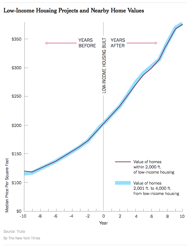
YIMBY: Low-Income Housing

November 25, 2016 | 2:02 pm | | Infographics |

lowincomevvaluetrulianyt

The YIMBY (Yes-In-My-Backyard) movement is fairly new.

In the United States, early leaders of the YIMBY movement include Sonja Trauss in San Francisco and Nikolai Fedak in New York. The first ever Yes In My Backyard conference was held in Boulder, Colorado, in June 2016.

Nikolai has done an amazing job at chronicling the explosion of new development in NYC over the past several years with his must read web site New York YIMBY.

One of the misconceptions with the NIMBY movement which is largely the opposite of YIMBY is the idea/rule of thumb that low-income housing always drags down property values of nearby properties. In an era challenged by the lack of any type of affordable housing, this makes a bad situation worse.

According to this recent research by Trulia (FYI – I was part of their industry advisory board from 2006-2014), and notably in aggregate form, the impact seems to be non-existent in the majority of the markets covered. One can’t conclude there is no impact as a general rule but it does show that should not be the default assumption.

The above infographic is from this Weekend’s New York Times’ real estate section column called ‘Calculator’ – Low-Income Housing: Why Not in My Neighborhood?. The methodology used in the Trulia research was the following:

To measure this, Trulia compared the median price per square foot of nearby homes (within 2,000 feet of low-income housing) with that of homes farther away (2,001 to 4,000 feet) over 20 years, starting 10 years before the low-income housing was built and ending 10 years after.

Tags: , , , ,


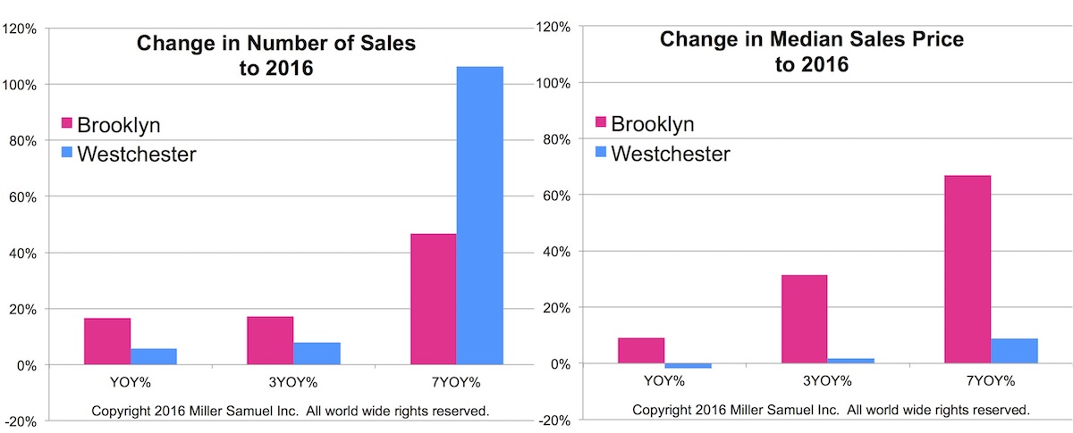
NYT Calculator: Suburban Sales Boom Measured By Houses on Monopoly Board

November 19, 2016 | 7:46 am | | Charts |

The New York Times created another super cool graphic in their new Calculator column, based on my idea. In the fall of 2015 I observed a massive surge of sales in Westchester County (north of NYC for those not familiar with our area). However median sales price was nearly flat during this period. This was phenomenon repeated in all of the counties that surround NYC – except for NJ since I don’t cover that market yet but anecdotally I believe the same phenomenon is occurring there. I believe this moment was the point where the affordability challenge became so severe that renters and move up buyers had to move out of the city.

Specifically, Brooklyn showed a surge in median sales price from 2009 with a modest growth in sales. Westchester reflected the opposite patterns of Brooklyn. Westchester county sales boomed over the same period while the growth in median sales price was much more tepid.

westchestervbrooklyn11-2016

Below is the NYT graphic for the suburban sales boom article.

11-18-16nytcalculator

Tags: , , ,


The Relationship Between Commute Time and Housing Prices

October 28, 2016 | 3:48 pm | | Infographics |

Back in the mid 1990s after my wife and I moved to Fairfield County, Connecticut from Manhattan, I noticed the decline in housing prices further from the first express stop in Stamford, CT.

I worked on an updated version of the concept for this weekend’s New York Times Real Estate section: What’s Your Commute Time Worth? They did an amazing job on the graphic.

nytimesmetro-northcommute3q16

Tags: , , , , ,


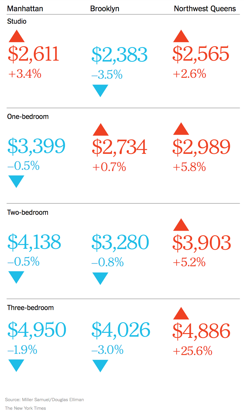
NYT Real Estate Calculator: NYC Rents Go Graphic

October 9, 2016 | 8:49 am | | Infographics |

I’m liking the new goodies in the New York Times real estate section, especially this week, and not because the most recent market report on the Manhattan, Brooklyn and Queens rental market for Douglas Elliman was featured.  No, really.

See for yourself.


nytcalculator10-9-2016rents

Tags: ,

Get Weekly Insights and Research

Housing Notes by Jonathan Miller

Receive Jonathan Miller's 'Housing Notes' and get regular market insights, the market report series for Douglas Elliman Real Estate as well as interviews, columns, blog posts and other content.

Follow Jonathan on Twitter

#Housing analyst, #realestate, #appraiser, podcaster/blogger, non-economist, Miller Samuel CEO, family man, maker of snow and lobster fisherman (order varies)
NYC CT Hamptons DC Miami LA Aspen
millersamuel.com/housing-notes
Joined October 2007