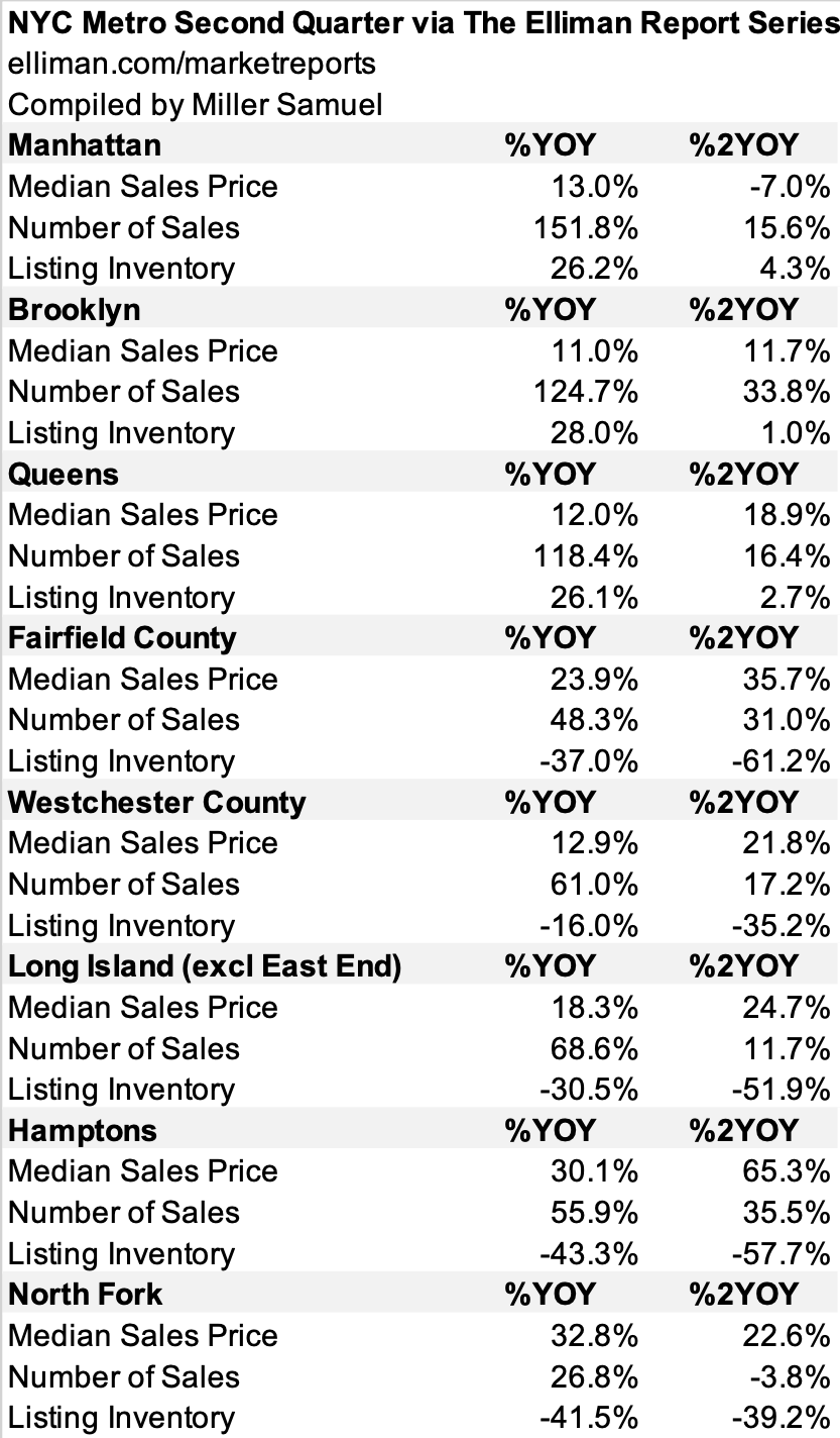
NYC Metro Conditions Much More Robust Than Two Years Ago

August 20, 2021 | 12:56 pm | Infographics |

One of the problems with my normally preferred year-over-year comparisons with metrics to diffuse seasonal impact is that the year-ago period happened to be the pandemic lockdown.

I went through the region using our market report series for Douglas Elliman, comparing the same period two years ago to capture the pre-COV ID market and prices. and sales are up with the exception of Manhattan and North Fork. Listing inventory is up slightly within the city boroughs and plunged in the suburbs.

Tags: ,


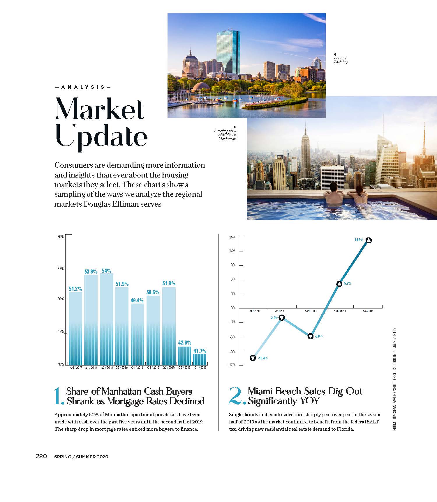
Elliman Magazine: 8 Regional Housing Market Charts

April 2, 2020 | 12:01 am | | Articles |

I whipped up eight charts using data from our expanding Douglas Elliman Market Report Series to touch base on a wide array of U.S. housing markets. These charts appeared on pages 280-282 in the 2020 Spring/Summer edition of Elliman Magazine. Click on each graphic to expand.

Tags: , , , , , , , , ,


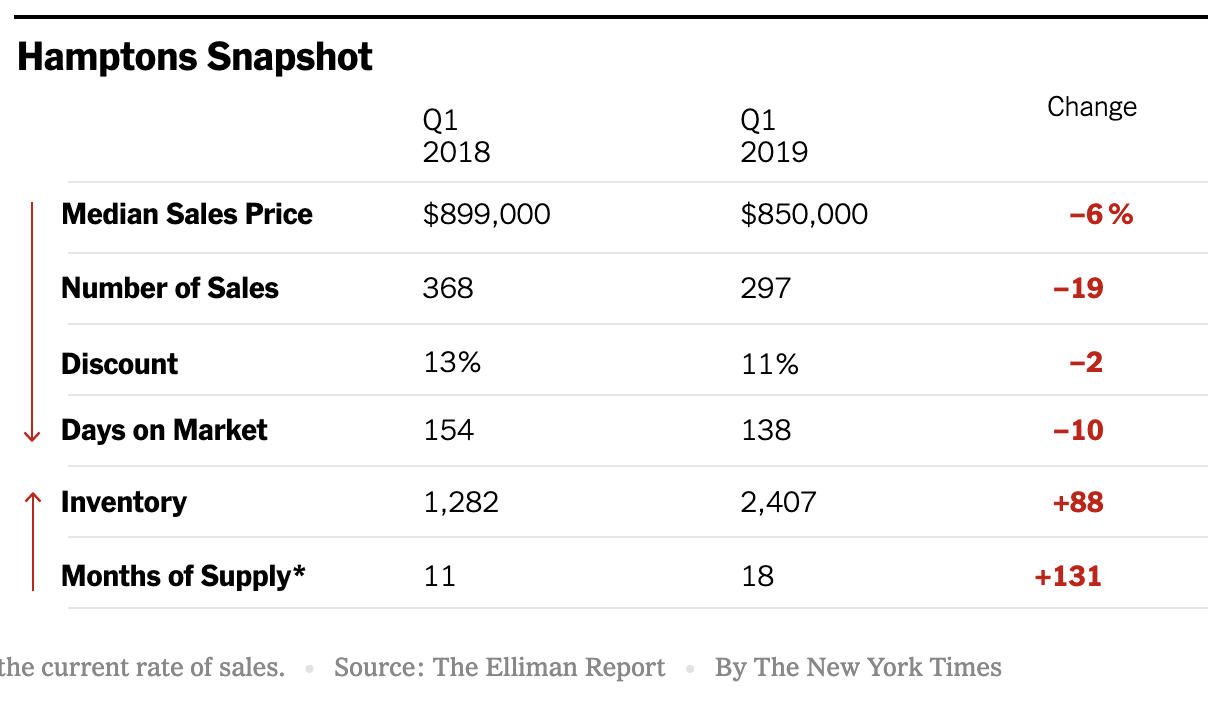
Hamptons Sellers Are Starting To Get The Message

May 16, 2019 | 2:01 pm | | Infographics |

Michael Kolomatsky of the Calculator column in the New York Times real estate section crafted a cool infographic for this weekend using data from the Douglas Elliman‘s Hamptons Sales report that I author. The gist of it is that sellers are slowly pricing closer to market causing days on market and the listing discount to compress somewhat. This faster moving pattern is in sharp contrast to sliding price trends, declining sales, and rising inventory. The narrative in this market clearly reflects a slowdown, but with a vibrant regional economy, the buyers are here, but unwilling to pay at price levels of a few years ago.

Tags: , , ,


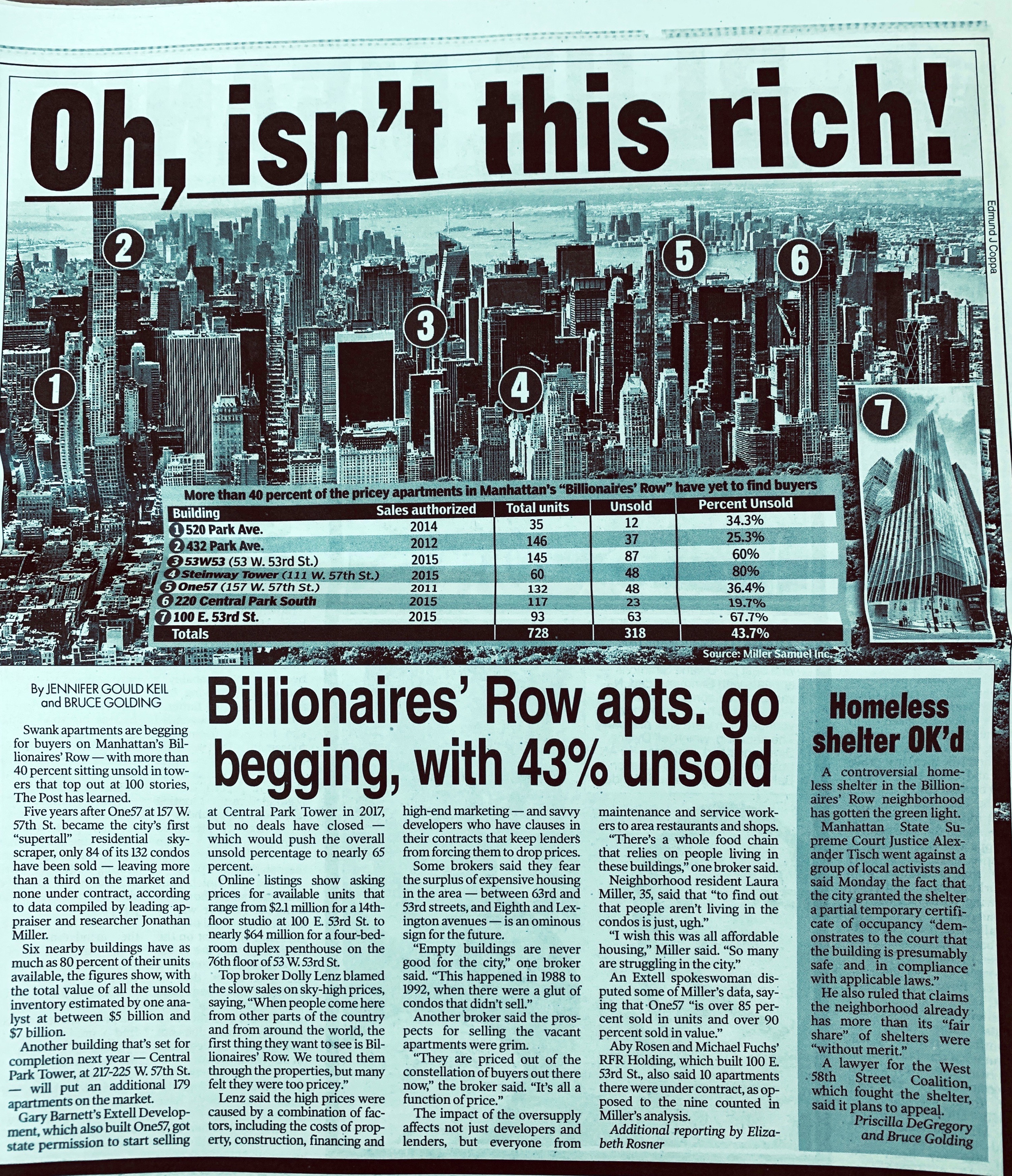
Billionaires Row Continues to be Challenged

May 4, 2019 | 11:09 am | Infographics |

It’s been no secret that super luxury Manhattan sales have been the hardest hit segment of the market since 2014. The slowdown is related to the oversupply of new development created from the vast amounts of capital looking for a home since the financial crisis. Perhaps the most famous representation of the super-luxury market has been “Billionaires Row” centered on 57th Street in the heart of Manhattan’s central business district in Midtown Manhattan. The introduction of supertalls to the skyline has provided never before expansive views to the buyers.

I was asked by the New York Post to provide a snapshot of this submarket. Since contract data is not public record and is easily manipulated, I estimated the state of the key buildings as best I could, using ACRIS for closed sales, Streeteasy contract tags, and feedback from market experts in and around the brokerage community. The result was really no surprise to anyone in the real estate business but because it was concentrated in one place, the story went viral. Curbed wrote a good follow-up as well.

Tags: , , , ,


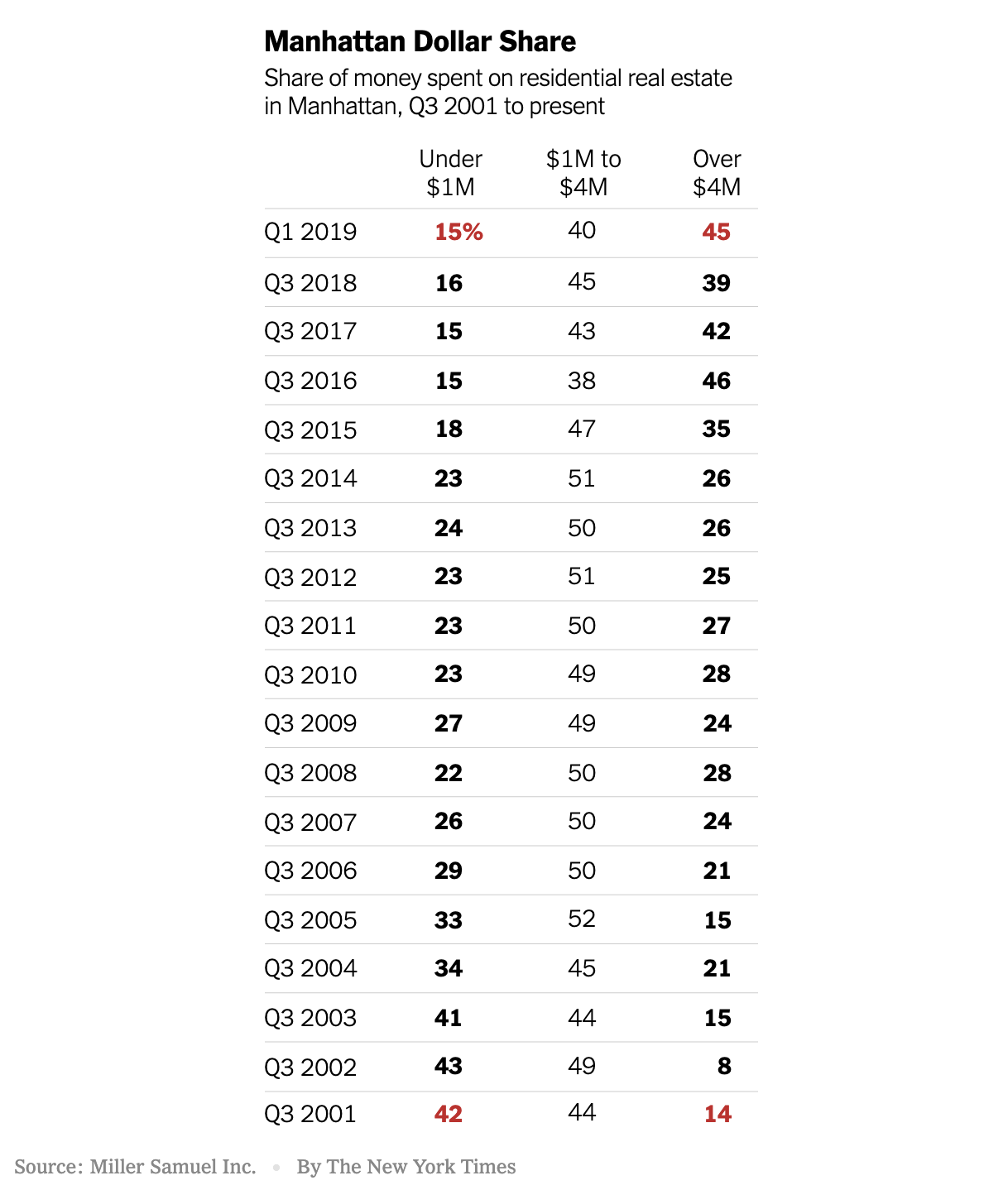
NYT Infographic: Manhattan Real Estate Shift To High End, Illustrated

May 4, 2019 | 11:03 am | | Infographics |

There is a cool graphic from the New York Times Calculator column by Michael Kolomatsky in this Sunday’s print edition of the Real Estate section that illustrates Manhattan’s dependence on high-end real estate. Using the data from a chart I began right after 9/11 and we continue to update, he illustrates this point:

Almost half the money spent by New York City home buyers in the first quarter of 2019 went toward the most expensive properties. That wasn’t always the case.


Tags: , ,


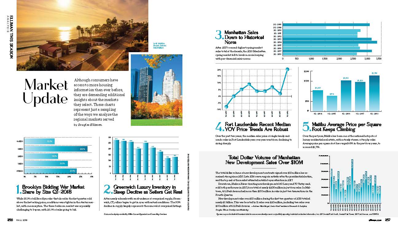
Fall 2018 Elliman Magazine – Market Update

September 7, 2018 | 10:00 am | Infographics |

The Fall 2018 Issue of Elliman Magazine was just released and as usual, I provided a two-page spread showing interesting (my definition, lol) of what is going on in some of the markets under their national footprint. The magazine is well done and a fun aspirational read.


[click to expand]

Here’s the full online version of the magazine:


Tags:


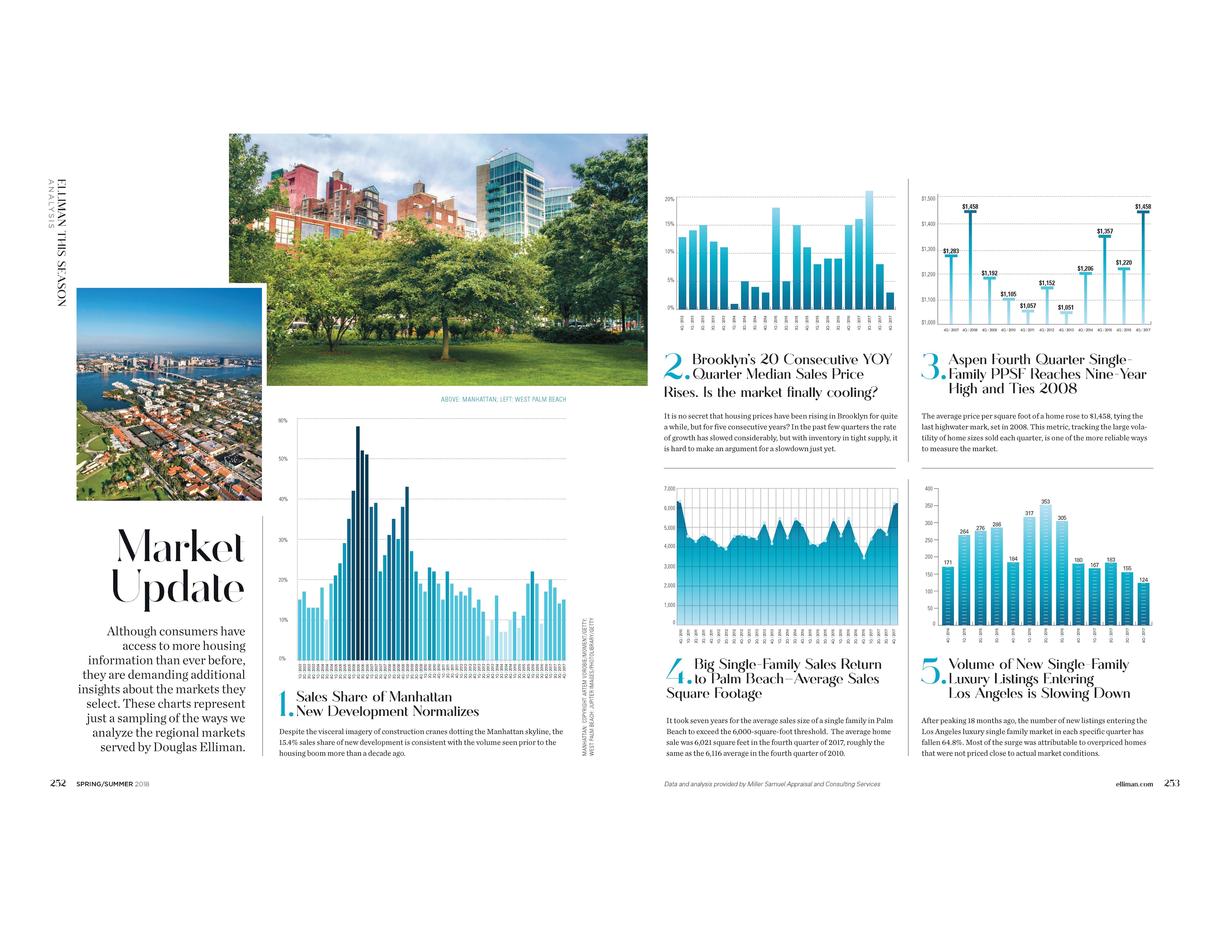
Elliman Magazine Spring Edition – 5 Charts

April 15, 2018 | 4:10 pm | | Infographics |

Every seasonal edition, Douglas Elliman Real Estate asks me to provide a visual market update for their magazine in any 5 of the markets they cover nationwide. The following graphic is found in their latest Elliman Magazine.

Click on the following graphic to see my charts in all their majesty.

Tags:


One57 Flip Analysis From Manhattan’s Peak New Development

November 15, 2017 | 4:47 pm | | Articles |

For those of you that read my weekly Housing Notes, you’ll know I refer to 2014 as “Peak New Development” for the Manhattan housing market. “Peak Luxury” works as a label too.

Bloomberg news broke the story that a $50M+ condo purchased in 2014 just sold at a foreclosure auction for $36,000,0000. There were five bidders. It’s been the fourth resale since the market peaked and the sixth overall – so I created a graphic of all the resales to show how they fared before and after the 2014 “peak.”


The Bloomberg story (that I got to chime in on) lays out the details of the One57 auction sale: One57 Foreclosure Shatters Price Dreams at Billionaires’ Tower

The story reached #1 as the most read on the 350k± Bloomberg Terminals worldwide yesterday.


It is important to remember that there are still a fair amount of units remaining that are priced at 2014 levels. Extell, the developer, has their work cut out for them to compete with current market conditions.

While One57 is a symbolic poster child for the new dev phenomenon, it is not a proxy for the entire new development market. Some projects were priced more reasonably at the peak, hence they haven’t fallen as much. In addition, the quality and design of each project can vary greatly. One thing is clear – since the 2014 peak, investors don’t have the same potential for big and fast returns on flips – their initial strategy was to buy early and realize instant equity as the sponsor increased the offering prices. That scenario no longer applies. Since the market has more choices for buyers now than it did back during peak, One57 is no longer seen as a “new” building like it was back then.

CNBC picked up the story – My firm and I get a shoutout during the conversation on Sqawkbox which was pretty cool.

Luxury condo in One57 tower sold in New York City’s biggest ever foreclosure auction from CNBC.

And here’s the transcript on yesterday’s PBS Nightly Business Report show (owned by CNBC) with the shoutout that is making the rounds.

Tags: , , ,


Explainer: Overall Median Sales Price Submarket Changes May Not Fall In Range

October 29, 2017 | 8:39 pm | Infographics |

This title is way too wonky but I found it hard to pare down. It’s easier to explain visually.

When I complete my research for Douglas Elliman in a particular housing market and the percent change in the overall median sales price doesn’t fall within the individual submarkets like averages do, I periodically receive inquiries from media outlets or real estate professionals to clarify. Many people see median sales price much like they see average sales price: proportional.

In this case, the median sales price change for resale to new development ranged from -23% to +1.9% yet the overall median increased 9.3…clearly outside of the range both submarkets established.


So I whipped up the following infographic with sample sales transactions and applied median and average sales price to illustrate how median sales price percent change for the overall market might not always fall within the individual submarket percent price changes. However, in an “average” analysis, the overall result will always fall within the range of the submarkets.

I hope the following color-coded breakdown below helps illustrate this clearly – be sure to click on the image once to expand or a second time for the extra large version.


[click to expand]

Tags: ,


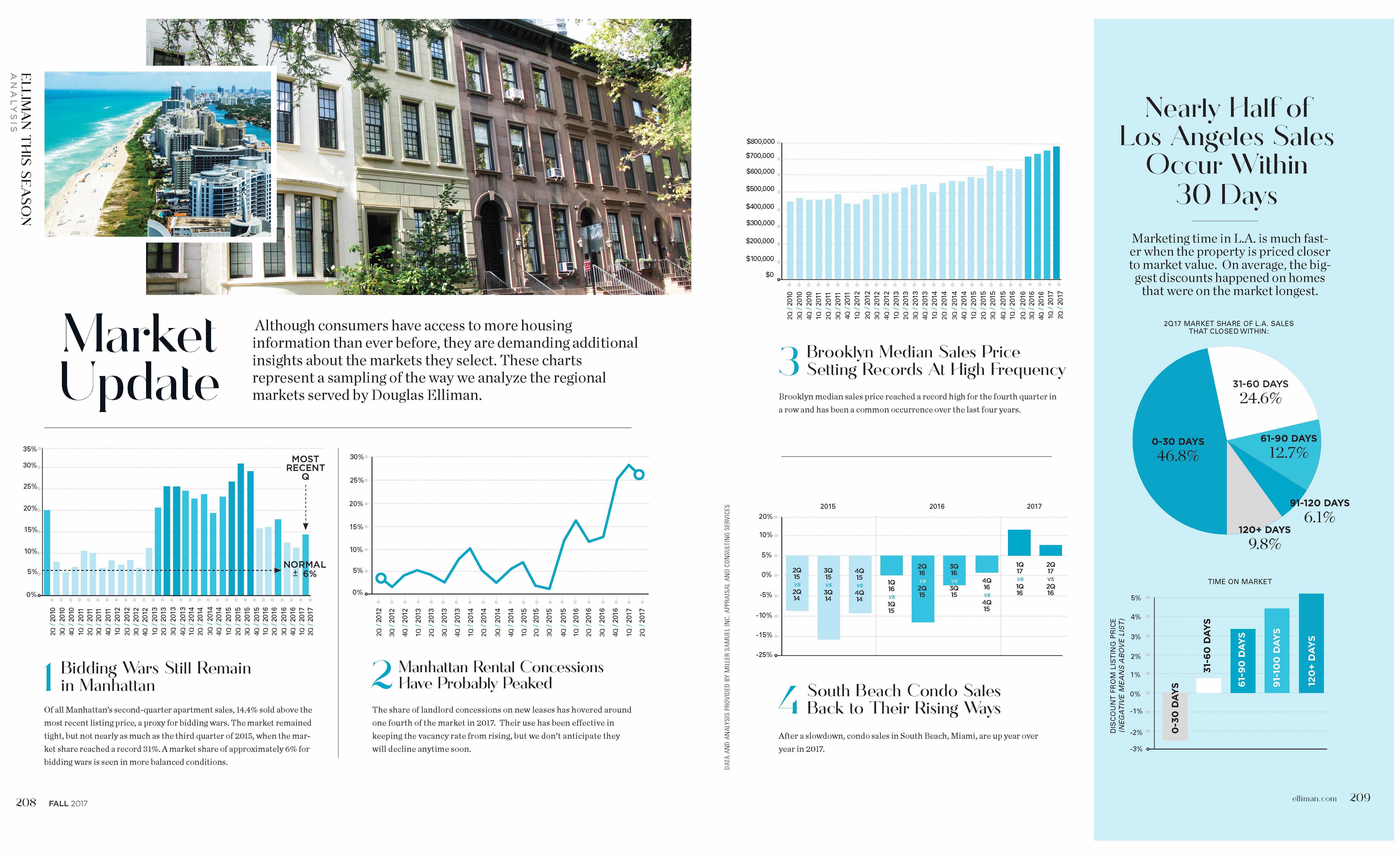
Real Estate ChartArt in Elliman Magazine’s Fall 2017 Issue

September 18, 2017 | 3:12 pm | | Charts |

Douglas Elliman Real Estate just published their fall issue. I created the content for pages 208-209 and I think it looks pretty snazzy (and interesting).

Click on image below to expand.

EllimanMag

Tags:


Vancouver’s Epic Real Estate Boom, Visualized

September 9, 2017 | 3:30 pm | Infographics |

The following is a housing related infographic on steroids from Visual Capitalist.

Visual Capitalist

Tags: ,


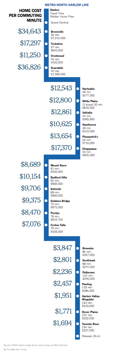
Westchester to Manhattan Commute Time by Housing Cost

April 7, 2017 | 10:34 am | | Infographics |

Because I’m a little behind, the awesome infographic below by Michael Kolomatsky appeared in the New York Times real estate section a few weeks ago: How Much Is Your House Worth Per Minute?.

My original version covering Fairfield County was so popular they wanted me to do recurring versions. This one was much harder since there wasn’t an obvious “sweet spot” but the concept was the same. And best of all, it’s pretty darn cool.

Tags: , ,

Get Weekly Insights and Research

Housing Notes by Jonathan Miller

Receive Jonathan Miller's 'Housing Notes' and get regular market insights, the market report series for Douglas Elliman Real Estate as well as interviews, columns, blog posts and other content.

Follow Jonathan on Twitter

#Housing analyst, #realestate, #appraiser, podcaster/blogger, non-economist, Miller Samuel CEO, family man, maker of snow and lobster fisherman (order varies)
NYC CT Hamptons DC Miami LA Aspen
millersamuel.com/housing-notes
Joined October 2007