Matrix Blog

Analysis & Research

Bloomberg View Column: Hedge-Fund Guys Have Foreclosure Fatigue

November 7, 2014 | 4:28 pm | | Charts |

BVlogo

Read my latest Bloomberg View column Hedge-Fund Guys Have Foreclosure Fatigue. Please join the conversation over at Bloomberg View. Here’s an excerpt…

One of the most important ways to strengthen the U.S. housing recovery is to get distressed properties into financially stronger hands. Shortly after the financial crisis began, institutional investors started snapping up foreclosed homes. These buyers, according to RealtyTrac, are entities that buy more than 10 properties in a calendar year. Blackstone Group has been among the most active, acquiring more than $20 billion of foreclosed properties, then making necessary repairs and renting them out…

[read more]


My Bloomberg View Column Directory

My Bloomberg View RSS feed.

Tags: , ,


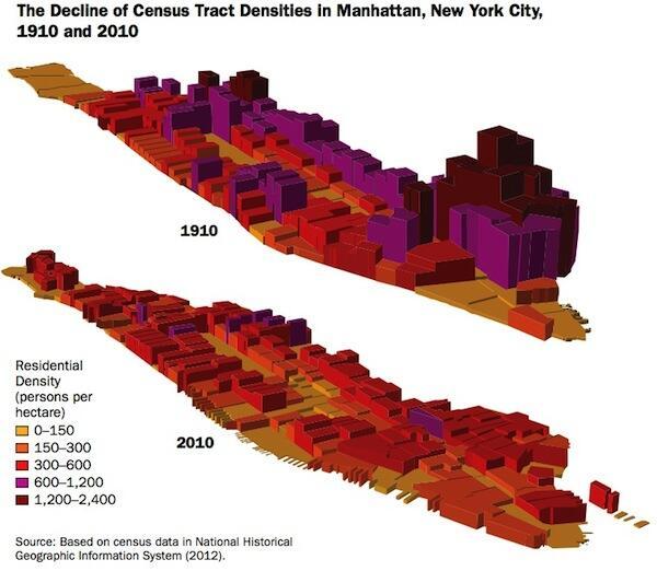
A Century Later: Manhattan Is Less Crowded

September 27, 2014 | 12:26 pm |

manhattandensity

The density of the Five Points in 1910 was absolutely incredible.  The 2010 population density is much more balanced across the island.

NYU’s Marion Institute of Urban Management is offering a free seminar at the New York Public Library called “The Rise and Fall of Manhattan Density” to explain how this happened.

Tags: , , , ,


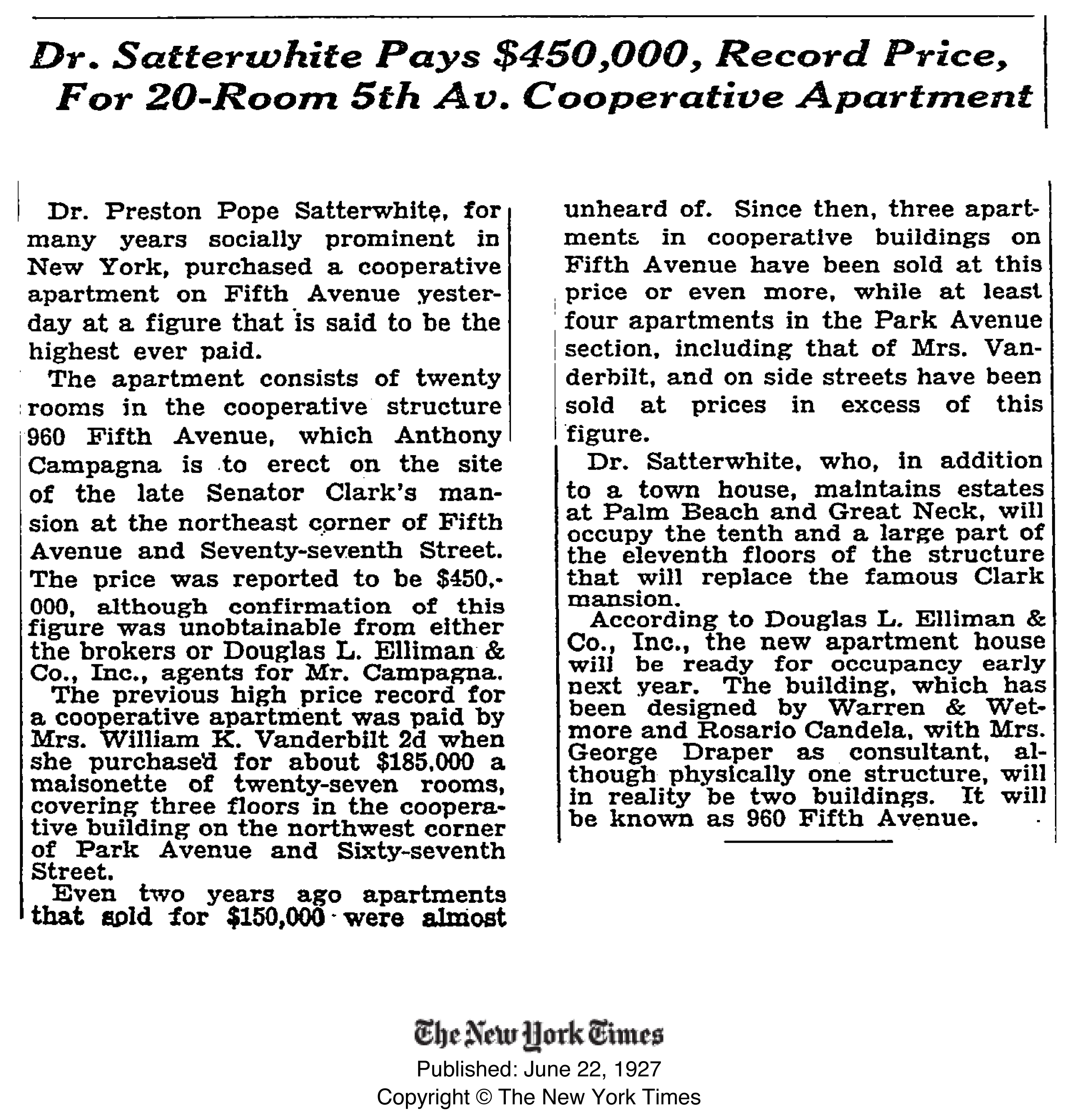
A Fifth Avenue Co-op’s 87-Year Price Increase was 3.6X Rate of Inflation

August 1, 2014 | 6:30 am | |

960fifth$450krecord-1927

[click to expand]

A few months ago there was a record $70M sale of a penthouse co-op sale at 960 Fifth Avenue.  The purchaser paid $5M over list price.

While doing some research I ran across an article in the New York Times archive that described a record Manhattan sale of $450,000 in the same building in 1927.  The apartment was located on the 10th and most of the 11th floor in the same building (aka 3 East 77th Street).

Based on the unit description, I believe this to be Apartment 10/11B which last sold for $21,000,000 on July 24, 2013.   Using the BLS calculator for CPI, a $450,000 sales price in 1927 adjusted for inflation to 2014 dollars would be $6,164,043 or an increase of 1,270%.

However the apartment sold for $21,000,000. an increase of 4,567% or 3.6 times the rate of inflation.

Tags: , , , , , , ,


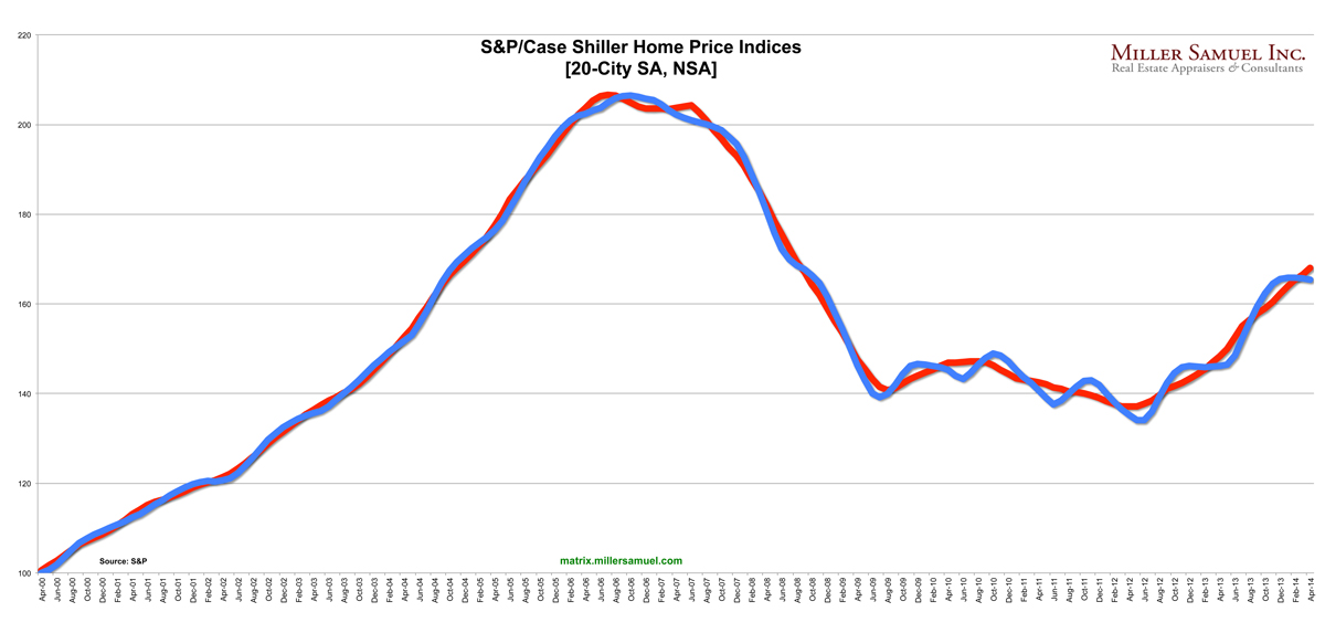
Time-Shifted Case Shiller: Dallas, Denver Crushing it, Polar Vortex a Non-Issue ‘Cause It’s Still December

June 24, 2014 | 5:29 pm | Charts |

matrixCSI-6-24-14 [click to expand]

The above chart is a generic trend line for the seasonally and non-seasonally adjusted 20-City Case Shiller Index released today using the data from the release.

And here’s the same index that I time-shifted backwards by 6 months to reflect the “meeting of the minds” of buyers and sellers. More specific methodology is embedded in the following charts. By moving the index back 6 months, the changes in the direction of the index are in sync with economic events (reality). In my view this index has a 6 month (5-7) month lag rendering it basically worthless to consumers but perhaps a useful tool for academic research where timing may not be as critical. I’m just grasping here.

matrixCSI-6-24-14INDEXshift

[click to expand]

And here’s a time-shifted trend line for the year-over-year change in the 20 city index. You can see that the pace of year-over-year price growth began to cool at the end of last year. Talk about the weather is still premature since the polar vortex occurred after the new year.

matrixCSI-6-24-14YOYshift

And here is the ranking by year-over-year changes for each city as well as the 10 and 20 city index. Dallas and Denver are no longer under water and Las Vegas, despite recent good news has a long way to go to get to the artificial credit induced high it reached in 2006.

matrixcsi6-2014ranking

Tags: , , ,


Status Quo Bias: ‘Linear” Thinking in the Real Estate Industry

June 8, 2014 | 8:09 pm |

linearcharts
[source]

When we look at forecasting, planning, trending or anything that includes a look out over the future, I find the real estate industry (i.e. appraisers, real estate agents & brokers) generally thinks along linear lines.

For example:

  • When housing prices rise…they will rise forever.
  • When housing prices fall…they will fall forever.
  • When sales activity rises…they will rise for ever.
  • When inventory falls…it will fall forever.
  • When rental prices rise…they will rise forever.

…and so on.

Where does this status quo bias come from?

I don’t think this bias only specific to the real estate industry – but I describe it through the industry only because it simply happens to be my area of focus. I do find that real estate professionals can be quite disconnected from the mindset of their clients when the market is at extreme points in the trend i.e. peak and trough.

For example, in the dark days following the Lehman Brothers bankruptcy, I was giving a speech to a large group of New York real estate agents in October of 2008. Roughly a dozen agents approached me before and after my presentation saying they were getting offers on their listings at roughly 30% below ask, characterizing the offers as “lowball.” It was quite amazing to hear all the agents use a similar characterization of the post-Lehman market. Of course when nearly all buyers are behaving in the same manner, that becomes the new market condition.

Towards the end of 2008, I found that New York real estate agents rapidly changed their view on the market as sales contract activity fell by 75% YoY. The real estate agent disconnect with the consumer was evident by the early spring of 2009 when it was apparent that buyers were not as negative in their outlook of the coming real estate year as the typical agent was. Needless to say that the market did see a significant rebound over the following year and the consumers were ultimately right.

My takeaway from all of this is never to get too comfortable with a trend. Although we like to say “the trend is your friend,” it is only your friend “until it ends.”

I would think this “status quo bias” behavior manifests itself more strongly in professions that are sales commission heavy, i.e. where commission incentives and generally over-the-top positive thinking are the norm and the agent tries to feel like they have some control over the impact of the market on their livelihood.

Of course the real estate market could care less what anyone thinks.


I was away last week, invited by the US Army to participate in a seminar at the US Army War College in Carlisle Pennsylvania after they heard me give a speech about the evolution of our company. Last week was a complete strategic immersion at the college and frankly I didn’t think a whole lot about the housing market or social media. I met an impressive group of accomplished military veterans who are furthering their careers. I also got to meet civilians like me from around the country that were also invited to participate. I gained invaluable strategic insights and friendships from this event that have made a real impact on me and how I interpret information that is presented to me.

Tags: , ,


Manhattan Home Sales Are NOT 80% All-Cash (They Are 45%)

May 17, 2014 | 11:04 am | | Favorites |

Actually, overall Manhattan Home Sales are 45% All-Cash. I want to make sure that the 80% number doesn’t become embedded in our housing market mindset.

1q14manhattanCASH
[click to expand]


I’ll explain.

Recently a friend passed along a post in the Washington Post titled: 8 in 10 Manhattan home sales are all-cash and my jaw dropped. The author, who I am a fan of, got this information from Realtytrac, who I am also a fan of, but I knew it was either wrong or misinterpreted.

Over the years I’ve played around with NYC mortgage data, usually incomplete and very dirty, from various sources and have combined that with frontline feedback from our own experience as appraisers, as well as from real estate brokers and lenders. I had come to the conclusion that roughly half of Manhattan home sales (co-op, condo & single family) were probably all-cash and condos are definitely well over 50%. I used the logic that foreign and high-end buyers are a large part of the all-cash market, especially within the new development space. And it makes sense – while condo end loan financing is tight, new development condo end loan financing is beyond tight.

The reason the Realtytrac 80% figure jumped out at me was the fact that co-ops account for about 60% of sales and have the highest concentration of entry level and middle class demographics in Manhattan. I was very skeptical that virtually all the market-majority co-op buyers were paying all-cash, especially in the tepid economy we are stuck with.

So I reached out to Daren Blomquist, Vice President at RealtyTrac who is often the point person on their data releases. I indicated that the 80% figure seemed off and wondered if it excluded the co-op market. It didn’t. However even an 80% all-cash share for only single family and condo sales seemed like a stretch. He said he would look into it and within an hour they could see an issue with their co-op data feed. They were already working on the issue (and why I like Realtytrac). He shared their 1Q14 Manhattan information (I omitted the suspect co-op data) and here are the key numbers:

Their Results
All-Cash Condo Sales 60.78%
All-Cash Single Family Sales 73.08%

I came up with a new methodology, which looked at the ratios seen in Douglas Elliman sales – the largest real estate brokerage company in Manhattan – with a sales mix is generally consistent with the overall market mix and applied their results to the overall market, and I saw this:

Our Results
All-Cash Co-ops 36% (no revised Realtytrac results yet)
All-Cash Condos 58% (similar to Realtytrac’s 60.78%)

I didn’t have the single family (fee simple) results compiled so I went with Realtytrac’s 73% because: their fee simple (condo) data was consistent with ours, the single family market is skewed much higher price-wise than the condo market (i.e. skewing towards cash buyers) and the single family market share is very small. In fact the market share is so small that the overall 45% all-cash ratio wouldn’t change unless I dropped the single family market share down to 6% from 73% but even then the overall cash ratio would only drop to 44% from 45% – so you get my point (my apologies for the excessive wonkiness on this but it was necessary).

As a result and represented in the table at the top of this post, it is reasonable to say that the overall Manhattan all-cash home sale market in 1Q 2014 was 45% of all residential sales. Got it?

Tags: , , , ,


Q1 2014 Lower Manhattan Real Estate Market: “Vigorous,” “Expand,” “Bullish”

May 5, 2014 | 12:00 pm | | Reports |

These are some of the words used in the Downtown Alliance 1Q 2014 report: Lower Manhattan Real Estate Market Overview

LM-Real-Estate-4Q2014-12

Our appraisal firm Miller Samuel and real estate firm Douglas Elliman provide information and insights for the residential market section of the quarterly report.

LM-Real-Estate-4Q2014-13

Download the Downtown Alliance report: Lower Manhattan Real Estate Market Overview Q1 2014

Tags: ,


PBS Newshour – Making Sense of Weak US Housing Reports

April 28, 2014 | 5:10 pm |

Michelle Conlin of Reuters gives a nice overview of the state of the US housing on PBS, talking through the national reports that hit us recently. Check it out. This month’s weak NAR Existing Home Sales report has unleashed a surge of housing self-loathing (although today’s PHSI seems to take some of the drama/edge off).

Tags: , , , , , , , ,


Pending Home Sales Down 10.2% YOY And That’s Not A Bad Thing

March 27, 2014 | 11:55 am | Charts |

NARphsi3-27-14
[click to expand]

NAR released their pending home sale index today and the news was not unexpected. US home sales volume has slowed since last spring’s taper miscue by the fed which caused mortgage rates to jump. If you look at the May surge in pending sales, sales volume, seasonally speaking (comparing year over year) has fallen 10.2% (unadjusted).

The introduction of QM earlier in the year probably doesn’t help volume levels, but I’m not really convinced that the housing recovery is actually stalling. It seems more like sales levels are settling to more sustainable levels. And as sales go, so goes the insane price gains seen in the national reports.

Tags: , , , , ,


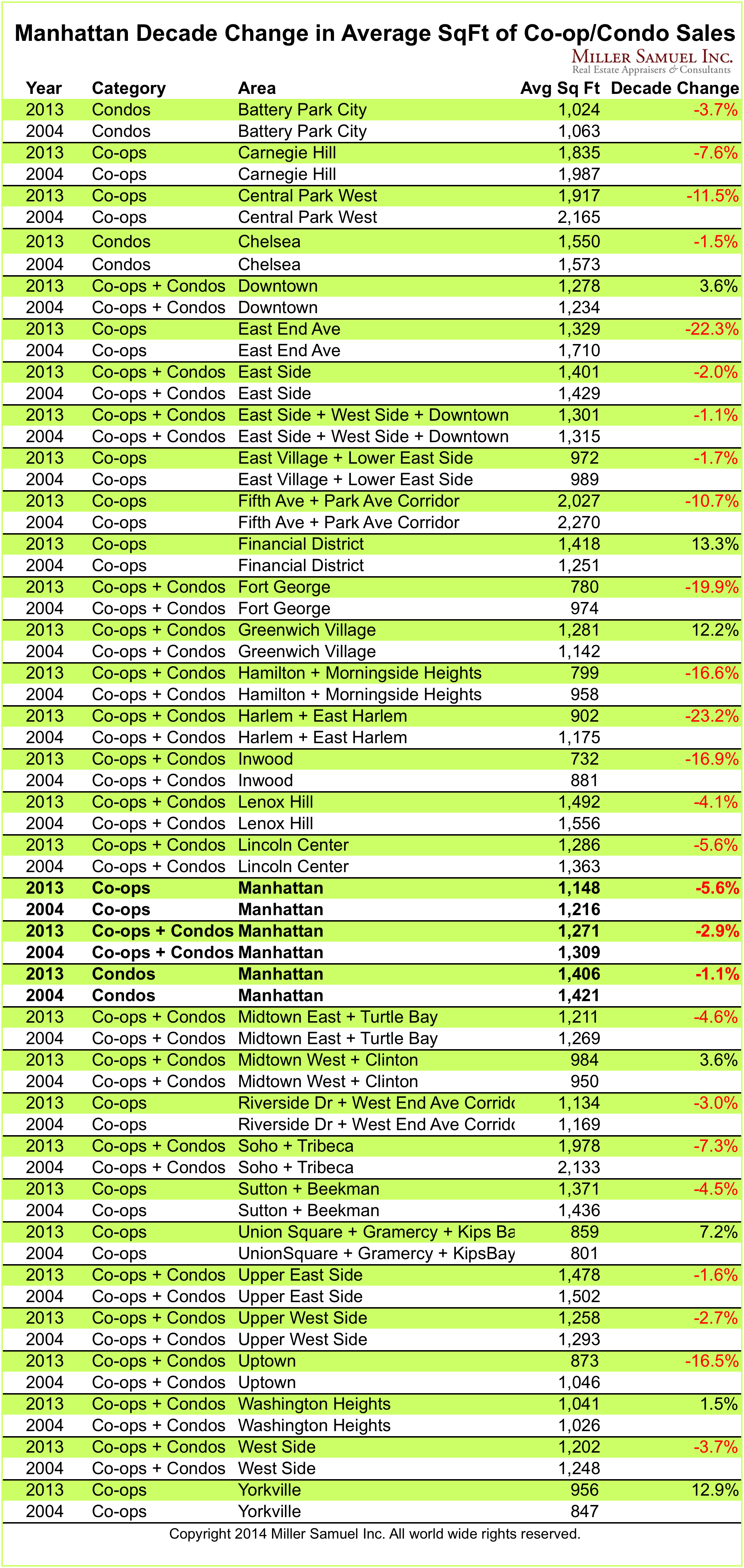
Manhattan’s Decade of Incredible Shrinking Apartment Sizes

March 19, 2014 | 12:30 pm | Charts |

I took a look at the last decade of Manhattan sales activity and broke out a bunch of neighborhoods and property types to compare their changes in average square footage from 2004 to 2013. I looked at the annual sales activity for both years and presented the percent change in the table below.

Takeaway

Rising costs over the decade have prompted small apartment sales at higher prices. New development activity that dominated the market in the middle of the last decade influenced sizes to shrink. This is distinctly different than the discussion about the shift in the mix towards larger apartments – ie more bedrooms.

matrix14manhattansqft
[click to expand]

Tags: ,


Bonus for NYC Housing: Wall Street Comp Up 15.1%, Most Cash Paid Out Since ’08 Crash

March 17, 2014 | 7:00 am | Charts |

The annual release by the New York State Office of Comptroller brought upbeat news to the real estate economy in NYC. Wall Street compensation has long accounted for roughly a quarter of personal income but only 5% of employment so the industry remains very important to NYC’s tax revenues. Here are some of the key points:

  • The overall bonus pool and bonus per person increased 15.1%.
  • The total bonus pool was
  • Bonus pool is up 44% in past 2 years.
  • Securities employment is down 12.6% from before the 2008 market crash.
  • Wall Street accounts for 8.5% of NYC tax revenue and 16% of NYS tax revenue
  • Part of the rise was due to payouts of deferred compensation from prior years.

Here are a few charts that layout the bonus trends in NYC. Wall Street is a key economic driver of NYC and therefore important to the health of the NYC housing market.

Wall Street compensation is 5x that of mere mortals (other private employment compensation) and that ratio has stabilized after a modest correction following the 2008 stock market crash.
2013nycsecuritiesbonus
[click to expand]

Wall Street bonuses rose steadily as a portion of total compensation but after the 2008 stock market correction and financial reform, the market share fell – but not as much as perceived.
2013nycsecuritiescompasperc
[click to expand]

Wall Street employment has fallen since 2008, but not nearly as much as expected. The market share of Wall Street NYC employment has slipped as a result.
2013nycwallstreetemployment
[click to expand]

Tags: , , ,


[Manhattan Absorption] February 2014 – “Tight Supply” as a Market Rant

March 4, 2014 | 10:41 am | Charts |

2-2014Manhattan [click to expand]

Thoughts
For the overall inventory in the Manhattan market, the operative phrase remains “tight supply” with no real relief in sight. While we are seeing a nominal improvement year to date in 2014, the operative word remains “nominal.” $10M+ has long had bloated supply with lots of “I’ll sell if you pay that” listings. $5M and up continues to see the most supply relative to demand. Supply is chronically low below the $3M threshold and most acute between $1M and $2M.

Side by side Manhattan regional comparison:

February 2014 v 2013
2-201402-2013
[click images to expand]

I started this analysis in August 2009 so I am able to show side-by side year-over-year comparisons. The blue line showing the 10-year quarterly average travels up and down because of the change in scale caused by some of the significant volatility seen at the upper end of the market. The pink line represents the overall average rate of the most recently completed month for that market area.

Definition
Absorption defined for the purposes of this chart is: Number of months to sell all listing inventory at the annual pace of sales activity. (The definition of absorption in our market report series reflects the quarterly pace – nearly the same)


Manhattan Market Absorption Charts 2014 [Miller Samuel]
Manhattan Market Absorption Charts 2013 [Miller Samuel]
Manhattan Market Absorption Charts 2012 [Miller Samuel]

Tags:

Get Weekly Insights and Research

Housing Notes by Jonathan Miller

Receive Jonathan Miller's 'Housing Notes' and get regular market insights, the market report series for Douglas Elliman Real Estate as well as interviews, columns, blog posts and other content.

Follow Jonathan on Twitter

#Housing analyst, #realestate, #appraiser, podcaster/blogger, non-economist, Miller Samuel CEO, family man, maker of snow and lobster fisherman (order varies)
NYC CT Hamptons DC Miami LA Aspen
millersamuel.com/housing-notes
Joined October 2007