Matrix Blog

Analysis & Research

Agricultural Land versus Manhattan Parking Per Acre

March 26, 2017 | 8:19 pm | Infographics |

Well here’s a first for me.

Our Manhattan parking stats were compared with the average value per acre of agricultural land in FarmLife magazine.

In 25 years, the cost of an acre of agriculture farmland rose 309% while a Manhattan parking space rose 855% over the same period. Cost? $7,700 per acre for California agricultural land versus $55.5 million per acre for a Manhattan parking spot.

Gotta love this comparison.


UPDATE A colleague pointed out that we don’t know how large the average farmland was or whether it had reasonable access to water and electricity. I pointed out that Manhattan parking spaces don’t have electric and water service and seem to be about 100 feet from the elevator. LOL.

Tags: , ,


John Burns Has It Wrong, Luxury Home Sales Are Not Increasing

December 11, 2016 | 8:56 pm |

Last week a newsletter from John Burns Consulting got big SEO points by exclaiming that Wall Street Has It Wrong: Luxury Home Sales Increasing. Normally his firm is a good source of housing research, but this time they missed the mark on New York City, even when using facts.

While facts are provided and luxury sales are rising in markets like DC, there is a lack of proper context and this is a challenge that national analysts face when looking at specific market subsets. In this analysis, the luxury market was arbitrarily defined as having a $600,000 threshold. In a number of high cost housing markets on the following chart, their luxury threshold is equivalent to the entry or middle market, which I agree, is booming.

I took a look at markets I report on: Kings County (Brooklyn) and Manhattan. Their respective median sales prices of $735,000 and $1,073,750 are higher than $600,000. The John Burns definition for luxury would include more than half of these respective housing markets.

jbc-yoysalesabove600k

Besides the random threshold selection, their reasons seem to be weak. This list of common perceptions that would explain our underestimate of the strength of the luxury sales market are provided by them. I provide a subsequent clarification for each.

1. New disclosure laws. Foreign-buyer activity has slowed in two high-profile markets, Manhattan and Miami, due to threat of enforcement of new disclosure laws that began in 2016.

The market in both of these markets actually slowed sharply well before the new disclosure laws were in place. And foreign buyer participation in NYC has long been over-hyped.

2. High-profile Florida second-home markets. High-priced homes have indeed slowed in two of the highest-profile second home markets in the country, Naples (Collier County) and Palm Beach. These are two of the six counties where sales have declined.

Again county-wide prices set way below the actual luxury market may be the problem. Within Palm Beach County, I cover Palm Beach and the luxury market starts just below $5 million. In arguably the most expensive city in this county, the median price for all property types is just below their $600,000 luxury threshold.

3. Fortune article on Greenwich, CT. The sales slowdown in high-profile Greenwich, CT, was featured in Fortune magazine. The article included some very misleading headlines about a national luxury slowdown that were supported only by the fact that prices have appreciated 5% at the high end compared to more appreciation at lower prices.

This is an odd interpretation of the Greenwich market. I track this market in my research, live near it and have relatives that live there. This Fortune article was not misleading. Prices have not appreciated 5% at the Greenwich high end and $600,000 might not even buy you a starter home there. In fact, their luxury market has still not recovered from housing bubble.

4. Increased $1 million new-home supply. New-home sales have slowed in a few new-home markets due to a surge in competitive supply. Coupling this surge in supply, builders have pushed prices too high in comparison to the resale competition due to rising costs.

Why is this perception wrong? Excess or rising luxury supply is apparent across the 28 markets I research.

5. Improving entry-level sales. Entry-level sales are also improving at a faster rate than higher-priced home sales. Indeed, the market for lower-priced homes is stronger, but that does not mean that luxury sales are struggling.

True, but I think the disconnect is just the opposite. The luxury market is soft so many market participants assume the entry level is soft as well and yet it is seeing heavy sales volume.

Since housing across the U.S. is softer at the top, Wall Street looks like they have been correct about luxury. Placing a uniform threshold across a slew of different U.S. housing markets doesn’t tell us anything. Stick to specifics since that’s where you provide solid research.

Tags: ,


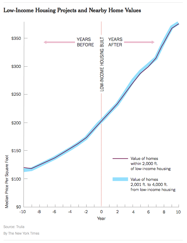
YIMBY: Low-Income Housing

November 25, 2016 | 2:02 pm | | Infographics |

lowincomevvaluetrulianyt

The YIMBY (Yes-In-My-Backyard) movement is fairly new.

In the United States, early leaders of the YIMBY movement include Sonja Trauss in San Francisco and Nikolai Fedak in New York. The first ever Yes In My Backyard conference was held in Boulder, Colorado, in June 2016.

Nikolai has done an amazing job at chronicling the explosion of new development in NYC over the past several years with his must read web site New York YIMBY.

One of the misconceptions with the NIMBY movement which is largely the opposite of YIMBY is the idea/rule of thumb that low-income housing always drags down property values of nearby properties. In an era challenged by the lack of any type of affordable housing, this makes a bad situation worse.

According to this recent research by Trulia (FYI – I was part of their industry advisory board from 2006-2014), and notably in aggregate form, the impact seems to be non-existent in the majority of the markets covered. One can’t conclude there is no impact as a general rule but it does show that should not be the default assumption.

The above infographic is from this Weekend’s New York Times’ real estate section column called ‘Calculator’ – Low-Income Housing: Why Not in My Neighborhood?. The methodology used in the Trulia research was the following:

To measure this, Trulia compared the median price per square foot of nearby homes (within 2,000 feet of low-income housing) with that of homes farther away (2,001 to 4,000 feet) over 20 years, starting 10 years before the low-income housing was built and ending 10 years after.

Tags: , , , ,


New Yorkers Are Busy During Week So Big Snowstorms Need to Occur On Weekends

March 7, 2016 | 1:20 pm | | Favorites |

snowstormCP
Source: Jackson Fine Art

Even though housing market talking heads are known for dramatizing the long term economic impact of a big snow storm, it’s basically a “snow ball’s chance in hell” that it has a lasting effect.

Given that it is early March and it is 54 degrees outside in NYC as I write this, it’s hard to think about snowstorms. However Mother Nature has a way of messing with us so I’m optimistic that we’ll get socked with at least one more big storm this month.

My friend Jason Bram, an economist at the Federal Reserve Bank of New York, was interviewed for his views on NYC snowstorms and their economic impact in Hey, Economist! How Well Do We Weather Snowstorms? He found that:

  • 81% of major snowstorms (over 15 inches dumped in Central Park) began on a Friday, Saturday or Sunday
  • there is no evidence that major snow storms disrupt the economy more than a few days.

In fact, the odds of repeating NYC’s snowstorm history is 0.2% or 500 to 1.

FRBsnowstorms

“The bottom line is, when you look at monthly or even weekly economic indicators, you rarely see a blip, even after the most severe blizzards.” —Jason Bram

This is why I go crazy at the beginning of every calendar year listening to housing prognosticators fret about severe winter weather having a far reaching long term impact on the housing market and the economy.

Consider this scenario by a couple looking to purchase their first home:

Tuesday
Husband: Hi honey, ready to go look for houses this weekend?
Wife: Yes, I can’t wait! We’ve been saving up for a long time and we are finally at the point where we can buy!

A big snow storm hits on Friday night…

Saturday
Husband: Ugh, this snowstorm is really bad. We’d better cancel our appointment with the real estate agent to view homes.
Wife: Yes, that’s a good idea. This is so frustrating!
Husband: I know! Now we have to wait another year!
Wife: I just can’t believe it. Just when we were ready to buy, a snowstorm hits and now we have to wait another year!

Of course you can see how ridiculous this scenario is despite my John Grisham/Stephen King – like story telling skills. These buyers will simply wait until the following weekend.

Tags: , , ,


Manhattan Monthly Absorption Rate – August 2015

September 22, 2015 | 2:07 pm | Charts |

8-2015Manhattan [click to expand]

Thoughts The co-op and condo market absorption rates for the $10 million+ market have slowed over the past year while the pace of the sub-$3 million remains extremely brisk. The $3 million to $10 million shows limited change and some stabilization.

Side by side Manhattan regional comparison:

August 2015 v August 2014
8-20158-2014 [click images to expand]

I started this analysis in August 2009 so I am able to show side-by side year-over-year comparisons. (I got tired of the red/gray look in 2014 so I changed it) The blue/red line shows the 10-year quarterly average for context. The pink/orange line represents the overall average absorption rate of the most recently completed month for that market area.

Definition Absorption defined for the purposes of this chart is: Number of months to sell all listing inventory at the current annualized pace of sales activity in our market report series.


Manhattan Market Absorption Charts [Miller Samuel]

Tags: , ,


[Three Cents Worth #291 Ski] Aspen Sales at $10 Million and Above Stay Consistent

August 31, 2015 | 6:19 pm | | Charts |

It’s time to share my Three Cents Worth (3CW) on Curbed Ski. Whether I’m on the trail, on the lift or in the lodge, I’m always taking notes with my gloves off.

Check out my 3CW column on @Curbedski:

Over the last decade, sales of high end Aspen residential properties have followed a logical flow, consistent with the overall U.S. housing market. Activity peaking in 2006; extinguished with the Lehman Brothers collapse in 2008; weakness in 2011; showing elevated levels over the past year; all tell the national real estate story. And recently…

3cw8-19-2015A10m
[click to expand chart]


Three Cents Worth Archive Curbed NY
Three Cents Worth Archive Curbed DC
Three Cents Worth Archive Curbed Miami
Three Cents Worth Archive Curbed Hamptons
Three Cents Worth Archive Curbed LA
Three Cents Worth Archive Curbed Ski

Tags: , ,


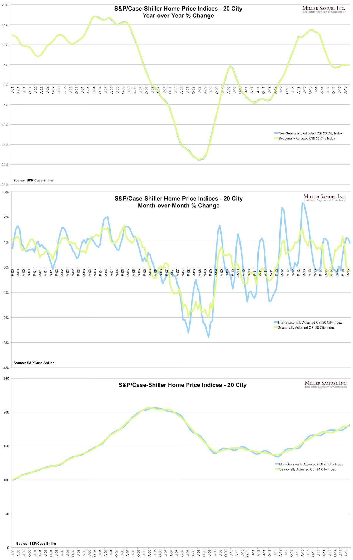
Explainer: Three Ways to Look at S&P/Case-Shiller Index Results

August 25, 2015 | 2:00 pm | Charts |

I have a long history of dissing the relevance of the S&P/Case Shiller Index because of the 6 month lag and the slew of anecdotal link-the-dot official commentary associated with it that literally has nothing to do with the numbers generated (gasping for air). However I feel compelled to look at it periodically because it is part of the media’s monthly market report gauntlet.

The S&P/Case-Shiller Home Price Indices were published today so I thought I’d create a trifecta of ways to look at the same data.

Top Chart – This is the famous year-over-year % change view which I believe is the best way to look at the market and the scariest. They use the seasonally adjusted index and the non-seasonally adjusted index (so did I) but there is virtually no difference. Most news coverage of the index usually link to the press release which embeds this type of chart that uses all the broad indices: 10-city, 20-city and National. The 20-City has long been the primary index that was touted but the references in the media are shifting to the national index and that’s probably a good thing.

Middle Chart – This is the month over month version using the same data. Clearly the seasonal adjustment smooths out the line. However the non-seasonally adjusted versions shows a significant impact from the seasonal nature of real estate – in fact this chart shows that seasonal patterns are becoming more extreme since the financial crisis began. Originally the index was virtually all about the month over month results even though the featured chart was year-over-year. They have since moved year-over-year to the front of the press release and has already influenced the way the index is presented in the media which is good to see.

Bottom Chart – This is the only chart that uses the actual index numbers rather than percentages. It’s a sleepy pattern that seems to wash out seasonality a bit and shows the market in a less intimidating way. Ironically, the actual index trend is visually less interesting. Seems ironic.

8-25-2015CSI
[Click to expand]

Tags: , ,


Record Queens Condo Prices: Bigger Than Crises in Greece, China

July 9, 2015 | 9:51 pm | |

Rental_0615Douglas Elliman published our research today covering Queens sales, Brooklyn sales Westchester/Putnam sales as well as the rental market for Manhattan Brooklyn & Queens. You can download the reports and more at Douglas Elliman’s market report page.

Like last week’s Manhattan report, there were lots of records set and it wasn’t simply the influence of high end sales – prices were up across the board in most markets.

Incidentally, the Bloomberg News article that covered record Queens condo sales was the second most emailed story world-wide. It stoked more interest than the finance crisis in Greece and the recent Chinese stock market gyrations. Apparently only “investors with satellites” was a more popular read.

Idea (?) for next quarter: Talk about drones and investors in the Queens housing market.

2q15queensrptBLOOMBERGTERMINALS

Tags: , ,


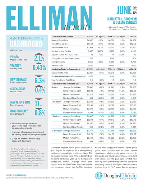
2Q 2015 Manhattan Sales Market Breaks A “Record Number of Records”

July 5, 2015 | 9:38 pm | Reports |

Manhattan_2Q15

Last Thursday, the 2Q 2015 Manhattan Sales Report we prepared for Douglas Elliman (part of the Elliman Report series I’ve been writing for 21 years) was published.

I spoke at length about the report in last Friday’s Housing Note: What Greek Debt Crisis? Manhattan Set A Record Number of Housing Records.

You might considering signing up for it. I clear my mind of all the housing clutter accumulated during the week into a thought piece that tries to make sense of what is going on. It’s got plenty of humor and sarcasm, but most importantly, it has plenty of understandable insights, data and charts.

housingnotes_logo

Sign up here as thousands of others have. It’s free and best of all, you’ll make me happy. Even better, if you like it, share it with others.

But I digress…

There were lots of Manhattan records set in 2Q 2015. Here’s a partial list I created for last Friday’s Housing Note: What Greek Debt Crisis? Manhattan Set A Record Number of Housing Records.

Co-op/Condo
Highest Average Sales Price
Highest Average Sales Price – New Development
Highest Average PPSF – New Development
Highest Median Sales Price – New Development
Highest Average Sales Price – Resales
Largest Average Square Feet – New Development
Highest 2-Bedroom Median Sales Price
Highest Median Sales Price 5th Quintile
Highest Median Sales Price 2nd Quintile
Highest Median Sales Price 1st Quintile

Co-op
Highest Average Sales Price
Highest Median Sales Price
Highest Median Sales Price – Resales
Highest Average PPSF – Downtown
Highest Median Sales Price – 2-Bedroom
Highest Average Sales Price – 2-Bedroom
Highest Average PPSF – 4+ Bedroom
Highest Median Sales Price 5th Quintile
Highest Median Sales Price 4th Quintile
Highest Median Sales Price 3rd Quintile
Highest Median Sales Price 2nd Quintile

Condo
Highest Average Sales Price
Highest Average Sales Price – New Development
Highest Average Sales Price – Resales
Highest Average PPSF – Resales
Highest Median Sales Price – Resales
Highest Median Sales Price – Studio
Highest Median Sales Price 5th Quintile
Highest Median Sales Price 4th Quintile
Highest Median Sales Price 1st Quintile

Loft (Co-op+Condo)
Highest Average PPSF
Highest Average Sales Price – Resales
Highest Average PPSF – Resales

Luxury (Co-op+Condo) – Top 10%
Highest Average Sales Price
Highest Average Sales Price – New Development
Highest Median Sales Price – Co-op
Highest Median Sales Price – Condo
Highest Median Sales Price – Resale

Tags:


NYC Economy is Expanding Rapidly

January 30, 2015 | 11:05 am | |

NYFedCEI2014

According the Federal Reserve Bank of New York, the NYC economy is crushing it, growing far faster than the states of New York and New Jersey.

They are using an Index of Coincident Economic Indicators:

A coincident index is a single summary statistic that tracks the current state of the economy. The index is computed from a number of data series that move systematically with overall economic conditions.

Bloomberg View Column: The $10 Million Home, Never Hotter

November 30, 2014 | 1:00 pm | |

BVlogo

Read my latest Bloomberg View column The $10 Million Home, Never Hotter. Please join the conversation over at Bloomberg View. Here’s an excerpt…

As the U.S. housing market cools from last year’s overheated state, sales of homes at the top haven’t been following the same script. Prices and sales at the upper reaches are soaring…

[read more]


My Bloomberg View Column Directory

My Bloomberg View RSS feed.

Tags:


Bloomberg View Column: Housing Bust Wasn’t About the House

November 30, 2014 | 9:00 am | | Charts |

BVlogo

Read my latest Bloomberg View column Housing Bust Wasn’t About the House. Please join the conversation over at Bloomberg View. Here’s an excerpt…

Unless you live in a cave, you’re no doubt familiar with the outlines of the housing bust that marked the beginning of the financial crisis: Real-estate prices plunged, people lost their homes, banks went under and the economy tumbled into a recession. We are still grappling with the hangover…

[read more]


My Bloomberg View Column Directory

My Bloomberg View RSS feed.

Tags: , ,

Get Weekly Insights and Research

Housing Notes by Jonathan Miller

Receive Jonathan Miller's 'Housing Notes' and get regular market insights, the market report series for Douglas Elliman Real Estate as well as interviews, columns, blog posts and other content.

Follow Jonathan on Twitter

#Housing analyst, #realestate, #appraiser, podcaster/blogger, non-economist, Miller Samuel CEO, family man, maker of snow and lobster fisherman (order varies)
NYC CT Hamptons DC Miami LA Aspen
millersamuel.com/housing-notes
Joined October 2007