I have a long history of dissing the relevance of the S&P/Case Shiller Index because of the 6 month lag and the slew of anecdotal link-the-dot official commentary associated with it that literally has nothing to do with the numbers generated (gasping for air). However I feel compelled to look at it periodically because it is part of the media’s monthly market report gauntlet.
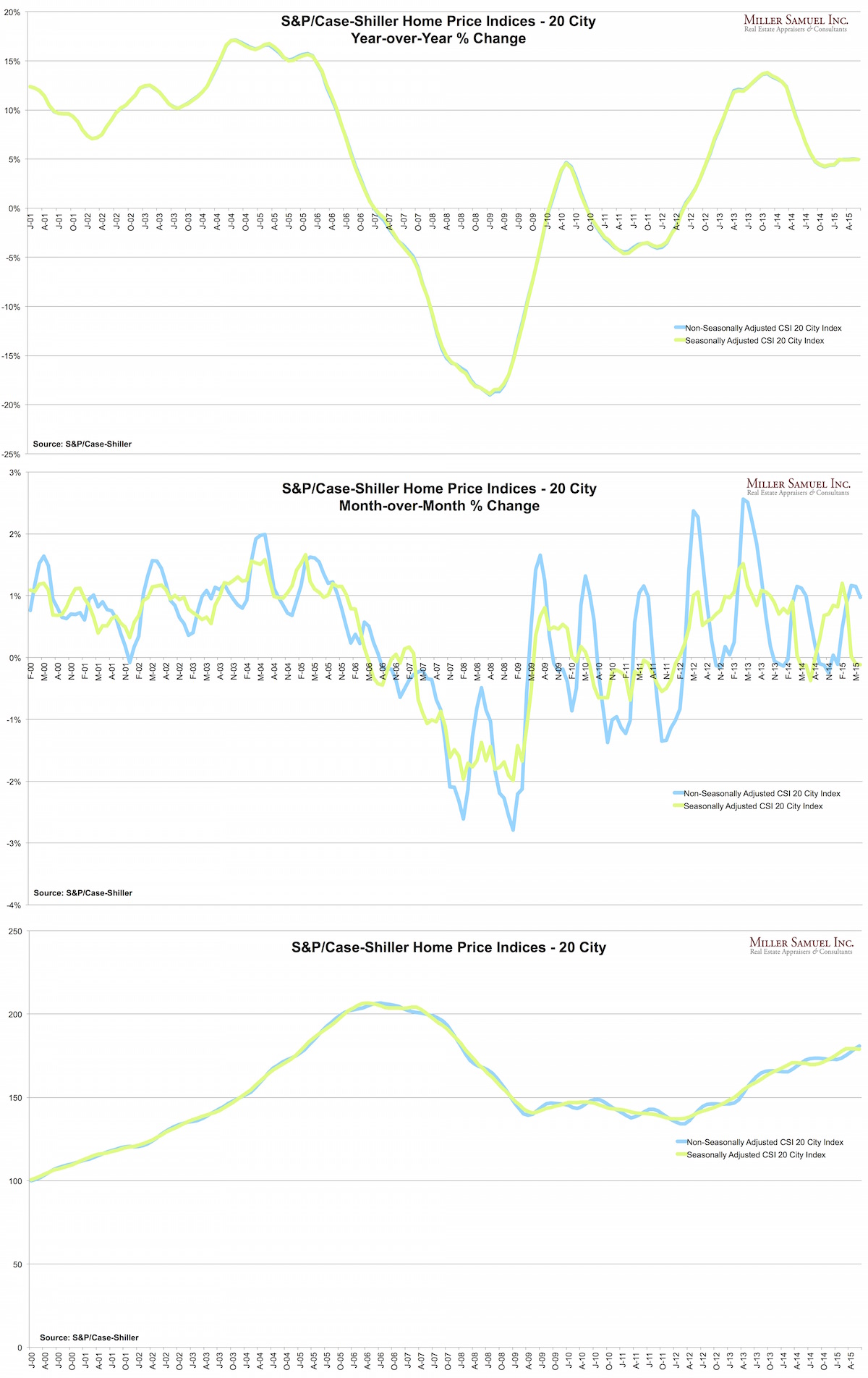
The S&P/Case-Shiller Home Price Indices were published today so I thought I’d create a trifecta of ways to look at the same data.
Top Chart – This is the famous year-over-year % change view which I believe is the best way to look at the market and the scariest. They use the seasonally adjusted index and the non-seasonally adjusted index (so did I) but there is virtually no difference. Most news coverage of the index usually link to the press release which embeds this type of chart that uses all the broad indices: 10-city, 20-city and National. The 20-City has long been the primary index that was touted but the references in the media are shifting to the national index and that’s probably a good thing.
Middle Chart – This is the month over month version using the same data. Clearly the seasonal adjustment smooths out the line. However the non-seasonally adjusted versions shows a significant impact from the seasonal nature of real estate – in fact this chart shows that seasonal patterns are becoming more extreme since the financial crisis began. Originally the index was virtually all about the month over month results even though the featured chart was year-over-year. They have since moved year-over-year to the front of the press release and has already influenced the way the index is presented in the media which is good to see.
Bottom Chart – This is the only chart that uses the actual index numbers rather than percentages. It’s a sleepy pattern that seems to wash out seasonality a bit and shows the market in a less intimidating way. Ironically, the actual index trend is visually less interesting. Seems ironic.


