Matrix Blog

Backyard BBQ Talk

[Three Cents Worth #278 NY] Murray Hill Has the Most Micro Units in All of Manhattan

February 26, 2015 | 8:00 pm | | Charts |

It’s time to share my Three Cents Worth (3CW) on Curbed NY, at the intersection of neighborhood and real estate in the capital of the world…and I’m here to take measurements.

Check out my 3CW column on @CurbedNY:

Uptown may have the smallest studios, but which Manhattan neighborhood can claim the most micro units? To find out, I looked at where apartments measuring 300 square feet or less are located and determined what they have in common—besides being small. We’ve appraised many micro apartments over the years, so I was admittedly a little confused at how micro apartments were some sort of new concept…


3cw2-26-15
[click to expand chart]


My latest Three Cents Worth column on Curbed: Three Cents Worth: Murray Hill Has the Most Micro Units in All of Manhattan [Curbed]

Three Cents Worth Archive Curbed NY
Three Cents Worth Archive Curbed DC
Three Cents Worth Archive Curbed Miami
Three Cents Worth Archive Curbed Hamptons

Tags: , , ,


[Three Cents Worth #277 NY] Which Manhattan Neighborhood Has The Smallest Studios?

February 24, 2015 | 8:00 pm | | Charts |

It’s time to share my Three Cents Worth (3CW) on Curbed NY, at the intersection of neighborhood and real estate in the capital of the world…and I’m here to take measurements.

Check out my 3CW column on @CurbedNY:

Although I’m often a bit macro in this column, it’s Micro Week at Curbed. So I thought I would rank Manhattan neighborhoods by the average square footage of their studio apartments based on all the closed sales of 2014. The results are in: if you want a plethora of small apartments, look uptown. On both the East and West Sides above 96th Street, from Morningside Heights and the Upper East Side to Harlem and Inwood, the average studio clocks in at under 500 square feet. By contrast, downtown, in areas like Soho, Tribeca, Battery Park City, and the Financial District, studios are larger…


3cw2-24-15
[click to expand chart]


My latest Three Cents Worth column on Curbed: Three Cents Worth: Which Manhattan Neighborhood Has The Smallest Studios? [Curbed]

Three Cents Worth Archive Curbed NY
Three Cents Worth Archive Curbed DC
Three Cents Worth Archive Curbed Miami
Three Cents Worth Archive Curbed Hamptons

Tags: , , , ,


Contrary To Popular Belief, The World Has Manhattan All Wrong

May 18, 2014 | 11:00 am |

nycsubway1969timelife
[Source: Time-Life]

Today, when I speak to friends and relatives in other parts of country, I find a consistency in the image Manhattan currently conveys and it’s completely skewed. Here’s a little background.

1985 to 1995 [Wild West] I moved to Manhattan in 1985 and it was perceived by outsiders as a very dangerous place. “Manhattan-bashing” was in vogue. My relatives in the Midwest saw Manhattan as a place where tourists were getting mugged and stabbed in broad daylight (It didn’t help that my father was mugged twice in Midtown outside of our office in broad daylight on a weekday). They feared for our lives.

1996 to 2000 [Dot Com Boom] Manhattan now had “Silicon Alley” as well as NASDAQ – which was soaring. Midwesterners were caught up in the stock market frenzy as evidence by conversations of trades of Microsoft and Caterpillar stock over potato salad and cheeseburgers and bottles of Faygo.

2001 to 2008 [9/11 to Development Boom to Lehman] The 9/11 tragedy struck New Yorkers hard but the subsequent rise of NYC from the ashes into an eventual new development housing boom was simply amazing. The Manhattan housing boom peaked in 2008, two years after the US housing market had peaked. This period ended with the collapse of Lehman Brothers and access to credit worldwide immediately evaporated.

2009 to 2010 [Collapse and Rebound] There was a surprisingly rapid improvement in the regional economy in the year following Lehman’s collapse and housing rebounded faster than expected.

2011 to 2014 [Playground of Wealthy Foreigners] Manhattan and Brooklyn become a favorite safe haven for international investors to park their money in real estate.

But now we stuck with a Manhattan housing market exaggerated stereotype (represents 90% of media coverage) in 2014:

  • Most sales are all-cash transactions.
  • Most purchasers are made by foreign buyers.
  • Most sales are millions of dollars (i.e. $5M and up).

When in fact, the 2014 Manhattan housing market reality is:

  • 45% of sales are all-cash transactions.
  • Foreign buyers are a small part of the market – i.e. 60% of all sales are co-ops and foreigners don’t purchase them.
  • More than half of all sales are below $1M (i.e. $5M+ is way up in the top 5%).

Tags: , ,


Manhattan Home Sales Are NOT 80% All-Cash (They Are 45%)

May 17, 2014 | 11:04 am | | Favorites |

Actually, overall Manhattan Home Sales are 45% All-Cash. I want to make sure that the 80% number doesn’t become embedded in our housing market mindset.

1q14manhattanCASH
[click to expand]


I’ll explain.

Recently a friend passed along a post in the Washington Post titled: 8 in 10 Manhattan home sales are all-cash and my jaw dropped. The author, who I am a fan of, got this information from Realtytrac, who I am also a fan of, but I knew it was either wrong or misinterpreted.

Over the years I’ve played around with NYC mortgage data, usually incomplete and very dirty, from various sources and have combined that with frontline feedback from our own experience as appraisers, as well as from real estate brokers and lenders. I had come to the conclusion that roughly half of Manhattan home sales (co-op, condo & single family) were probably all-cash and condos are definitely well over 50%. I used the logic that foreign and high-end buyers are a large part of the all-cash market, especially within the new development space. And it makes sense – while condo end loan financing is tight, new development condo end loan financing is beyond tight.

The reason the Realtytrac 80% figure jumped out at me was the fact that co-ops account for about 60% of sales and have the highest concentration of entry level and middle class demographics in Manhattan. I was very skeptical that virtually all the market-majority co-op buyers were paying all-cash, especially in the tepid economy we are stuck with.

So I reached out to Daren Blomquist, Vice President at RealtyTrac who is often the point person on their data releases. I indicated that the 80% figure seemed off and wondered if it excluded the co-op market. It didn’t. However even an 80% all-cash share for only single family and condo sales seemed like a stretch. He said he would look into it and within an hour they could see an issue with their co-op data feed. They were already working on the issue (and why I like Realtytrac). He shared their 1Q14 Manhattan information (I omitted the suspect co-op data) and here are the key numbers:

Their Results
All-Cash Condo Sales 60.78%
All-Cash Single Family Sales 73.08%

I came up with a new methodology, which looked at the ratios seen in Douglas Elliman sales – the largest real estate brokerage company in Manhattan – with a sales mix is generally consistent with the overall market mix and applied their results to the overall market, and I saw this:

Our Results
All-Cash Co-ops 36% (no revised Realtytrac results yet)
All-Cash Condos 58% (similar to Realtytrac’s 60.78%)

I didn’t have the single family (fee simple) results compiled so I went with Realtytrac’s 73% because: their fee simple (condo) data was consistent with ours, the single family market is skewed much higher price-wise than the condo market (i.e. skewing towards cash buyers) and the single family market share is very small. In fact the market share is so small that the overall 45% all-cash ratio wouldn’t change unless I dropped the single family market share down to 6% from 73% but even then the overall cash ratio would only drop to 44% from 45% – so you get my point (my apologies for the excessive wonkiness on this but it was necessary).

As a result and represented in the table at the top of this post, it is reasonable to say that the overall Manhattan all-cash home sale market in 1Q 2014 was 45% of all residential sales. Got it?

Tags: , , , ,


[Vox Video] Housing Crash Fix Explained From Geithner’s Perspective

May 13, 2014 | 11:03 am | |

Former US Treasury Secretary Timothy Geithner is promoting his book chronicling the financial crisis Stress Test: Reflections on Financial Crises. Great book name, btw.

He sits down with Vox Media’s Ezra Klein to talk about what happened. I highly recommend watching this entire interview. Once you get past Ezra Klein’s sock selection, he touches on all the key points that would help us better understand what went wrong. It reconfirms why I enjoy reading anything Ezra writes.

I also have to say that Geithner has a great engaging conversational style that I enjoyed and helped me gain additional insights. However the problem with the Geithner’s responses – that I can’t seem to get past – is that Geithner was head of the New York Fed, surrounded by Wall Street, during the housing bubble run up. You walk away from this conversation feeling like his actions were the only appropriate responses to the crisis – ie focus only on the banks (and grow moral hazard significantly). Of course it has to be a nightmare to get anything done in Washington. However, I also got that same feeling when I read Andrew Ross Sorkin’s well written “access journalism” book, “Too Big To Fail” – that saving the banks was all that mattered to him.

It doesn’t help that I read previously Neil Barofsky’s terrific book “Bailout” which provides a lot of insights into how the sausage was made – identifying the US Treasury’s exclusive focus on the banking system when there were opportunities to help main street at the same time. Apparently Geithner takes Barofsky to task in the book, probably because Barofsky did the same.

I’m not sure if I’m going to pick up a copy.

Tags: , , , ,


PBS Newshour – Making Sense of Weak US Housing Reports

April 28, 2014 | 5:10 pm |

Michelle Conlin of Reuters gives a nice overview of the state of the US housing on PBS, talking through the national reports that hit us recently. Check it out. This month’s weak NAR Existing Home Sales report has unleashed a surge of housing self-loathing (although today’s PHSI seems to take some of the drama/edge off).

Tags: , , , , , , , ,


My New Book “Flash Appraisals” Just Passed Michael Lewis

April 1, 2014 | 2:38 pm | |

bbmostreadterminal4-1-14

Coverage of my new book “Flash Appraisals” just passed Michael Lewis’ “Flash Boys” as “Most Read” on Bloomberg Worldwide.

Ok, ok, admittedly a lame attempt at April Fools’ Day humor….but if I wrote a book…

More importantly, Bloomberg News coverage of our recently released Manhattan market report for Douglas Elliman jumped into 4th place and passed the coverage of Michael Lewis’ new book (8th place) – I’m halfway through his book and it’s a fantastic read – so is Oshrat Carmiel’s article.

The market report article has been the number 1 most emailed article all day. Apparently real estate remains the backyard bbq conversation not unlike rigged high speed trading on Wall Street.

bbmostemailedterminal4-1-14

Tags: , ,


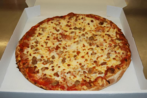
Price per Square Inch for Pizza, Slices for Real Estate Market

March 3, 2014 | 5:58 pm | Explainer |

sausagepizzabox

Now that the Oscars are behind us and the “next big snowstorm” just missed NYC, I thought I would finally talk about pizza. But because of why you are here – I’ll make price per inch and price per square foot interchangeable.

One of my favorite podcasts, NPR Planet Money had a great segment called “74,476 Reasons You Should Always Get The Bigger Pizza

The math of why bigger pizzas are such a good deal is simple: A pizza is a circle, and the area of a circle increases with the square of the radius. So, for example, a 16-inch pizza is actually four times as big as an 8-inch pizza. And when you look at thousands of pizza prices from around the U.S., you see that you almost always get a much, much better deal when you buy a bigger pizza.

Explanation of above math: 200.1 inches of pizza surface versus 50.2 inches of pizza surface (pi*r squared=surface area of a circle) And here’s an easy way to calculate the volume of a pizza if you can’t help get enough pizza geometry.

priceperinchpizzachart

Here’s the (pizza) logic
The premise of the piece is that it is much cheaper to buy a large pie than a small pie on a price per inch basis. Pricing for a large pie doesn’t expand as much as the surface area does so the price per inch drops precipitously. In the example above, the 16″ pizza wouldn’t be priced 4x as much as the 8″ pizza – probably more like 2x. Apparently pizza makers don’t take geometry seriously.

Buy the large and throw the unused portion in the fridge. Perhaps that is why people buy homes somewhat larger than what they actually need – they will grow into it.

Suburbs
In suburban real estate, after a certain point, larger the home is, generally the lower the price per square foot. There is a point of diminishing return on excess square footage. The total dollar price is higher, obviously, but the cost of additional space is usually less on a per square foot basis. Hence the pizza analogy applies.

Queen of Versailles, Florida
A well known example of diminishing return is the home featured in the documentary, Queen of Versailles. The 90,000 square foot home is so oversized for the Windmere, South Florida housing market that the vast majority of the living area likely has no value as a single family – other than to the current owners, of course.

Manhattan
In a market with one of the highest per capita population density for a US city, there is a premium for larger contiguous space so perhaps that is why we have so many pizza joints. Here is an price per square foot table by apartment size – you can see how ppsf expands with apartment size consistently over the decade (actually it has shown this pattern for the past 25 years). It’s expensive to get more living area in Manhattan.

manhattanppsftable

Tags: , ,


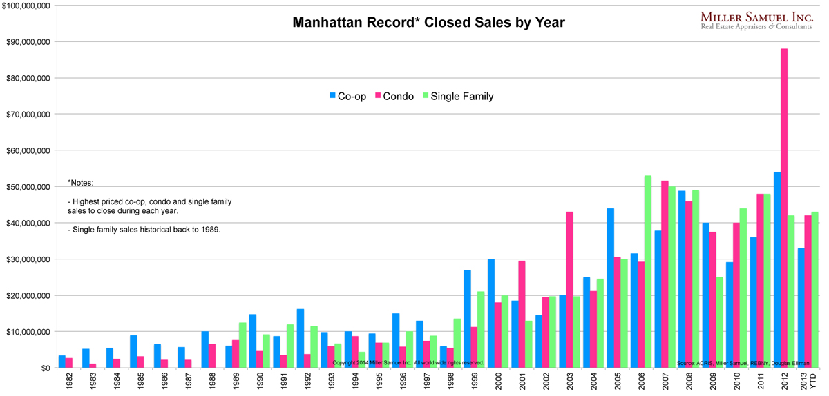
Manhattan Price Records from 1982 to 2013 (Will Soon Be Broken)

January 31, 2014 | 10:21 pm | | Charts |

4q13manhattan-records
[click to expand]

What I love about this chart is how Manhattan co-ops dominated the record books through the late 1990s Dot.com boom until condos started to take over. Until then, condos were seen as more utilitarian and less about luxury. Over the past decade, Manhattan condos have generally eclipsed co-ops in the record books.

As a stagnant form of Manhattan housing stock, they ain’t building luxury co-ops like that any more (actually they’re not building them anymore).

I’ve updated this chart through the end of 2013, but it’ll be obsolete fairly quickly with records expected to fall in 2014. At a minimum, anticipated record closings include a few condos and a townhouse.


[Promoting The Homeownership Cycle] Obsessive Housing Disorder

May 17, 2009 | 11:06 pm | |

The City Journal, a quarterly must-read urban affairs journal published a terrific article on the cycle of Washington’s efforts to encourage homeownership called Obsessive Housing Disorder by Steven Malanga.

The author suggests our troubles began in the 1922 with Herbert Hoover’s Own Your Own Home Campaign and was seen in nearly all of the following decades.

The author suggests it’s based on an unsubstantiated political premise without empirical data – a “cliche of political discourse” that:

Homeowners make better citizens.

As a result, homeownership continues to be pushed and the view is myopic:

In December, the New York Times published a 5,100-word article charging that the Bush administration’s housing policies had “stoked” the foreclosure crisis—and thus the financial meltdown. By pushing for lax lending standards, encouraging government enterprises to make mortgages more available, and leaning on private lenders to come up with innovative ways to lend to ever more Americans—using “the mighty muscle of the federal government,” as the president himself put it—Bush had lured millions of people into bad mortgages that they ultimately couldn’t afford, the Times said.

When I think back to our recent housing boom and the mantra of Fannie Mae and the former administration, we paid a significant price for a 5% boost in homeownership from 64% to 69% in a decade. The resulting economic damage render moot the effort – we got the ownership numbers boosted through artificial financial means.

Although I tend to believe that owner occupied housing is better cared for by its occupants (speaking as a former renter), I had never considered the idea of history repeating itself in this economic sector, in such a specific way.

A good read.

UPDATE: Another excellent article in the same publication: Spendthrift Sunbelt States
Arizona, Florida, and Nevada have run through the riches of their boom and are starting to look more like cash-strapped New York.


Get Weekly Insights and Research

Housing Notes by Jonathan Miller

Receive Jonathan Miller's 'Housing Notes' and get regular market insights, the market report series for Douglas Elliman Real Estate as well as interviews, columns, blog posts and other content.

Follow Jonathan on Twitter

#Housing analyst, #realestate, #appraiser, podcaster/blogger, non-economist, Miller Samuel CEO, family man, maker of snow and lobster fisherman (order varies)
NYC CT Hamptons DC Miami LA Aspen
millersamuel.com/housing-notes
Joined October 2007