Matrix Blog

Posts Tagged ‘Case-Shiller’

Falling Inventory Has Created a Housing “Pre-Covery,” not “Recovery”

January 28, 2013 | 9:00 am | |

I was speaking at the New York Real Estate Bar Camp recently and asked the audience what to call the state of housing market right now, since I objected to the use of the word “recovery” and “a period of better stats without underlying fundamentals” wasn’t catchy. Philip Faranda came up (more like shouted out) a brilliant suggestion. We’re in a “Pre-Covery!” I loved it and it stuck.

I thought about the new word when I read a great Robert Shiller piece in the New York Times this weekend called: A New Housing Boom? Don’t Count on It.

Shiller questions the substance of the happy housing news we’ve all been reading about:

It’s hard to pin down, because nothing drastically different occurred in the economy from March to September. Yes, there was economic improvement: the unemployment rate, for example, dropped to 7.8 percent from 8.2 percent. But that extended a trend in place since 2009. There was also a decline in foreclosure activity, but for the most part that is also a continuing trend, as reported by RealtyTrac.

What’s missing from all the metrics being tracked and discussed is sharply falling inventory – that’s what is driving prices higher even though little else has changed.

The reason for falling inventory? Sellers, when they sell, become buyers (or renters) and with >40% of mortgage holders having low or negative equity, they don’t qualify for the trade up. We have been so focused on negative equity that we’ve paid short shrift to the impact of low equity.

Not only don’t many sellers qualify – they simply aren’t under duress i.e. they haven’t lost their job, don’t need to move, etc. so what will they do when they realize they don’t qualify?

Nothing.

They expect/hope hope the market improves eventually.

This has created yet another form of “shadow inventory.”

Although I certainly agree that the long term trend of mortgage rates doesn’t really correlate with housing prices since rates have been falling for years, weak employment and personal income are not justifying the last 6 months of housing market improvement.

I see falling mortgage rates as simply keeping demand steady (but rates can’t fall much further) and falling inventory is either pressing prices higher or to stabilization depending on the market.

Here is a simplistic generic but typical scenario in most of the markets I follow over a 2 year window:

  • The number of sales in a market rises 2%.
  • The number of listings in same market falls 30%.

In this scenario the rise in sales is NOT working off inventory – the math doesn’t work so something else is in play – low or negative equity is choking off new listings entering the market against steady demand caused by falling rates.

Since low inventory is not a local market phenomenon but is happening in nearly every housing market I can think of (sales rising modestly and listing inventory falling sharply) it makes this a credit phenomenon. I like to say “housing is local but credit is national.”

To make this discussion really crazy we could even say that tight credit conditions are actually prompting the pre-recovery something that on the surface is very counterintuitive. But in reality, tight credit is choking off supply and low rates are keeping demand constant. Then prices rise.

Tags: ,


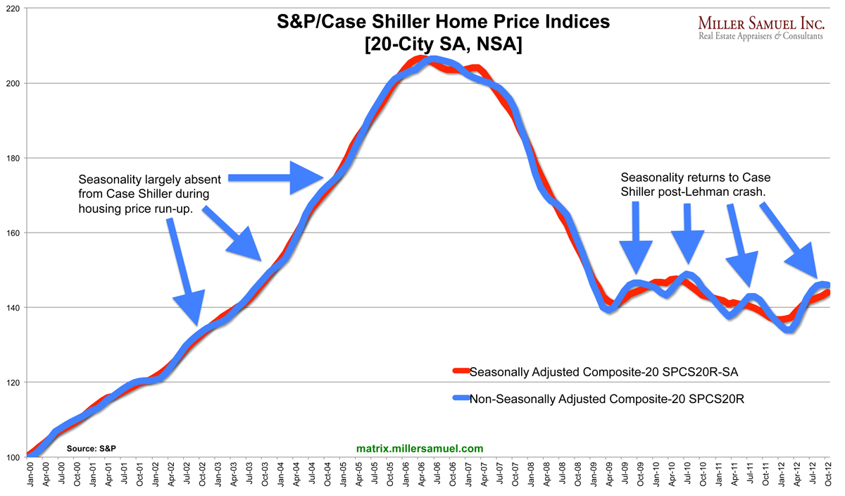
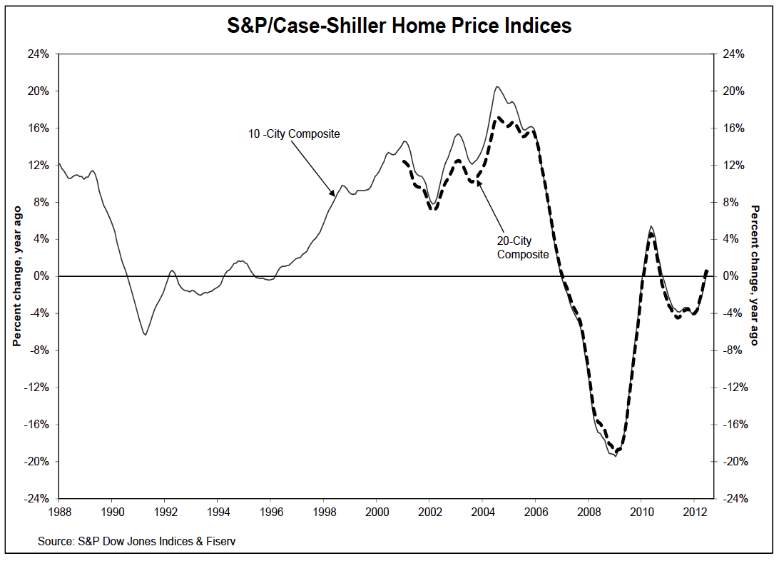
[Case Shiller] Recovery Is Back In Season

December 27, 2012 | 7:00 am | Charts |


[click to expand chart]

Well the frequently maligned but most influential housing metric was published yesterday, the S&P/Case Shiller Home Price Indices and the 20 City index rose 4.3% year-over-year. The only two “regions” to see declines were Chicago and New York.

Baseball Correlation? Chicago and New York are the only 2 cities who also have 2 Major League Baseball teams. No, Los Angeles doesn’t have two MLB teams…the Los Angeles Angels of Anaheim are clearly trying to have it both ways.

But I digress…

With all the talk about “recovery” (aka happy housing news) these days it just dawned on me that since 2000, the Case Shiller HPI only began to show significant seasonality since mid-2009. No one has really talked about this and I’m not sure what it means, but it just jumped out at me today.

Pre-peak housing prices fueled by falling lending standards and the seasons were largely crushed by the locomotive known as the housing boom. Therefore the seasonally adjusted and non-seasonally adjusted price trends were virtually the same during the market’s ascent. I distinctly remember real estate agents commenting during this period that the seasons were going away and housing market patterns were changing permanently.

Post-peak housing prices After the plunge subsided in mid-2009, the market began to ebb and flow with peaks in the spring/summer and troughs in the fall/winter.

Note to self
The next time CSI prices begins to smooth into nothingness, perhaps it’s a housing boom, baby.

Tags: , , ,


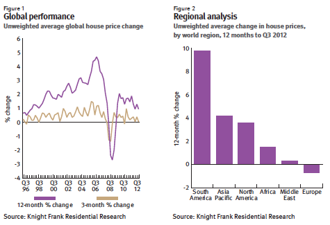
[Knight Frank] Global Reports That Look Forward and Backward : Europe As Denominator

December 13, 2012 | 9:35 am | | Reports |


[click to open report]

Where we’ve been

Knight Frank’s Global House Price Index is published quarterly and tracks the performance of mainstream national housing markets around the world. They use Case Shiller results for the US market.

Europe at bottom:

With the Eurozone now in its second recession in three years buyer confidence is at an all-time low and it is no coincidence that all the bottom 12 rankings are occupied by European countries this quarter.

The top performers:

But it’s not all bad news. Six markets recorded double-digit annual price growth in the year to September; Brazil, Hong Kong, Turkey, Russia, Colombia and Austria.

Where we’re going


[click to open report]

I help provide their Manhattan and Miami insights and they liked the way I characterize the state of luxury housing as a “safe-haven” and the “new international currency.” Here are the top line observations in their Q4 12 Prime Global Forecast:

• In 2013, we expect prime residential prices across the 14 cities included in our forecast to rise by 2.5% on average, with Moscow, Miami and Dubai being the strongest performers.
• A sharp slowdown in the global economy is the highest risk for the world’s prime residential markets closely followed by government cooling measures.
• However, the current economic uncertainty is also considered a key driver of demand in prime cities as HNWIs seek the shelter of ‘safe-haven’ investments.
• Supply, or the lack of it, will be a key determinant of price performance in cities such as New York, Moscow and Miami in 2013.
• We envisage that government-imposed regulatory measures will keep a lid on price growth in Asia in 2013 but the west-east shift in the economic balance of power suggests more promising prospects in the medium term.


Q3 12 Global House Price Index [Knight Frank]
Q4 12 Prime Global Forecast [Knight Frank]

Tags: , ,


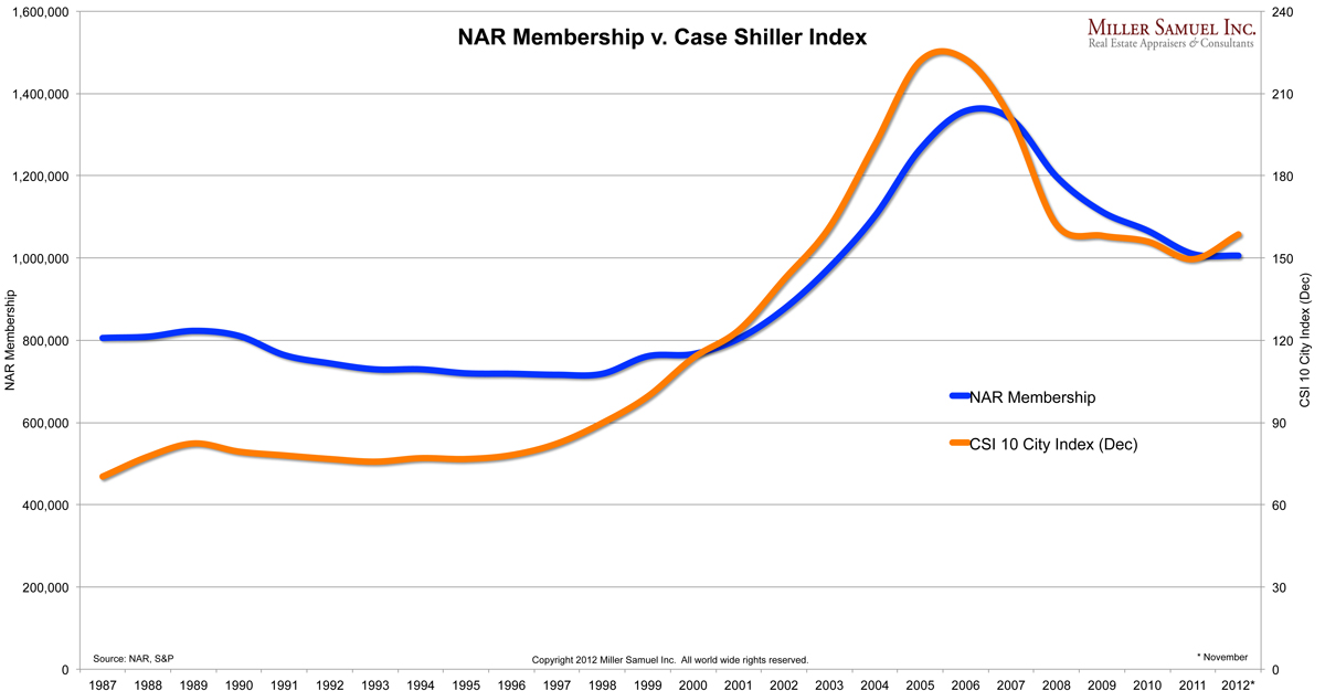
NAR Membership Flows With Housing Market

December 6, 2012 | 11:07 am | Charts |


[click to expand]

Membership is very close to falling below the 1M threshold (1,005,838) for the first time since 2003.

The rise and fall of NAR membership with the S&P/Case Shiller Home Price Index is a logical trend in a commission driven profession with a low barrier to entry – although one would think membership would correlate better with number of sales rather than prices (Case Shiller or CSI is a price index i.e., not based on sales).

The public strongly and incorrectly relates the health of housing with prices rather than sales. Sales activity leads price direction by about a year and membership lags prices so the membership correlation to price probably reflects the time it takes people to jump into the profession when things seem to improve – the chart suggests 1-2 years. You can see the membership lag prices during the boom, at peak and when the market crashed.

In the period like now where the market is transitioning from bad to good, the sharp agents have the opportunity to do very well with less competition from those who were only in it for the quick buck.

The appraisal profession likely shows a similar pattern but perhaps would be more closely aligned with refi applications. On my “to do” list.

Tags: , ,


[NewYork Fed] Excellent Mapping of Housing’s Recovery Process in Region

December 4, 2012 | 9:00 am | | Charts |


[click to expand]

The Federal Reserve has been relying more on CoreLogic housing data these days, rather than Case Shiller or NAR and I’m down with that. The New York Fed has put the CoreLogic data for New York, Connecticut and New Jersey to good use in a very easy to use interactive County format that I highly recommend you check out. They even present a two-fer: all sales, without distressed sales.

My only criticism of the presentation (and it’s really me just being petty) is the orientation to market peak in 2006 as the benchmark. I see the 2006 peak as an artificial level we should not be in a hurry to return to since it reflected all that was bad with the credit/housing boom.

But I digress…

The top chart shows that Manhattan and Brooklyn after removing distressed sales, have “recovered” using the Fed’s methodology. In fact all 5 boroughs are out-performing the US housing market.

Manhattan is clearly one of the top performing locations in the region or at least it is ahead of the region. The map below shows the counties (green) that are now equal to 2007 price levels. Not many in close proximity to Manhattan are doing as well.


[click to expand]


Housing Market Recovery in the Region [Federal Reserve Bank of New York]

Tags: , ,


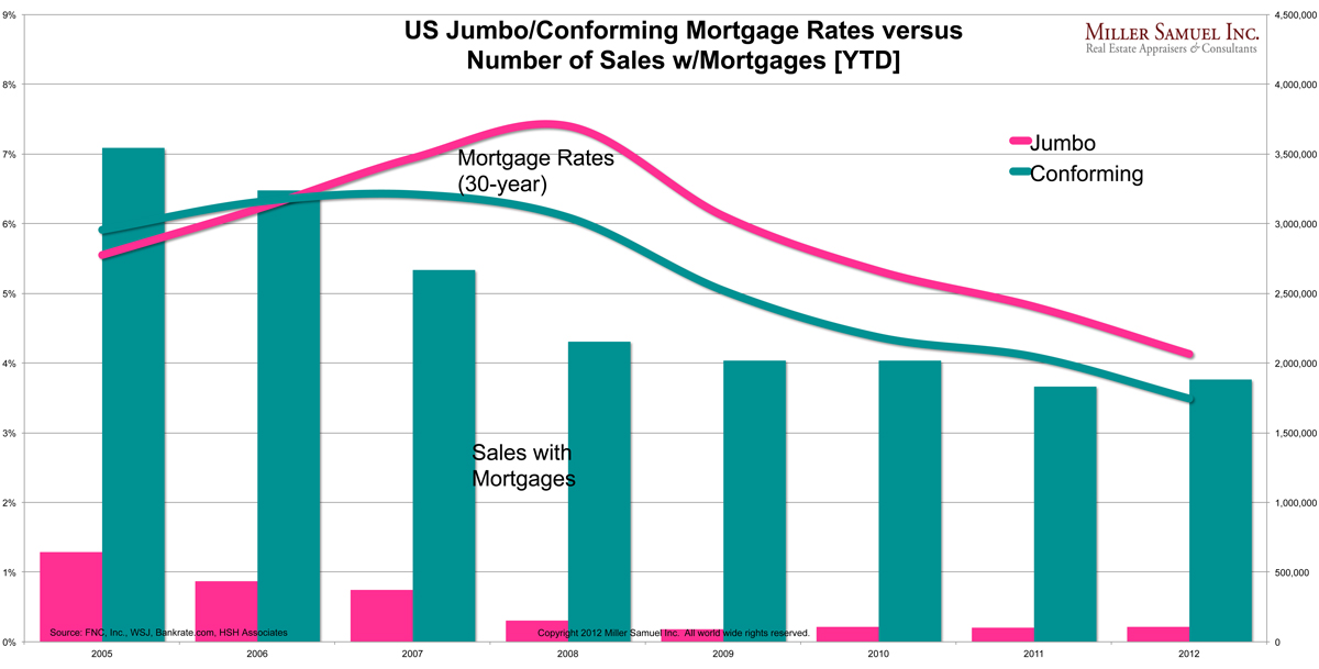
Get Down With It: Falling Mortgage Rates Are Not Creating Housing Sales

November 27, 2012 | 11:16 am | | Charts |

Inspired by my analysis of yesterday’s WSJ article, I thought I’d explore the effectiveness of low mortgage rates in getting the housing market going. I matched year-to-date sales volume where a mortgage was used and mortgage rates broken out by conforming and jumbo mortgage volume.

Mortgage volume has been falling (off an artificial high I might add) since 2005, while rates have continued to fall to new record lows, yet transaction volume has not recovered. I contend that low rates can now do no more to help housing than they already have.

Even the NAR has run out of reasons and is now focusing on bad appraisals as holding the market back (I agree appraisal quality post Dodd-Frank is terrible and is impacting the market to a limited extent – and I secretly wish appraiser held that much sway over the market).

I’m no bear, but the uptick Case Shiller’s report today (remembering that Case Shiller reflects the housing market 5-7 months ago) still shows slowing momentum and all 2012 year-over-year comparisons in the various national reports are skewed higher from an anemic 2011.

Five years of falling mortgage rates have only served to provide stability in volume. The monetary and fiscal conversation ought to be on ways to incentivize banks to ease credit – falling rates only makes them more risk averse.

Of course a significant drop in unemployment would likely solve the tight credit problem fairly quickly.

Tags: , , , , , ,


[Breaking News] CNN Gives Housing Followers Heart Attack, Case Shiller Up 1.2% YOY

September 25, 2012 | 12:01 pm |


[click to open report]

I like this index chart from the report (2nd chart presented in their report) better than the more commonly used % based chart (1st chart presented in their report) because it provides better context. The recent trend is clearly a small see-saw but still sliding in general. I’m not a fan of the CS index for its 5-7 month lag but since it’s some sort of gold standard for housing, it’s important to point out that this clearly shows housing remains tepid at best.

But more importantly…


Shortly after the S&P/Case Shiller report was released this morning at 9:00am, I got the following CNN Breaking News email at 9:15am:

Home prices in 20 major U.S. cities rise to highest level in nine years, according to a new report.

I just about had a heart attack, wondering how I could be so far off in my assessment of the housing market. However I opened the report and the numbers didn’t show that kind of gain.

At 10:21am I received a followup email from CNN Breaking News:

Correction: Home prices rose in July to their 2003 level, but remain lower than the peak in 2006. CNN’s previous alert erroneously stated that home prices had risen to the highest level in nine years.

Not to single CNN out since this has happened at ABC, Breitbart and Fox.

Speed comes at a price: Accuracy.

Similar phenomenon in the appraisal business. The absurd speed demanded by retail banks and AMCs of their appraisers even after the “lessons learned” in this credit crunch, attracts the wrong kind of appraiser. Speed still trumps accuracy.


Home Prices Increase Again in July 2012 [S&P/Case Shiller]

Tags: , ,


NAR and Florida Realtors to Create Repeat Sales Index: Why?

September 4, 2012 | 6:00 am | |

Last week the Florida’s state Realtor association announced they are developing a repeat sales index for tracking the state’s housing market. NAR is doing the same thing on a national level. My first thought was, huh?

The new Florida Realtors Real Estate Price Index will use data from the Florida Department of Revenue to chart home prices for the state and metro areas during the last 17 years.

Why create yet another housing index?

NAR has been sharply critical of the repeat sales methodology for years – and now to suddenly create one because it works better? Damaging logic and once again undermining NAR’s credibility and branding.

The motivation for the creation of a new index seems to be the popularity of the Case Shiller Home Price Index which has been a thorn in NAR’s side since it was introduced a number of years ago. Ironically, NAR enabled Case Shiller to thrive from NAR’s own inability to become a neutral trusted advisor of the exclusive housing data they publish. The culture at NAR Research enabled the two most recent chief economists Lereah and Yun to consistently interpret the numbers with an almost cartoonish glowing angle that has caused severe damage to the NAR brand.

In other words, Realtors and their associations have long ago missed the opportunity to be a reliable provider of real estate stats, but that’s really ok. After all, the association is a trade group and any stats they produce are, by definition, tainted even if they aren’t. Case in point: NAR just revised their Existing Home Sales stats after data provider CORElogic discovered there was a significant error and pressured them to do a revision. NAR had double counted about 2M sales since 2007.

What is a repeat-sales index?

A repeat sales index measures the difference in price from sales that recently sold and their prior sale. New development is omitted because those units have never sold before – a huge characteristic of the Florida housing market. Of course if the property was gut renovated, doubled in size, torn down and rebuilt, a repeat sales index does not know this. A repeat sales index is also subject to the same skew in housing type that a hedonic (i.e. Existing Home Sales) index is and is therefore adjusted using varying formulaic methodologies.

A repeat sales index does not reflect true seasons in housing. Yes there is a nominal difference between their seasonally adjusted and non-seasonally adjusted trends, but it does not show the spring rush and winter doldrums as they actually occur. There seems to be a need by economists to show a steady line rather than a seasonal visual a consumer would better understand.

Whats wrong with the Case Shiller Index?

I’ve been quite critical of the Case Shiller Index since I began this blog in 2005 namely because:

  • it is 5-7 months behind the market;
  • it excludes co-ops, condos and new development.

I do admire Robert Shiller and Karl Case as pioneers in this field but the CS index was NEVER intended to be a consumer tool used to measure housing. It was meant to be the basis for allowing Wall Street to hedge the housing market. A logical goal indeed, but CS was conceived before it was feasible to “game it” i.e. many economists and analytics firms can now accurately project the results of the index in advance. Not a good thing for investors who want to bet on it which explains why such limited trading actually occurs.

There are a lot of housing indices these days. There are also many new data companies that can do analytics a lot better than Realtors can because they only do analytics for a living. Without neutral commentary, how do more housing indices by NAR or Florida’s association make the picture any clearer to the consumer (and Realtors)? Instead I think the Florida association should be focusing on ways to help their members be more successful.


Case Shiller Index [Standard & Poor’s]
Existing Home Sales [NAR]
Florida Association of Realtors [Home Page]

Tags: , , , ,


[In The Media] Yahoo!’s ‘The Daily Ticker’ With Dan Gross 7-19-12

July 19, 2012 | 2:17 pm | Public |


Had a spirited conversation with my friend Dan Gross, the economics editor at Yahoo! Finance who has a new book out.

Something I thought about before the show that I sort of mentioned but I will mention a lot more going forward:

The state of the housing market is a process rather than a moment.
ie “bottom” becomes “bottoming”, “recovery” becomes “recovering”, “turned the corner” becomes “turning the corner”.

Tags: , , , ,


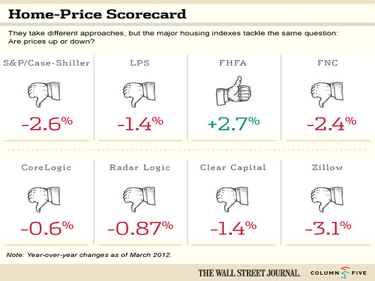
[WSJ] The Crazy 8: Comparing Results of National Home Price Indices

June 9, 2012 | 1:18 pm | |

Matthew Strozier over at WSJ with Column Five (a large producer of infographics) presented an interesting side by side of 8 national housing indices.

All but one index shows a year over year decline in housing. Trulia’s new Price Monitor by Jed Kolko would be a great addition once the year-over-year history is established. It was also interesting that NAR’s Existing Home Sales was omitted (I’m not advocating).

Beyond the obvious price decline, my takeaways were:

  1. US indices are general in sync on the year-over-year. Our confusion in the monthly barrage of housing metric releases is that most push the month-over month.
  2. With the proliferation of these indices, data subscriptions must be getting cheaper. There are a few more out there as well.
  3. Of the indices presented, their data collection and methodologies vary significantly (where disclosed) yet their results were consistent perhaps suggesting the 7 for 8 result is coincidence as opposed to an aggregated trend.
  4. Sales prices are not something we should be obsessed with as an indicator of market health (think Las Vegas, mid decade). I’d much prefer seeing more attention paid to sales trends since they are a pre-cursor to price trends if you are trying to reasonably answer the question: Has the US housing market hit bottom?

It is interesting and my rough understanding that most of these indices were created and run by economists, scientists or data wonks, many for Wall Street purposes with virtually no real estate types. That’s obviously fine until you consider what is said in barrage of monthly press releases for some, citing things that are not empirically measured in their respective reports, i.e. weather, inventory, etc. that create further confusion.

I’d love to see a side by side comparison of the lag time from the point of “meeting of the minds” between buyer and seller for each index. The significant lag time reflected in this index genre is a practical one due to the massive scale of information, but I think it would give consumers (who were generally not the intended users of any of these indices at the time they were created) a better sense of reliability for each.

National housing indices provide useful tools for setting government economic policy but the consumer’s obsession with the idea of a national housing market and it’s relevance to their local markets is, well, crazy.

Tags: , ,


[Interview] Robert Dorsey, Chief Data and Analytics Officer, FNC Co-Founder

November 18, 2010 | 11:03 pm | Podcasts |

Read More

Tags: , , ,


[Bubbletheory] Lets Not Re-write History

May 10, 2010 | 12:00 am | |

I have been coming across what I believe to be somewhat weird rear view looks at the credit/housing bubble we just went through from some well respected voices. I’m thinking there is perhaps an academia disconnect from the front lines.


[click to open article]

Casey B. Mulligan is an economics professor at the University of Chicago writes “Was it really a bubble?

According to the bubble theory, for a while the market was overcome with exuberance, meaning that people were paying much more for housing than changes in incomes, demographics, technology and other basic factors would suggest.

But why would the blue line need to be where it is? Housing prices are stickier on the downside and the slope should not form a bell curve as the drawing suggests. It should be a lesser slope and drawn out over several years, shouldn’t it? And wasn’t that the whole point of the stimulus plan in reference to the first time home buyers’ and existing homeowner’s tax credit? It stimulated sales activity and as a result, artificially pushed sales price levels sideways.

Take a look at my colleague at Westwood Capital, Dan Alpert’s chart showing the exuberance of housing prices. You can slice it and dice anyway you want but THAT’s a bubble.


[click to open article]

And one of my favorite economist/writers Edward Glaeser writes “What Caused the Great Housing Maelstrom?

If the easy credit hypothesis is correct, then we can take comfort in the thought that we understand the great housing convulsion, and we can start pointing fingers at those institutions, like the Federal Reserve System, that play a role in determining interest rates.

He and his colleagues through their research seem to be saying that low interest rates and high lending approval rates don’t explain enough of the rise in housing prices.

In all due respect, I don’t know exactly how they proved their points empirically but this research seems to be a bit disconnected to what most of us observed on the ground during the boom itself.

For example, a five percent increase in loan-to-value ratios is associated with a 2.5 percent increase in prices, and loan-to-value ratios rose by less than five percent during the boom.

That seems like a very low ratio to me. As appraisers we could clearly see the pressure we were under to hit the number for the mortgage approval and that most people were placing 5%-10% down. I contend that credit was easier than anytime in modern history and that combined with interest rates kept on the floor from late 2001 to mid 2004 caused a frenzy of demand or as Professor Robert Shiller characterizes it as “Irrational Exuberance.”

This was a credit bubble and that housing was merely a way to keep score. Perhaps I am not following their logic but having lived through it and saw the lending environment first hand, its hard to imagine this whirlwind of the past 7 years was not a bubble of some kind.


Tags: ,

Get Weekly Insights and Research

Housing Notes by Jonathan Miller

Receive Jonathan Miller's 'Housing Notes' and get regular market insights, the market report series for Douglas Elliman Real Estate as well as interviews, columns, blog posts and other content.

Follow Jonathan on Twitter

#Housing analyst, #realestate, #appraiser, podcaster/blogger, non-economist, Miller Samuel CEO, family man, maker of snow and lobster fisherman (order varies)
NYC CT Hamptons DC Miami LA Aspen
millersamuel.com/housing-notes
Joined October 2007