Matrix Blog

Posts Tagged ‘Case-Shiller’

Declaring A Housing Recovery Using A Threshold Based on Fraud

November 30, 2016 | 3:16 pm | Charts |

S&P CoreLogic used it’s National Non-Seasonally Adjusted Housing Price Index to declare that the housing market has recovered. Even the ironies of this public relations effort have ironies. I’ll explain.

First, look at this classic Case-Shiller chart. Notice how the arrows don’t connect to the lines they are associated? I’m being petty but it looks like the chart was updated and rushed out the door.

csiclassicchart11-2016

Incidentally, who controls the Case-Shiller Indices brand these days? It used to be “S&P/Case-Shiller Indices.” Here are a couple of variations found in the first paragraph of the press release:

  • S&P Dow Jones Indices
  • S&P CoreLogic Case-Shiller Indices

but I digress

Since the financial crisis, I have spent a good deal of time explaining away the reliability of the Case Shiller Index.

To be clear, I greatly admire Robert Shiller, the Nobel Laureate and his pioneering work in economics. I’ve had the pleasure of speaking with him on a number of occasions both publicly and privately. He and I were on stage together at Lincoln Center back during the housing bubble for a Real Deal event.

During the bubble I was the public face of a short lived Wall Street start-up that collapsed when the bubble burst. Like Case-Shiller it was built to enable the hedging of the housing market to mitigate risk using a different methodology, avoiding the repeat-sales method used in CS. The firm had annoyed Shiller by constantly citing the issues with the CS index and we got far more traction from Wall Street with our index that was (literally) built by rocket scientists. It got to the point where he mentioned me and the startup by name at a conference in frustration.

thhpodcastlogo

After I disconnected with the startup before it imploded, I reached out and we made up. In fact he did my Housing Helix podcast (link broken but hope to bring it back online soon for historical reference) at my office back when I was doing a podcast series of interviews with key people in housing). Also we’ve run into each other on the street in Manhattan a number of times. In fact when he learned of my love of sea kayaking he gave me the latitude and longitude coordinates of his island vacation home in case I was nearby. You can see that I feel a little guilty criticizing the use of the index since he is one of the nicest and smartest people I’ve ever had the honor to meet.

But I don’t like the way S&P, Dow Jones and/or CoreLogic have positioned Case-Shiller as a consumer benchmark. And especially yesterday’s announcement as a marker for the recovery of the U.S. housing market. I feel this is a low brow attempt by these institutions to leverage publicity without much thought applied to what is actually being said. Here are some thoughts on why it is inappropriate to use this moment as a marker for the housing recovery.

“The new peak set by the S&P Case-Shiller CoreLogic National Index will be seen as marking a shift from the housing recovery to the hoped-for start of a new advance” says David M. Blitzer, Managing Director and Chairman of the Index Committee at S&P Dow Jones Indices.

Blitzer remains in the very awkward position of explain away the gap between the market 6 months ago and current condition as if there is no difference. He does this by using anecdotal commentary about metrics like supply that has nothing to do with the price index as well as making pithy remarks.

  • The Case-Shiller National Index is being touted for reaching the record set in the housing bubble a decade ago despite the record being set back then by artificial aka systemic mortgage fraud. However their 20 city index has been pushed as the key housing benchmark for more than a decade, not the national index. And they are using the non-seasonally adjusted national index to proclaim the record beaten despite their long time preference of presenting seasonally adjusted indices (the seasonally adjusted national index has not broken the housing bubble record yet).

  • The credit bubble got us to the 2006 peak, not anything fundamental.

cshpitablefrompeak11-2016

  • In my thirty years of valuation experience, I have learned that sales transactions, not prices, should be the benchmark for a housing market’s health.

  • The 0% markets that reached the 2006 peak are super frothy – created by rapidly expanding economies and an inelastic housing supply. Income growth doesn’t always justify their price growth. Click on table below for the markets shaded in turquoise.

csnsazero

Some important background points on the Case Shiller Home Price Index (CS) – that most of its users are unaware of:

  • CS was never intended for consumer use! It was built for Wall Street to trade derivatives to hedge housing market risk much like hedging risk for weather, insurance, non-fat dry milk and cheddar cheese.

  • CS never caught on because housing is a slow and lumbering asset class, unlike a stock which has much more liquidity. The flaw during this bubble period was the way Wall Street and most real estate market participants considered housing as liquid as a stock and how financial engineering had enabled that liquidity.

  • As access to public housing data has become more ubiquitous, the index has been more easily gamed by companies like Zillow, who have been able to accurately predict the index results much sooner rendering the index as useless for hedging.

  • CS lags the actual “meeting of the minds” between by buyers and sellers – when they agree on the price and general terms – by 5-7 months. The November report just released was based on the 3 month moving average of closed sales from July, August and September. If we say that contract to close period is an average of 60 days, then the contracts signed in this batch of data represent May, June and July. And the time between the “meeting of the minds” and the signed contracts can be a couple of weeks, so the results in yesterday’s lease of the Case-Shiller index represents the period around Memorial Day weekend as summer was getting started.

  • CS only represents single family homes (although they have an index for condos).

  • CS excludes new development.

  • There is little if any seasonality in the CS methodology (even though there is a seasonally adjusted version).

  • Geographic areas in the 10 and 20 city CS indices are incredibly broad. For example, the “New York” index includes New York City, Long Island, Hamptons, Fairfield County, Westchester County, a bunch of counties in northern NJ and a county in Pennsylvania. Yet this index is often represented as a proxy for the Manhattan housing market by national news outlets. Manhattan residential sales have about a 1% market share of single family homes.

In other words, the CS index is a great academic tool to trend single family home prices at a 30,000 foot view for research but not to measure the current state of your local market.

Tags: , , , , ,


My Bloomberg View Column: Housing Data Is Old and Moldy

July 31, 2014 | 11:32 am | | Charts |

BVlogo

After being pummeled with confusing sound bits after the release of Monday’s Pending Home SalesIndex by the NAR and the S&P/Case Shiller Index, I thought it was time to set the record straight on the applicability of this research.

This is my second column for Bloomberg View: Housing Data Is Old and Moldy


My Bloomberg View RSS feed.

Tags: , , , , , ,


Bloomberg Surveillance TV – Guest Host 6-25-14

June 25, 2014 | 8:30 am | | TV, Videos |


UPDATE: above clip just added – expanded conversation.

Got to guest host an hour (6am to 7am) of Bloomberg Television’s Surveillance with Tom Keene, Scarlett Fu and Adam Johnson to talk housing. The above is just a couple of minutes of the hour (yes, you’re spared). We spoke about Case Shiller, New Home Sales, biting in World Cup Soccer, my fireman son using a GoPro in fires and LeBron/Carmelo’s real worth among other things. Like I said, we did talk housing.

Adam brought up a great point – while the economy is always characterized as 70% consumer driven, 16% of that is actually health care spending so the overall number is really 54%.

Very smart conversations (the topic of biting included). Always fun to join them.

Tags: , ,


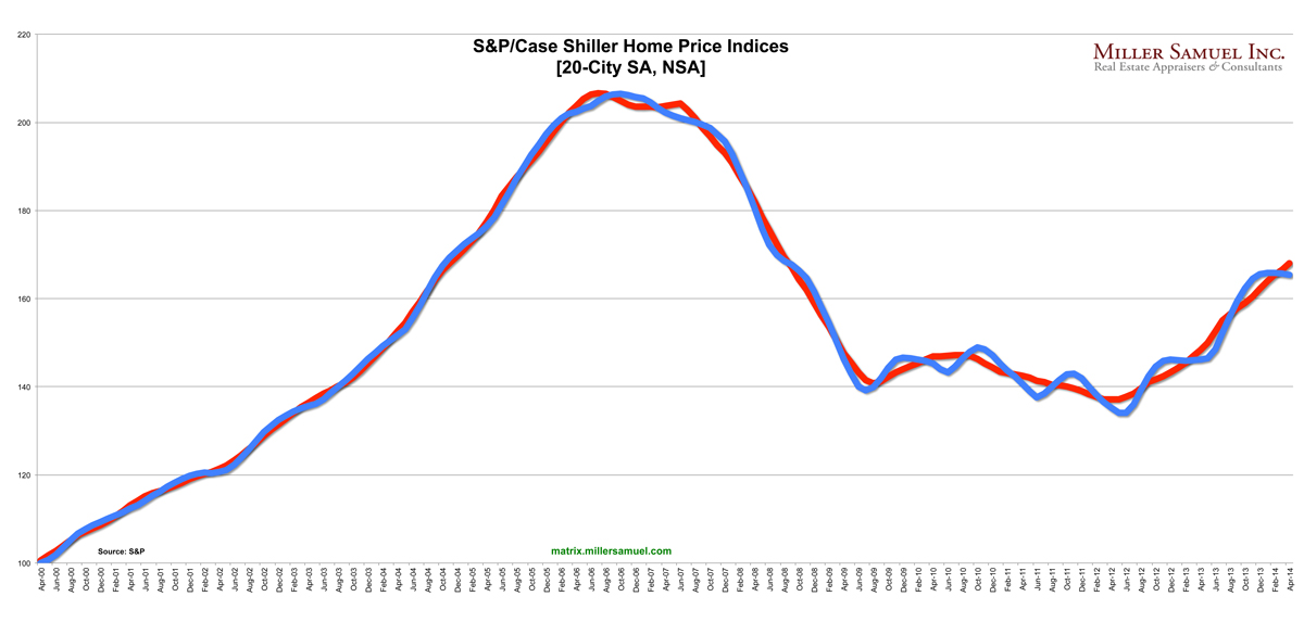
Time-Shifted Case Shiller: Dallas, Denver Crushing it, Polar Vortex a Non-Issue ‘Cause It’s Still December

June 24, 2014 | 5:29 pm | Charts |

matrixCSI-6-24-14 [click to expand]

The above chart is a generic trend line for the seasonally and non-seasonally adjusted 20-City Case Shiller Index released today using the data from the release.

And here’s the same index that I time-shifted backwards by 6 months to reflect the “meeting of the minds” of buyers and sellers. More specific methodology is embedded in the following charts. By moving the index back 6 months, the changes in the direction of the index are in sync with economic events (reality). In my view this index has a 6 month (5-7) month lag rendering it basically worthless to consumers but perhaps a useful tool for academic research where timing may not be as critical. I’m just grasping here.

matrixCSI-6-24-14INDEXshift

[click to expand]

And here’s a time-shifted trend line for the year-over-year change in the 20 city index. You can see that the pace of year-over-year price growth began to cool at the end of last year. Talk about the weather is still premature since the polar vortex occurred after the new year.

matrixCSI-6-24-14YOYshift

And here is the ranking by year-over-year changes for each city as well as the 10 and 20 city index. Dallas and Denver are no longer under water and Las Vegas, despite recent good news has a long way to go to get to the artificial credit induced high it reached in 2006.

matrixcsi6-2014ranking

Tags: , , ,


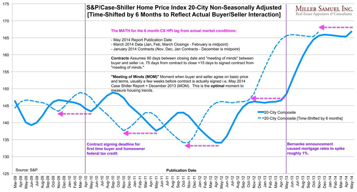
Pulling the Case-Shiller Index Back by 6 Months to Reflect Actual Buyer/Seller Behavior

May 27, 2014 | 10:45 pm | Charts |

matrixCSIshift-5-27-14
[click to expand]

The Case Shiller Index was released today and it continued to confuse consumers, pundits, economists etc…and for good reason. It’s 6 months late.

I wondered what would happen if their index result was pulled back by 6 months to see how it lined up with a couple of significant housing milestones (purple vertical lines). The most recent housing milestone was last year’s Bernanke speech that resulted in the spike in mortgage rates in May-June of 2013.

In the modified trend line (dotted blue) housing prices surge up until mortgage rates spike. This is clearly more logical than the actual index showing housing prices surging for six months after the mortgage rate spike.

In the earlier milestone in April 2010, the adjusted index (dotted blue line) immediately begins to slide after the April 2010 signed contract deadline passed to qualify for the federal homeowner tax credit as part of the stimulus plan. Yes, that’s exactly what happened on the front lines.

I’m going to call this new methodology “time-shifting a housing index.” From an historical perspective, this is a much more useful and reliable trend line. For the near term, it places the CS HP 6 months behind the market without any relevance to current conditions. Then again, the S&P/Case Shiller Home Price Index was never meant to be a monthly housing indicator for consumers as it is currently used by the media. It was originally created to enable Wall Street to hedge housing but never caught on because of the long time lag and therefore the eventual ability of investors to accurately predict the results.


The top chart is fairly self-explanatory but here’s the math again:

  • May 2014 Report Publication Date
  • March 2014 Data (Jan, Feb, March Closings – February is midpoint)
  • January 2014 Contracts (Nov, Dec, Jan Contracts – December is midpoint)

Contracts Assumes 90 days between closing date and “meeting of minds” between buyer and seller i.e. 75 days from contract to close +15 days to signed contract from “meeting of minds.”

“Meeting of Minds” Moment when buyer and seller agree on basic price and terms, usually a few weeks before contract is actually signed i.e. May 2014 Case Shiller Report = December 2013. The optimal moment to measure housing.

Here’s a regular chart that has a longer timeline, with and without seasonal adjustments (you can see that seasonal adjustments are essentially meaningless.)

matrixCSI-5-27-14

Tags: , , ,


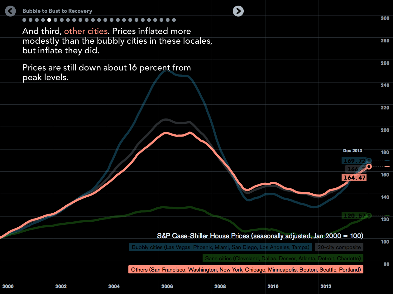
Bloomberg View’s Super Cool Visual: Bubble to Bust to Recovery

February 25, 2014 | 2:09 pm | |

Screen Shot 2014-02-25 at 1.52.41 PM
[Click to view presentation]

Matthew C. Klein does an amazing presentation on the housing cycle (h/t Barry Ritholtz) – think of it as a Kahn Academy presentation on visual steroids.

Bloomberg View’s “Bubble to Bust to Recovery.”

Required viewing.

Tags: , , ,


[Video] Talking Housing on CNBC TV’s Street Signs 9-25-13

September 25, 2013 | 7:29 pm | | TV, Videos |

I’m not quite ready to use the word “haunted” in my housing language, but I had a nice chat with Brian Sullivan and Mandy Drury of CNBC TV’s ‘Street Signs’ – 30 Rock is always quick walk from my office to do the remote. Although my firm’s name was announced backwards on air (It’s really “Miller Samuel” I swear), I think my logic was forward (sorry).

Fun. Plus Mandy gives The Real Deal Magazine a shout out.

Tags: , , , , ,


[Video] Talking Housing on Bloomberg TV’s Surveillance 9-24-13

September 24, 2013 | 12:10 pm | | TV, Videos |

Always fun (and refreshing) to talk housing with Tom Keene, Sara Eisen and Scarlet Fu on Bloomberg TV’s Surveillance. I always watch or listen to the show on their apps as part of my morning routine. Got to meet and hear great insights from Jim O’Neill, Bloomberg View columnist and former chairman of Goldman Sachs Asset Management as well.

Did I tell you I am still the mayor of the Bloomberg Cafeteria on Foursquare?

Tags: , , , , , , , ,


[Video] Talking Housing, Case Shiller, on Bloomberg TV’s Surveillance 8-28-13

August 28, 2013 | 11:13 am | | TV, Videos |

I had a nice discussion with Tom Keene, Sara Eisen and Alix Steel, along with guest host Byron Wien, vice chairman of Blackstone Group LP’s advisory services on the state of US housing and the latest Case Shiller numbers.

More importantly, I’m still the mayor of Bloomberg TV’s Green Room on Foursquare.

Tags: , , , ,


Talking Case Shiller on Bloomberg TV’s ‘Street Smart” with Betty Liu/Adam Johnson

May 29, 2013 | 11:57 am | | Public |

Yesterday’s release of the Case Shiller Index prompted a flurry of coverage given the 20-cities’ highest YoY increase in 7-years. I did a three way split interview from a remote location in CT (see studio set up below). I was a guest along with Vincent Reinhart, chief US economist at Morgan Stanley and Stan Humphries, chief economist at Zillow Inc. Betty Liu and Adam Johnson kept the conversation going.

I especially liked Stan’s modification of the Case Shiller Index results which excluded foreclosures and his research on low and negative equity (my explanation for low inventory right now). The drop in foreclosure activity over the past year caused significant skew to the mix. According to Stan the index would show roughly a 5% increase YoY rather than an 10.9% increase. A huge difference and yet another reason why this index does more harm than good to our understanding of the housing market.

Vincent’s observation that seasonality is considered in Case Shiller is basically wrong – not technically wrong because the data is seasonally adjusted. However the methodology of a repeat sales index washes out seasonality. If you look at the Case Shiller chart, there hasn’t been “seasons” in housing since 1987. That’s simply not true. The Case Shiller Index does not reflect annual housing cycles.

Since Case Shiller Index lags the signing of contracts by 5-7 months, expect to see much higher YoY results this summer.

How the sausage is made

Bloomberg TV is always great to work with – they arranged for me to use a remote studio in CT through a third party. Here is what the studio looks like. Amazingly primitive but it works!

Tags: , , , ,


Manhattan Diverged From NYC At US Housing Boom Peak

February 14, 2013 | 10:54 am | | Charts |


[click to expand]

As the above chart illustrates, the aggregate median housing price in New York City, based on co-op, condo and 1-3 family property sales, with and without Manhattan sales go their separate ways circa mid-2006, at the Case-Shiller Home Price Index peak of the national housing market. This also makes the decline in the New York Case Shiller HPI all that more maddening (because it’s not Manhattan, or co-ops or condos or new development and includes Long Island, Fairfield, Westchester, Northern New Jersey and a county in Pennsylvania).

The market share for new development sales in Manhattan peaked in 2Q 06 at 57.9%. The 4Q12 market share was 12.5% but fear not, more new development is coming per The Real Deal.

During the boom through today, the shift in the mix towards Manhattan luxury property, largely from the combination of new development activity as well as vigorous Wall Street and international demand has expanded the difference between Manhattan and the rest of New York City. In other words, the gain in median sales price for NYC was caused by a shift in the mix toward higher end properties.

Tags: , ,


Housing Data as Pop Culture

February 14, 2013 | 7:00 am | | Charts |


[click to open article]

A recent post in CNN/Money featured Andy Warhol’s 1984 “U.S. Unemployment Rate. No Campbell Soup Cans but it feels strange to associate his art with economic data from the 1980s. It somehow works for me. One of the coolest property inspections I made was through “The Factory” years ago.

In 2007 the “Stand-up Economist” Yorman Bauman led the way with this much watched video on the difference between macro and micro economists. “Microeconomists are wrong about specific things while macroeconomists are wrong about things in general.” HI-larious.

And recently the TV game show “Teen Jeopardy” had 5 questions about the “Federal Reserve.”

Christie’s sales rep said:

“Economic data has become popular culture. While we used to think of it as being some kind of verified information only for people who are really knowledgeable about the economy, it’s popular culture now. You can talk to a taxi driver about it.”

I completely agree. Gangnam Style and GDP now go hand in hand.

We devour housing data ie the recently released Real Deal Data Book (I’ve got a lot of charts and tables in there!)

Throw in the heavy downloads of our report series for Douglas Elliman, NAR Research, CoreLogic, Case Shiller, RealtyTrac, etc. it’s clear to me that housing data is an obsession and embedded in popular culture (thank goodness).

Tags:

Get Weekly Insights and Research

Housing Notes by Jonathan Miller

Receive Jonathan Miller's 'Housing Notes' and get regular market insights, the market report series for Douglas Elliman Real Estate as well as interviews, columns, blog posts and other content.

Follow Jonathan on Twitter

#Housing analyst, #realestate, #appraiser, podcaster/blogger, non-economist, Miller Samuel CEO, family man, maker of snow and lobster fisherman (order varies)
NYC CT Hamptons DC Miami LA Aspen
millersamuel.com/housing-notes
Joined October 2007