Matrix Blog

Posts Tagged ‘NYT Real Estate’

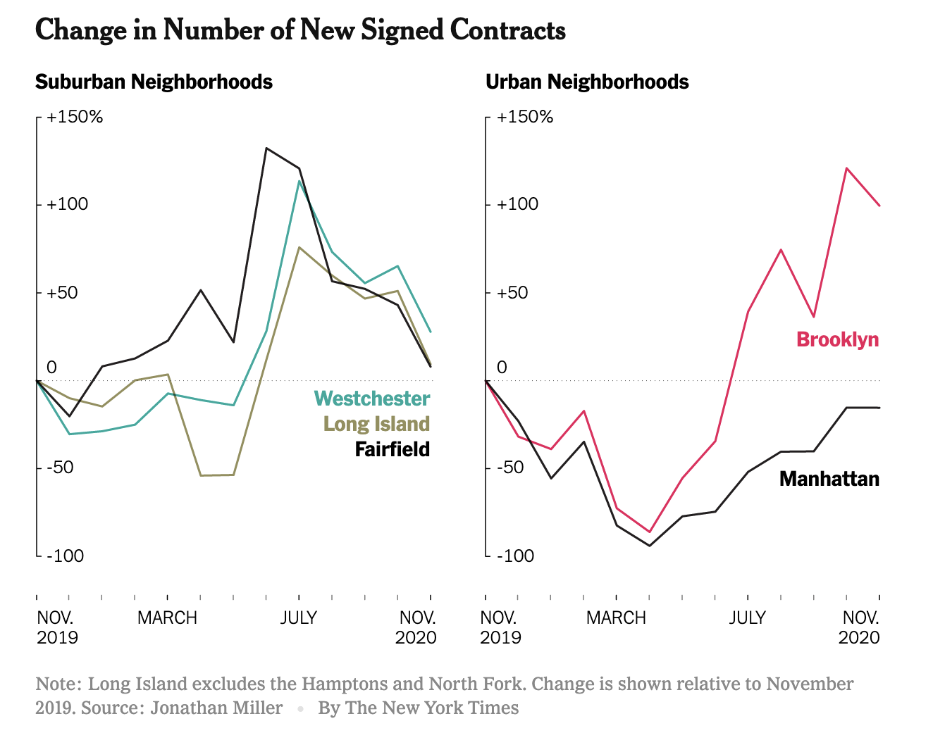
Peak Suburb Has Passed

December 28, 2020 | 2:22 pm | | Explainer |

The New York Times got the market nuances right in their epic end of year The Real Estate Collapse of 2020.

And including epic charts makes it even better.


I noticed that the Streeteasy median rent chart used in the piece shows the same pattern as my recent chart in Bloomberg. That drop in rent is gigantic.


[Source: Bloomberg – click image to open article]

Tags: , , , , , ,


NYT Real Estate Event May 21st @2:30 E.T. New York Real Estate: How Low Will Prices Go?

May 20, 2020 | 1:19 pm | | Events |

I’ve been asked to participate in Thursday’s New York Times Event New York Real Estate: How Low Will Prices Go?”.

Click on the image below to RSVP!


Tags: , , , , , , ,


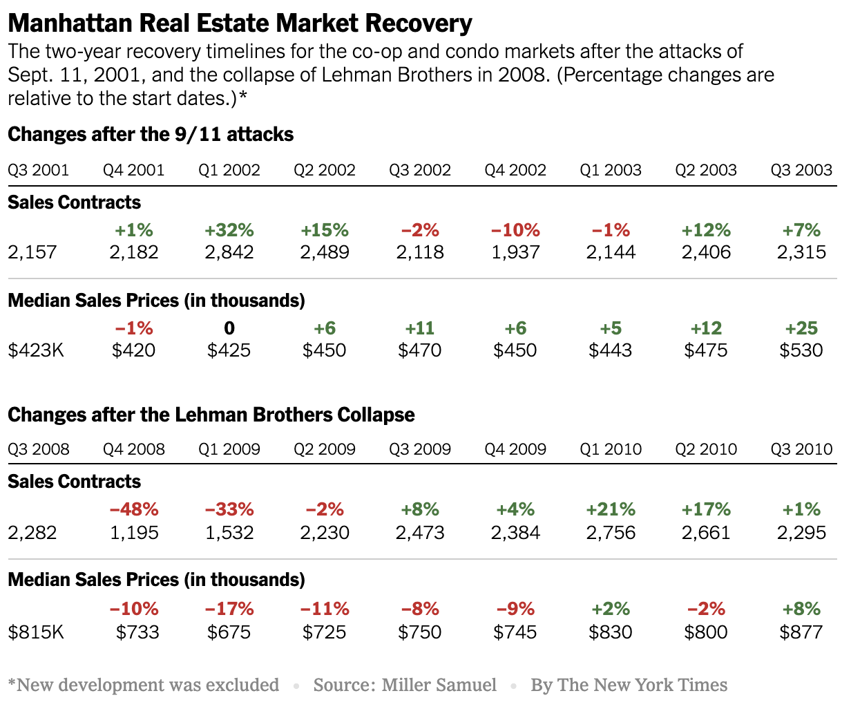
Manhattan Crisis: What Does Our Housing Past Tell Us About Our Housing Future?

May 7, 2020 | 1:02 pm | |

In this Sunday’s New York Times Real Estate Section (online now), the Calculator column featured some data trends I’ve gathered during two significant prior housing market events: What Can 9/11 and the Great Recession Tell Us About Coronavirus Recovery?

Tags: , , , , , , ,


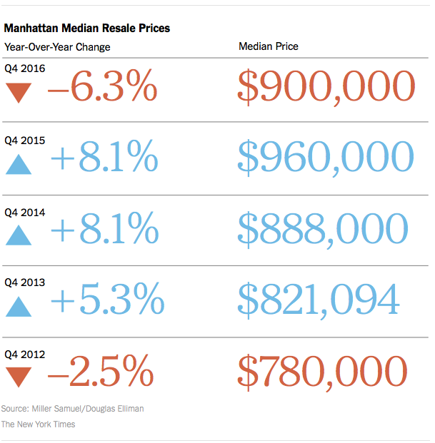
NYT Calculator Chart: The Resale Pendulum Swings Toward Middle

January 21, 2017 | 2:50 pm | | Charts |

I love the way the NYT Real Estate section handled the data from our Elliman Report series to present the Manhattan resale market.

2017-1-22NYTcalculator

I added my chart on bidding wars below – falling as supply enters the market, causing resale prices to soften.

4qoverlistmanhattan

Tags: , , , ,


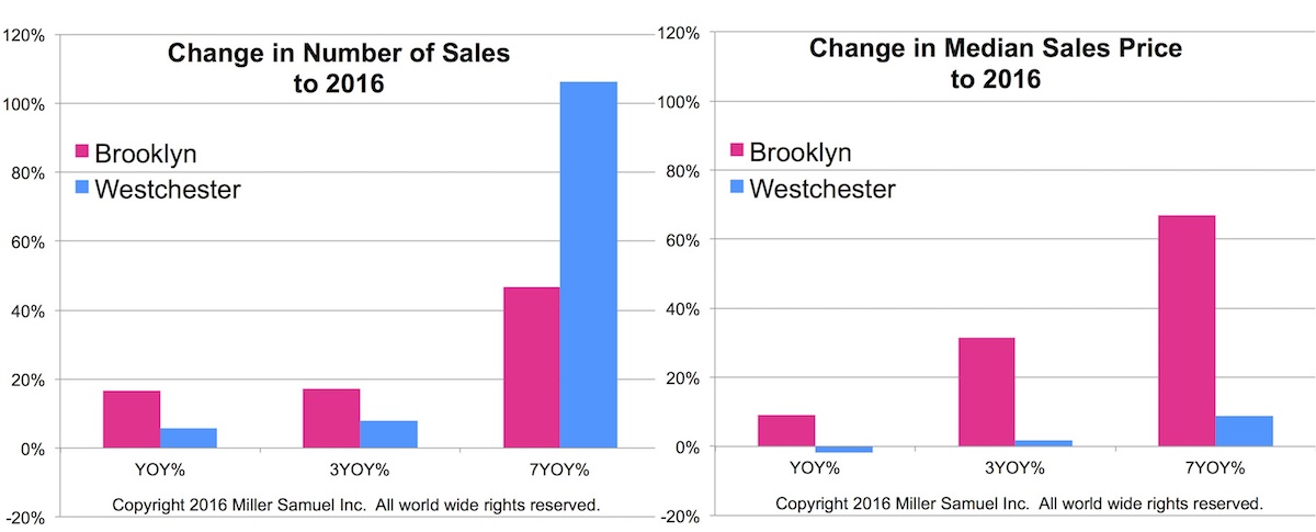
NYT Calculator: Suburban Sales Boom Measured By Houses on Monopoly Board

November 19, 2016 | 7:46 am | | Charts |

The New York Times created another super cool graphic in their new Calculator column, based on my idea. In the fall of 2015 I observed a massive surge of sales in Westchester County (north of NYC for those not familiar with our area). However median sales price was nearly flat during this period. This was phenomenon repeated in all of the counties that surround NYC – except for NJ since I don’t cover that market yet but anecdotally I believe the same phenomenon is occurring there. I believe this moment was the point where the affordability challenge became so severe that renters and move up buyers had to move out of the city.

Specifically, Brooklyn showed a surge in median sales price from 2009 with a modest growth in sales. Westchester reflected the opposite patterns of Brooklyn. Westchester county sales boomed over the same period while the growth in median sales price was much more tepid.

westchestervbrooklyn11-2016

Below is the NYT graphic for the suburban sales boom article.

11-18-16nytcalculator

Tags: , , ,


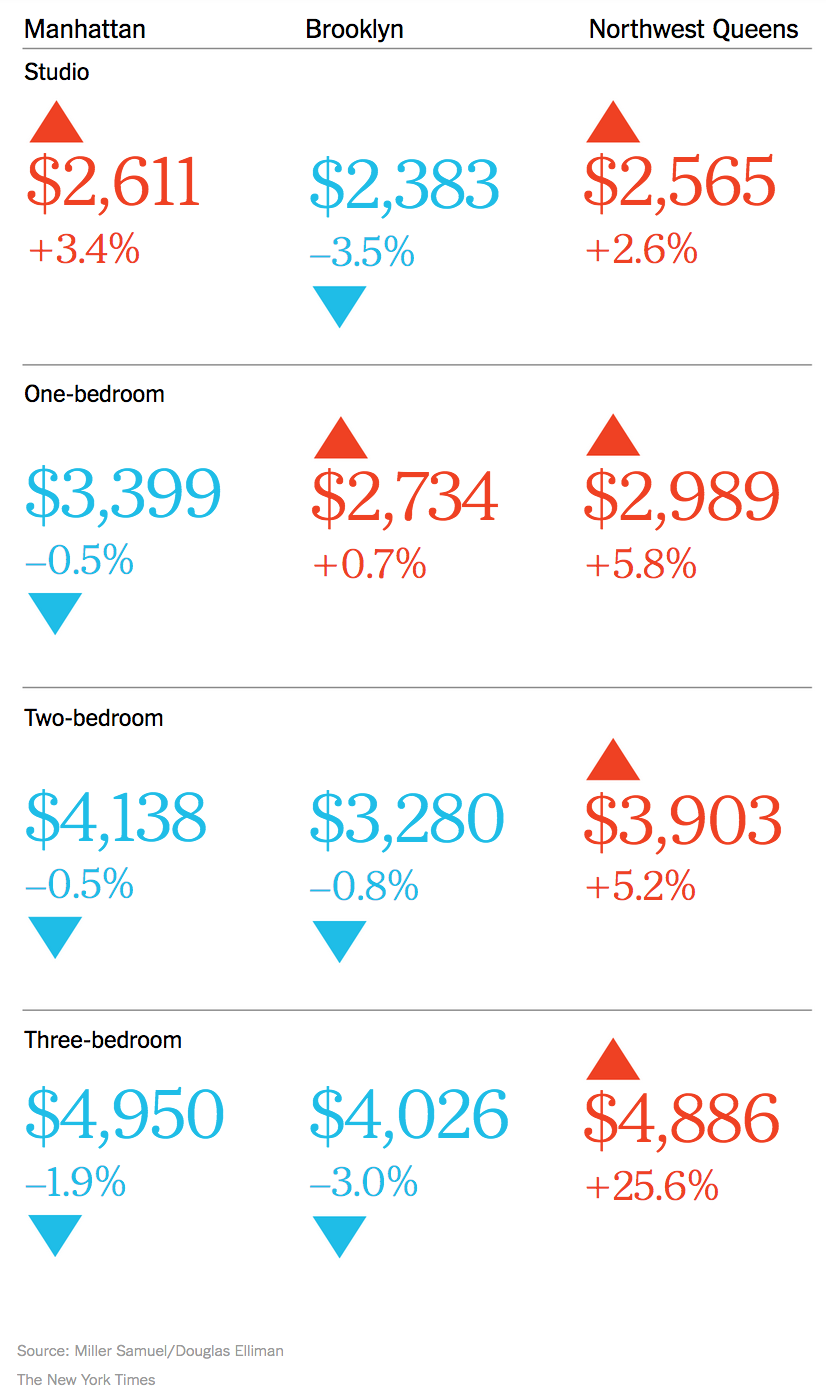
NYT Real Estate Calculator: NYC Rents Go Graphic

October 9, 2016 | 8:49 am | | Infographics |

I’m liking the new goodies in the New York Times real estate section, especially this week, and not because the most recent market report on the Manhattan, Brooklyn and Queens rental market for Douglas Elliman was featured.  No, really.

See for yourself.


nytcalculator10-9-2016rents

Tags: ,

Get Weekly Insights and Research

Housing Notes by Jonathan Miller

Receive Jonathan Miller's 'Housing Notes' and get regular market insights, the market report series for Douglas Elliman Real Estate as well as interviews, columns, blog posts and other content.

Follow Jonathan on Twitter

#Housing analyst, #realestate, #appraiser, podcaster/blogger, non-economist, Miller Samuel CEO, family man, maker of snow and lobster fisherman (order varies)
NYC CT Hamptons DC Miami LA Aspen
millersamuel.com/housing-notes
Joined October 2007