Matrix Blog

Posts Tagged ‘median sales price’

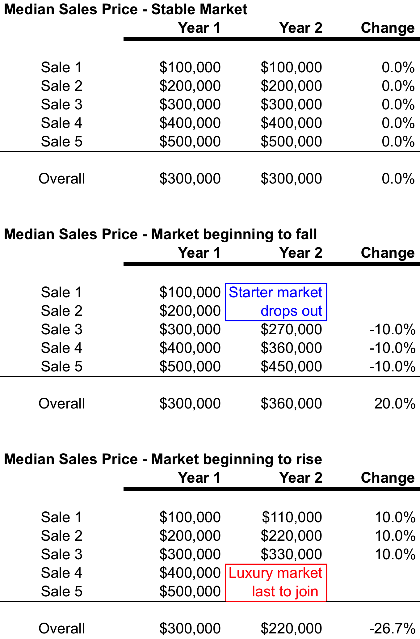
Median sales price can be subject to skew by consumer behavior more than math

May 12, 2020 | 11:19 am | Explainer |

Here’s an updated excerpt from my Housing Note newsletter dated October 28, 2016, digging into the median sales price. You can subscribe to Housing Notes and other housing resources for free.


I wrote about the median sales price a decade ago, and the message still holds. A couple of years ago, I whipped up a table that shows how median sales price can perform in a changing housing market. The median sales price is the default price trend indicator of real estate because it eliminates the extreme highs and lows of a data and merely represents the middle number. However, it is also subject to skew by consumer behavior that can overpower the math. So I always provide two to three price trend indicators depending on the quality of available information (average sales price, median sales price, median sales price) for all of the reports in my Elliman Report Series. The relationship between median and average sales price can also tell a story.

Click on the graphic below to expand.

medianexplained

Tags: ,


Explainer: Overall Median Sales Price Submarket Changes May Not Fall In Range

October 29, 2017 | 8:39 pm | Infographics |

This title is way too wonky but I found it hard to pare down. It’s easier to explain visually.

When I complete my research for Douglas Elliman in a particular housing market and the percent change in the overall median sales price doesn’t fall within the individual submarkets like averages do, I periodically receive inquiries from media outlets or real estate professionals to clarify. Many people see median sales price much like they see average sales price: proportional.

In this case, the median sales price change for resale to new development ranged from -23% to +1.9% yet the overall median increased 9.3…clearly outside of the range both submarkets established.


So I whipped up the following infographic with sample sales transactions and applied median and average sales price to illustrate how median sales price percent change for the overall market might not always fall within the individual submarket percent price changes. However, in an “average” analysis, the overall result will always fall within the range of the submarkets.

I hope the following color-coded breakdown below helps illustrate this clearly – be sure to click on the image once to expand or a second time for the extra large version.


[click to expand]

Tags: ,


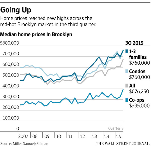
Brooklyn, Queens Set Records, NYC rents jump, Westchester, Putnam and Dutchess Get Busy

October 8, 2015 | 9:05 pm | | Reports |

wsjbrooklyn3q15-600

We published a slew of research today for Douglas Elliman Real Estate:

Manhattan, Brooklyn & Queens Rentals

Manhattan Rentals – Median rental price increased year-over-year for the 18th consecutive month – Median rental price was third highest on record – Brisk employment growth and strong economic conditions kept upward pressure on rents – Mortgage lending conditions remained tight tipping would-be first-time buyers back into rental market – Strength at lower end of market remained as non-doorman rents rose faster than doorman rents – Luxury median rental price slipped, showing weakest conditions of all price segments – Inventory slipped and marketing time remained low, despite rise in vacancy rate

Brooklyn Rentals – Median rental price set a new record for third consecutive month – Median rental price exceeded the $3,000 threshold for first time – Landlord concessions remained at nominal level as inventory slipped – Rental price indicators moved higher across all size categories – Listing inventory as well as negotiability between landlords/tenants fell – Median Brooklyn rent was $288 less than Manhattan

Queens Rentals – Price indicators showed mixed results, suggesting general stability overall – Studios showed strong price growth as 1-bedrooms and 2-bedrooms were flat – New development market share comprised 30.2% of new rentals – Luxury market median price gain was modest, but exceeded the overall market – Median Queens rent was $362 less than Brooklyn and $650 less than Manhattan

Brooklyn Sales – Brooklyn median and average sales price set a new record – Brooklyn remains the only New York City borough with a median sales price above the pre-financial crisis high – Condo, co-op and 1-3 family properties set new median sales price record – Luxury housing prices followed overall market trend – Sales expanded as listing inventory declined, resulting in brisk market pace – Fastest marketing time in 8 years

Queens Sales – Queens median and average sales price set a new record – Condo median sales price set a record for second consecutive quarter – Co-op price indicators set new record – 1-3 Family price indicators set new record – Luxury price indicators set new record – Inventory declined as sales surged – Marketing time fell as negotiability expanded

Westchester County Sales (expanded) – Record number of sales for the quarter, based in historical back to 1981 – Fastest marketing time and least negotiability in the 5.5 years this metric has been measured – Listing inventory for all property types slipped from year ago levels – Absorption rate was fastest market pace in 15 years – Single family and condo median sales price indicated stability – Single family market share declined even though sales increased – Luxury price indicators slipped, out performed by overall market

Putnam/Dutchess County Sales (new)

Putnam County – Price trend indicators increased on a year over year basis – Listing inventory slipped as the number of sales surged – Based on absorption, the market pace was 17.2% faster than the year ago quarter – Marketing time and listing discount expanded despite faster market pace

Dutchess County – Price indicators suggested general stability – Single family prices edged higher as condo prices declined – The pace of the market slowed as sales declined and inventory expanded

Tags: , , ,


[Three Cents Worth #290 NY] Tracking 24 Years of Manhattan Sales and Rental Prices

August 23, 2015 | 6:09 pm | | Charts |

It’s time to share my Three Cents Worth (3CW) on Curbed NY, at the intersection of neighborhood and real estate in the capital of the world…and I’m here to take measurements.

Check out my 3CW column on @CurbedNY:

It’s been a while since I dropped in on Curbed with a Three Cents Worth post but since I’m currently huddled next to an air conditioner, I really needed to take my mind off the heat and humidity. I thought I’d reach back into history and trend the year-over-year changes in the Manhattan sales and rental markets. I presented the median rental price and median sales prices by quarter back to 1991 measuring their year over year percent change. I’m surprised I haven’t done this before since there is so much discussion about the relationship between the two markets, and whether it’s better to rent or buy…

3cw8-19-2015

[click to expand chart]


My latest Three Cents Worth column: Three Cents Worth: Tracking 24 Years of Manhattan Sales and Rental Prices [Curbed]

Three Cents Worth Archive Curbed NY
Three Cents Worth Archive Curbed DC
Three Cents Worth Archive Curbed Miami
Three Cents Worth Archive Curbed Hamptons
Three Cents Worth Archive Curbed LA
Three Cents Worth Archive Curbed Ski

Tags: , , , , , , ,


Bloomberg View Column: Only Brooklyn Is Over the City’s Housing Bust

October 13, 2014 | 2:32 pm | | Charts |

BVlogo

Read my latest Bloomberg View column Only Brooklyn Is Over the City’s Housing Bust. Please join the conversation over at Bloomberg View. Here’s an excerpt…

Housing prices in four of New York’s five boroughs still haven’t reached their pre-crash highs. The outlier? Brooklyn.

Housing prices in Brooklyn now are more than 8 percent above the peak reached in 2007. The other four boroughs, meanwhile, are all more than 10 percent below their highs, with the Bronx still down by almost a quarter….

[read more]


My Bloomberg View Column Directory

My Bloomberg View RSS feed.

Tags: ,


Bloomberg View Column: Understanding Housing’s Dog Days

August 31, 2014 | 5:04 pm | | Charts |

BVlogoThe comparison of housing market statistics against last year’s results produced misdirection in our understanding of it’s current state. Although a year-over-year comparison gets rid of seasonality, the results are at the mercy of how normal the prior year was…

The slowdown in the U.S. housing market has caused much hand-wringing. But keep this in mind: robust housing sales and price gains in 2013 were the anomaly and at odds with tepid economic fundamentals such as income, employment and credit. It’s the year-over-year comparisons that make things look worse than they are.

Read my latest Bloomberg View column
Understanding Housing’s Dog Days.
Please join the conversation over at Bloomberg View.


My Bloomberg View Column Directory

My Bloomberg View RSS feed.

Tags: , , , , , ,


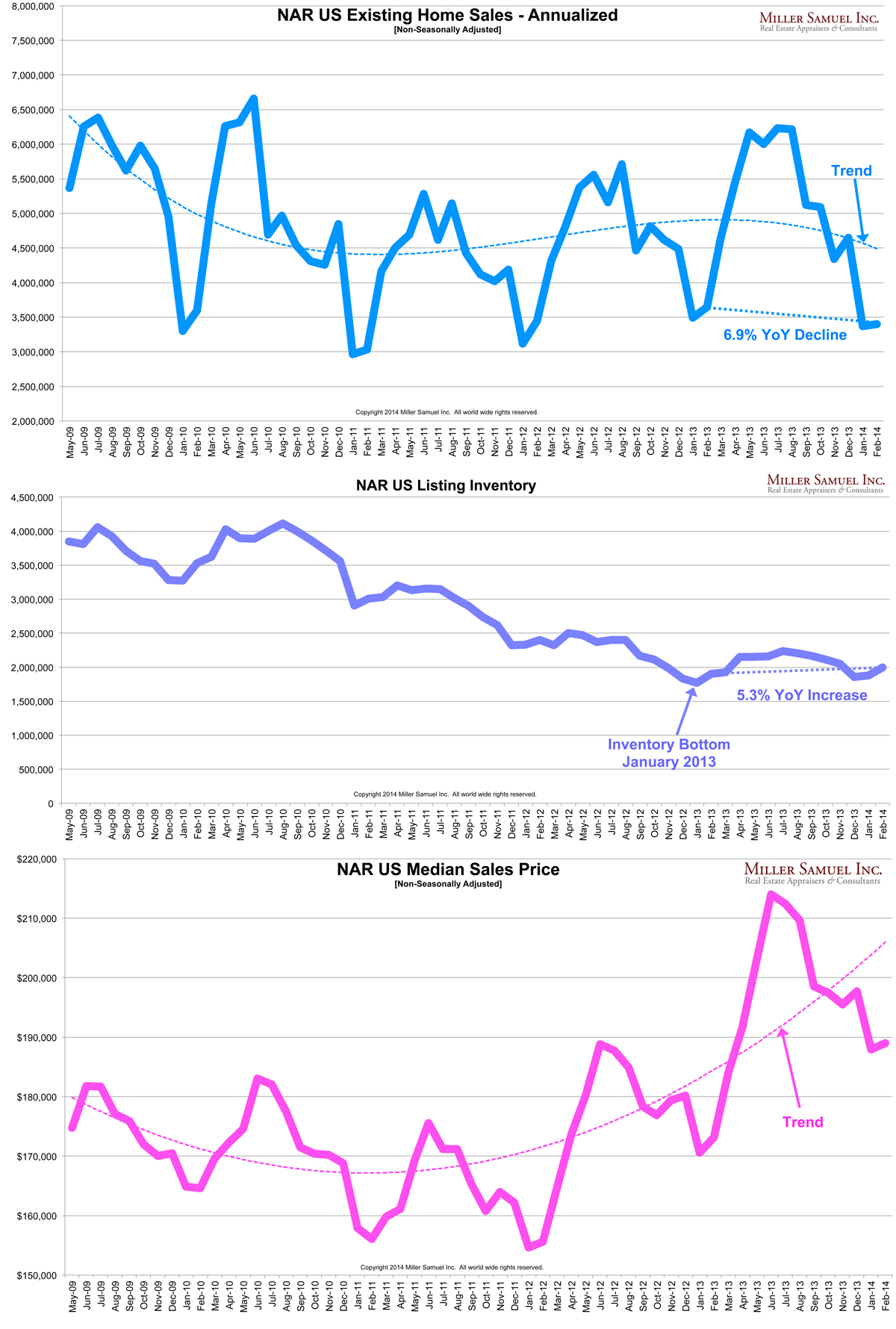
NAR Existing Home Sales Blink, And So What?

March 23, 2014 | 9:00 am |

NAR released their Existing Home Sales Report on Thursday with a headline that read: February Existing-Home Sales Remain Subdued that blamed the severe winter weather and low inventory for lower sales.

Of course inventory has been near historic lows for a few years so that’s not a new reason. I’m left with the weather and as someone who hates to use the weather as a crutch, it seems to be a pragmatic – it’s difficult to show or be in the mood to view properties when it is zero degrees outside. The weather explanation was also used in the prior report but those contracts were signed in December for the January report, before the “polar vortex.”

However the recent hand ringing caused by the downshift in sales is the concern that the recovery is cooling off.

I see the recent fretting about the cooling of housing as an indication of how improving conditions were based largely on Fed policy and not fundamentals. The combination of rising mortgage rates and declines from the year ago release of pent-up demand post-“fiscal cliff” likely gets price gains and sales levels in sync with fundamental economic conditions.

I’ve charted NAR EHS stats from the past 4 years without seasonal adjustments. Price gains have been insane so the combination of slowing sales and rising inventory will take the froth out of the market and hopefully get us on a more sustainable path.

2-14NARehs

Tags: , , , , , , ,

Get Weekly Insights and Research

Receive Jonathan Miller's 'Housing Notes' and get regular market insights, the market report series for Douglas Elliman Real Estate as well as interviews, columns, blog posts and other content.

Follow Jonathan on Twitter

#Housing analyst, #realestate, #appraiser, podcaster/blogger, non-economist, Miller Samuel CEO, family man, maker of snow and lobster fisherman (order varies)
NYC CT Hamptons DC Miami LA Aspen
millersamuel.com/housing-notes
Joined October 2007