Matrix Blog

Statistics, Metrics & Data

[Three Cents Worth #269 NY] Charting A Decade of Manhattan Inventory

August 31, 2014 | 4:09 pm | | Columns |

It’s time to share my Three Cents Worth (3CW) on Curbed NY, at the intersection of neighborhood and real estate in the capital of the world…and I’m here to take measurements.

Check out my 3CW column I posted a few weeks ago on @CurbedNY:

As summer comes to a close and many have checked out until Labor Day, I thought I’d try another GIF animation (after the jump!) to illustrate the long fall of inventory (I’m on the “pronounced like ‘Jif’ peanut butter” team, as is the format’s inventor). August generally represents the annual low for inventory (even though fourth quarter of 2013 was quarterly record bottom, August 2013 was the record monthly bottom). I thought I’d show the last decade worth of inventory and provide some context to how low inventory actually is…


3cw8-19-14
[click to expand chart]


My latest Three Cents Worth column on Curbed: Charting A Decade of Manhattan Inventory [Curbed]

Three Cents Worth Archive Curbed NY
Three Cents Worth Archive Curbed DC
Three Cents Worth Archive Curbed Miami
Three Cents Worth Archive Curbed Hamptons

Tags: , ,


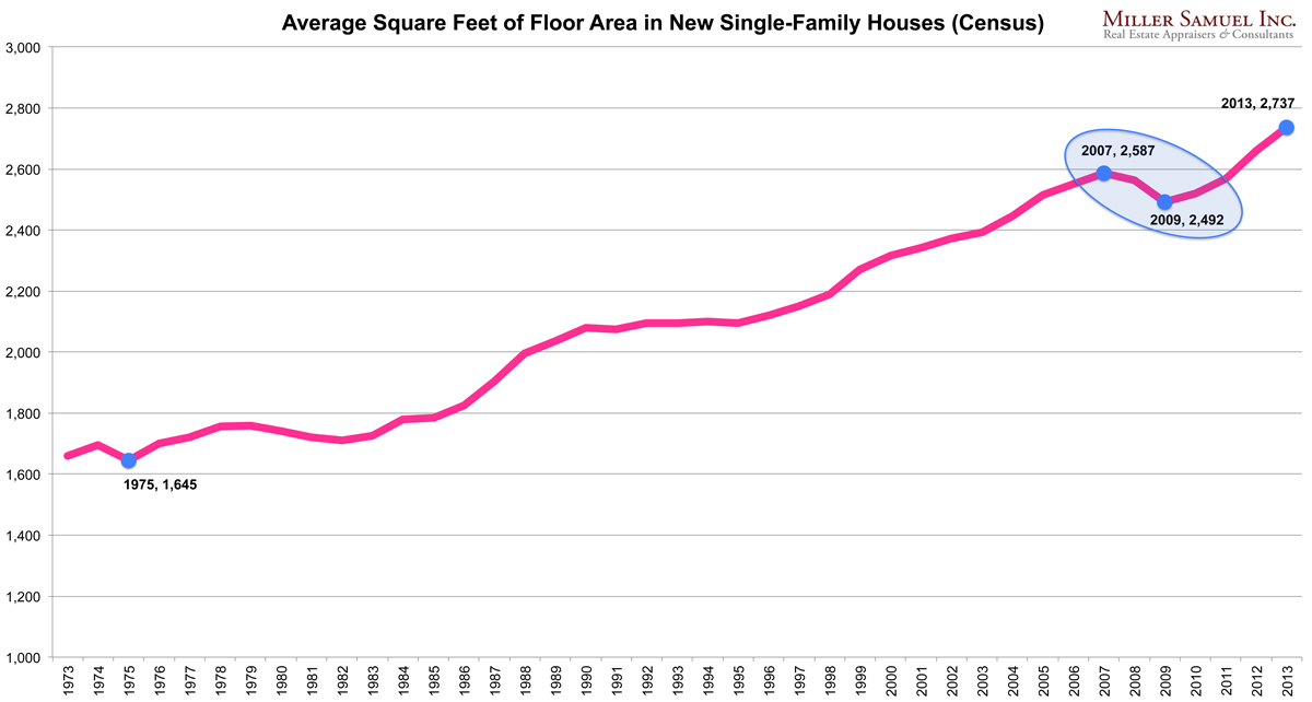
Trends in Home Size and Home Ownership React to Economic Conditions, Not Taste

June 9, 2014 | 11:42 am | Charts |

With big swings in housing related trends over the past decade, long term patterns are called into question. When a long term trend seemingly changes direction, it is reasonable to point it out. As I opined previously, the housing industry often defaults to linear thinking. It’s not enough to point out a trend, it is better to proclaim that the trend will run indefinitely because consumer tastes have changed.

Here are a few examples of trends in the US housing market that are not trends:

Average New Home Sale Size

matrixSQFT-6-9-14

[click to expand]

When the housing bubble popped in 2006, shortly after it was pronounced that the multi-decades long trend would reverse it self. Yet the change was a purely short term economic shift as the entry level surged with the sharp decline in mortgage rates. After a few years, the trend of expanding sizes resumed. I’m not saying that the trend will run indefinitely larger, but it is important to look at why the average square foot began to fall in the first place. A harsh economic condition with a rapid rise in affordability prompted in a shift in the mix. And remember, this highly referenced metric reflects new homes which is only about 15% of normalized housing sales.

Here is the housing conversation on home sizes from 2007-2011.

Home Ownership matrixHO-6-9-14

[click to expand]

Perhaps one of the largest misinterpretations of consumer trends has been on the subject of homeownership. As is evident in the chart, the heavily documented push to higher homeownership played was a sudden burst rather than a long term gradual change. The surge in the trend was artificial, based on fraud and unsustainably loose credit conditions that where based on NOTHING. With the multiyear decline, we are beating ourselves up over the decline in the homeownership rate yet we are reverting to the mean since credit is unusually tight. In fact the median homeownership rate of 64.8 over the past 49 years is exactly where we are right now in 1Q14. Will the market overcorrect towards rental? Yes I believe it will until tight credit conditions resume to more historic norms.

Here’s terrific takedown of the homeownership metric by Jed Kolko, Chief Economist at Trulia.

Will the US become a nation of renters and micro-houses? If one makes those arguments out over the long term, I don’t know what compelling information those trends would be based on.

Tags: ,


Manhattan Home Sales Are NOT 80% All-Cash (They Are 45%)

May 17, 2014 | 11:04 am | | Favorites |

Actually, overall Manhattan Home Sales are 45% All-Cash. I want to make sure that the 80% number doesn’t become embedded in our housing market mindset.

1q14manhattanCASH
[click to expand]


I’ll explain.

Recently a friend passed along a post in the Washington Post titled: 8 in 10 Manhattan home sales are all-cash and my jaw dropped. The author, who I am a fan of, got this information from Realtytrac, who I am also a fan of, but I knew it was either wrong or misinterpreted.

Over the years I’ve played around with NYC mortgage data, usually incomplete and very dirty, from various sources and have combined that with frontline feedback from our own experience as appraisers, as well as from real estate brokers and lenders. I had come to the conclusion that roughly half of Manhattan home sales (co-op, condo & single family) were probably all-cash and condos are definitely well over 50%. I used the logic that foreign and high-end buyers are a large part of the all-cash market, especially within the new development space. And it makes sense – while condo end loan financing is tight, new development condo end loan financing is beyond tight.

The reason the Realtytrac 80% figure jumped out at me was the fact that co-ops account for about 60% of sales and have the highest concentration of entry level and middle class demographics in Manhattan. I was very skeptical that virtually all the market-majority co-op buyers were paying all-cash, especially in the tepid economy we are stuck with.

So I reached out to Daren Blomquist, Vice President at RealtyTrac who is often the point person on their data releases. I indicated that the 80% figure seemed off and wondered if it excluded the co-op market. It didn’t. However even an 80% all-cash share for only single family and condo sales seemed like a stretch. He said he would look into it and within an hour they could see an issue with their co-op data feed. They were already working on the issue (and why I like Realtytrac). He shared their 1Q14 Manhattan information (I omitted the suspect co-op data) and here are the key numbers:

Their Results
All-Cash Condo Sales 60.78%
All-Cash Single Family Sales 73.08%

I came up with a new methodology, which looked at the ratios seen in Douglas Elliman sales – the largest real estate brokerage company in Manhattan – with a sales mix is generally consistent with the overall market mix and applied their results to the overall market, and I saw this:

Our Results
All-Cash Co-ops 36% (no revised Realtytrac results yet)
All-Cash Condos 58% (similar to Realtytrac’s 60.78%)

I didn’t have the single family (fee simple) results compiled so I went with Realtytrac’s 73% because: their fee simple (condo) data was consistent with ours, the single family market is skewed much higher price-wise than the condo market (i.e. skewing towards cash buyers) and the single family market share is very small. In fact the market share is so small that the overall 45% all-cash ratio wouldn’t change unless I dropped the single family market share down to 6% from 73% but even then the overall cash ratio would only drop to 44% from 45% – so you get my point (my apologies for the excessive wonkiness on this but it was necessary).

As a result and represented in the table at the top of this post, it is reasonable to say that the overall Manhattan all-cash home sale market in 1Q 2014 was 45% of all residential sales. Got it?

Tags: , , , ,


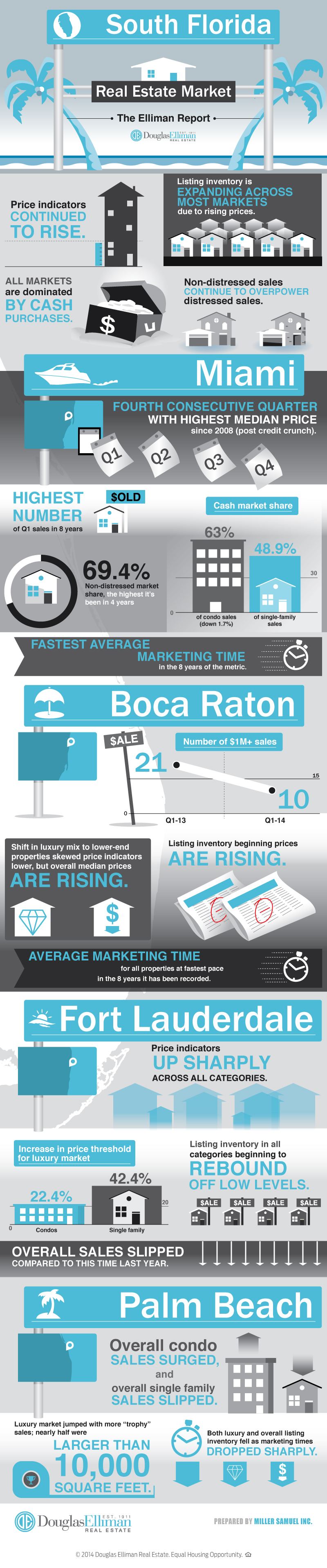
[Infographic] Getting Graphic in South Florida in 1Q 2014

April 18, 2014 | 4:30 pm | | Infographics |

Here’s a jumbo infographic from Douglas Elliman covering the findings of the four market reports in South Florida we prepare for them. Thank goodness Matrix can handle super tall images.

1q14infographicelliman-florida


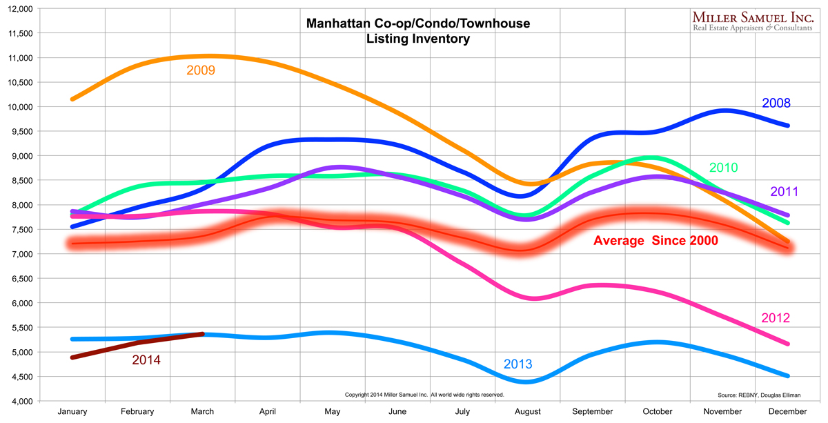
[Chart] Manhattan Co-op/Condo/Townhouse Monthly Listing Inventory Remains Woefully Low

April 3, 2014 | 9:00 am | Charts |

No meaningful rise in inventory in the last 3 months overall supply appears to be leveling off per the recently released 1Q14 Manhattan sales report we authored for Douglas Elliman.

1q14manhattan-inventorybymonth
[click to expand]

Manhattan Co-op/Condo Market Charts [Miller Samuel]

Tags:


[Infographic] Manhattan Sales Market 1Q14

April 1, 2014 | 5:28 pm | | Infographics |

Here’s our first professional infographic of my market research for Douglas Elliman. It covers the just released Elliman Report: Manhattan Sales 1Q 2014. Here was my recent attempt at a hand-made infographic covering another topic using Excel.

Manhattan Market Report Infographic


NY Fed: New York City and State Expanding at “Brisk Pace”

March 21, 2014 | 5:03 pm | |

03-14nyfedcoincident
[click to view report]

The Federal Reserve Bank of New York uses a coincident index to track the New York, New Jersey and New York City economies.

They define a coincident index as:

“A coincident index is a single summary statistic that tracks the current state of the economy. “

The Fed results share no analysis but state:

Our Indexes of Coincident Economic Indicators (CEI) for January show economic activity expanded at a brisk pace in New York State and New York City, but was essentially flat in New Jersey.

Tags: , , ,


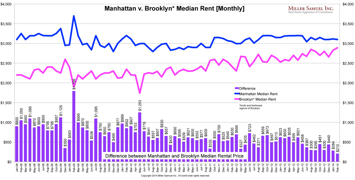
[Chart] The Manhattan-Brooklyn Median Rental Price Smackdown

March 15, 2014 | 1:57 pm | | Charts |

2014-2MBmedianspread

The rental price spread between Brooklyn and Manhattan is narrowing. At $210, the month of February saw the lowest differential between the median rental price of Manhattan and Brooklyn’s North and Northwest regions.

While Manhattan rents have leveled off, Brooklyn rents have continued to rise sharply – a combination of rising demand as well as a shift in the mix towards luxury rentals.

A decade ago, who would have thought we’d be talking about Brooklyn this way?

Tags:


Housing Starts Drop: Whether the Weather or New Trend?

February 20, 2014 | 12:21 pm | TV, Videos |

Yesterday I did a quick interview for CNBC at 30 Rock (right next to the new Tonight Show/Jimmy Fallon set which was all abuzz). We were talking about housing starts before they were released. While predicting this stuff is a fool’s errand, I think the bigger question was whether the recent weakening of housing metrics was a new trend or a pause caused by the harsh weather creating havoc across the US.

NAHBconf2-14

The NAHB homebuilder sentiment index (1 family) posted its largest one month drop in history – severe weather, cost of labor, materials and land with given as reasons but those really aren’t new issues other than the severe weather.

While weather played a role and probably amounts to more of a short term blip, I think the larger concern is the outlook over the next 6 months with reduced affordability (higher rates but still historically low) and the bottoming of existing home inventory in 2013 providing additional listing competition in some markets.

December housing starts
• 999k annualized and seasonally adjusted rate in December, declining 9.8% but exceeding forecasts. More weakness in multi-family starts than 1-family • +18.3% 2013 over 2012

Why I thought January Housing Starts would fall (luckily I was right with the announcement of a record 16% drop) • Same factors in place as last month: Weather, Labor and Material Costs and Land Costs. • Record m-o-m drop in NAFB confidence – looking out over the coming months – suggests a larger impact by weather. • Mortgage rates slipped from last month but still nearly a point higher than a year ago, expectation of flat or edging higher in 2014. • Implementation of Dodd-Frank Qualified Mortgage (QM) may also drag viewing traffic. • Permits already fell over last 2 months which suggests lower starts (contracts versus closed sales analogy).

Actual January housing starts release after my interview
880K annualized rate in January, dropping 16% from December 2013. • January 2014 y-o-y dropped 2%. • Permits fell for 3rd consecutive month, down 5.4% from prior month (seasonally adjusted).

STILL – the question REALLY is whether the recent construction slowdown is the beginning of a trend or a temporary set back that will clear over the next few months as the weather improves and the economy shows some improvement. Right now it feels more like the market is losing momentum and the weather is only making it worse.

Tags: , , , , , ,


On Bloomberg TV, Surveillance w/Tom Keene 3-11-13: Housing, Mortgages, Rising Prices

March 11, 2013 | 11:46 am | | Public |

Had a great visit with Tom Keene this morning on Bloomberg TV’s Surveillance along with Scarlet Fu and Sara Eisen. It was simulcast on Bloomberg Radio.

Also in studio was James Lockhart, vice chairman of WL Ross & Co., formerly the head of GSE regulator FHFA. We were also joined by Nicolas Retsinas, a senior lecturer in real estate at Harvard Business School who called in – he has been on my old podcast a few times. Both provided great insight to the housing narrative.

Here’s the second clip from the same session. My basic premise is that while new home sales are rising, it will not be enough to address the collapse of listing inventory which will drive housing prices higher in the US. Hint: It’s mostly about tight credit. Housing is local and credit is national.

Tags: , , , , , , , ,


Serious Jibber-Jabber: Lessons from Nate Silver to Filter Out Housing Noise

December 10, 2012 | 7:00 am | TV, Videos |

I really enjoyed this “Charlie Rose”-like interview by late night TV host Conan O’Brien and statistician Nate Silver on his “Serious Jibber-Jabber” series. I recently bought Nate’s book “The Signal and the Noise: Why Most Predictions Fail but Some Don’t” and it’s next on my reading list (actually I bought 2 copies because I forgot I had pre-ordered on Amazon for Kindle and ordered again from Apple iBooks, Doh!).

What I found intriguing about the discussion is how much effort it takes to filter out the noise and get the to meat of the issue as well as getting outside of your self-made insulated bubble to be able to make an informed decision – aka neutrality.

Real estate, like politics, is a spin laden industry whose health is very difficult to gauge if you rely on people and institutions who have a vested interest in the outcome. i.e. Wall Street, rating agencies, government, banks, real estate agents etc.

Some interesting points made:

  • During the bubble, for every $1 in mortgages, Wall Street was making $50 in side bets.
  • Many people during the housing boom saw it was a bubble but didn’t want to miss out. They would see the green arrows pointing up on CNBC screen and it became very hard to be contrarian and be left behind.

The current “happy housing news” that is all the rage seems to draw a parallel with the pundits who got the election outcome all wrong yet all were experienced in politics. The housing herd is disconnecting from what the data is showing.

Tags: , , ,


[Commerce Dept] US Housing Starts May 2010

June 17, 2010 | 7:30 am |


[click to expand]

May housing starts, seasonally adjusted, fell sharply with the expiration of the tax credit – signed contract by April 30. No surprises here. I suspect we’ll see similar levels for a few months. The tax credit likely “poached” sales from future months rather than jump start the housing market.

Privately-owned housing starts in May were at a seasonally adjusted annual rate of 593,000. This is 10.0 percent (±10.3%) below the revised April estimate of 659,000, but is 7.8 percent (±9.7%) above the May 2009 rate of 550,000. Single-family housing starts in May were at a rate of 468,000; this is 17.2 percent (±7.9%) below the revised April figure of 565,000. The May rate for units in buildings with five units or more was 112,000.

I’ve long marveled at the stats in this report (sarcasm) – notice the margin of error in the above paragraph. Still, it’s the standard reporting method for new housing starts.

The chart above is intended to provide perspective to any month over month gains. The peak for housing starts was January 2006 at $2.3M annual starts, 3.8 times the seasonally adjusted annualized rate.

NEW RESIDENTIAL CONSTRUCTION IN MAY 2010 [U.S. Department of Commerce]


Tags: ,

Get Weekly Insights and Research

Housing Notes by Jonathan Miller

Receive Jonathan Miller's 'Housing Notes' and get regular market insights, the market report series for Douglas Elliman Real Estate as well as interviews, columns, blog posts and other content.

Follow Jonathan on Twitter

#Housing analyst, #realestate, #appraiser, podcaster/blogger, non-economist, Miller Samuel CEO, family man, maker of snow and lobster fisherman (order varies)
NYC CT Hamptons DC Miami LA Aspen
millersamuel.com/housing-notes
Joined October 2007