Skip to content
Services
Appraisals
Consulting
Resources
Market Reports
Charts
Matrix Blog
Articles & Research
Press
About
get in touch
Charts
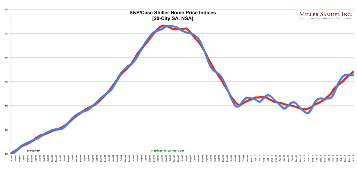
› S&P/Case-Shiller Home Price Indices
August 31, 2014
Blogging Off The Matrix
,
Bloomberg View
,
Charts, Maps, Images, Infographics, Video
,
Housing Trends & Cycles
Bloomberg View Column: Understanding Housing’s Dog Days
read more
July 31, 2014
Blogging Off The Matrix
,
Bloomberg View
,
Housing Indices & Portals
My Bloomberg View Column: Housing Data Is Old and Moldy
read more
June 25, 2014
Bloomberg News
,
Housing Indices & Portals
,
Manhattan
,
Market Reports
,
Media
,
New York City
Bloomberg Surveillance TV – Guest Host 6-25-14
read more
June 24, 2014
Analysis & Research
,
Charts, Maps, Images, Infographics, Video
,
Housing Indices & Portals
,
Housing Trends & Cycles
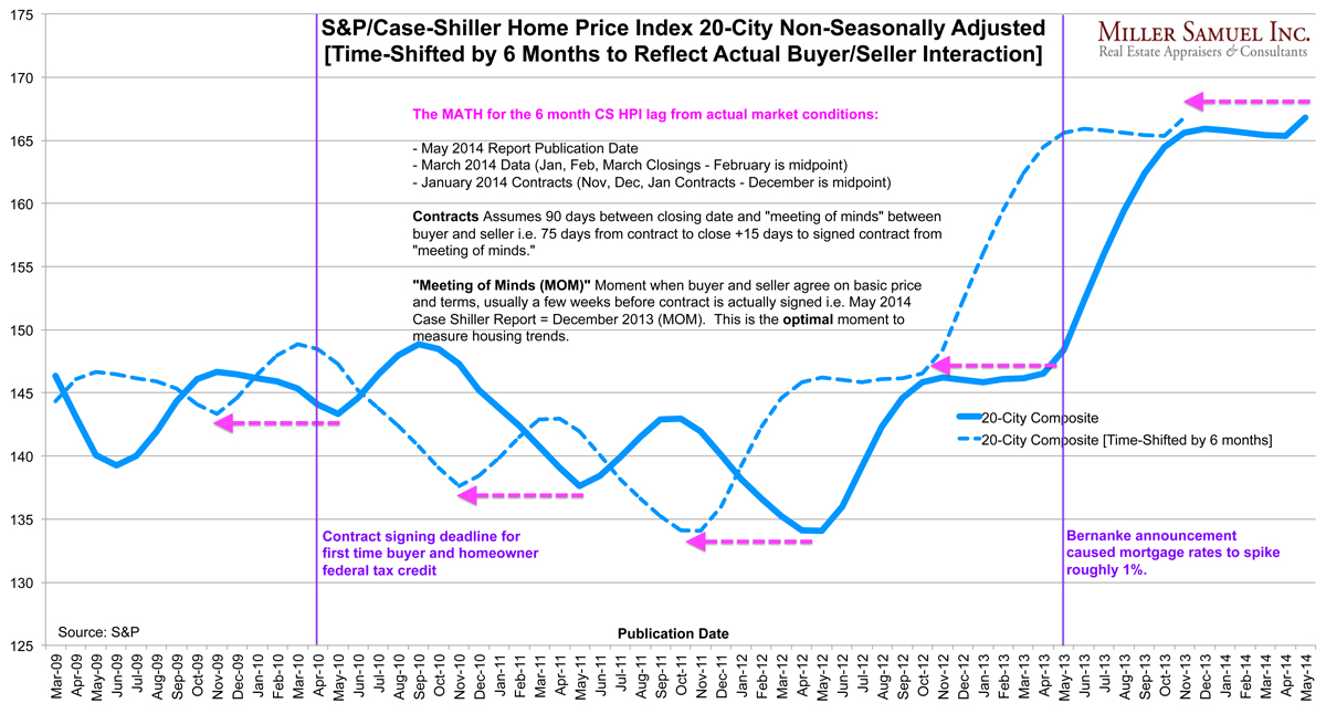
Time-Shifted Case Shiller: Dallas, Denver Crushing it, Polar Vortex a Non-Issue ‘Cause It’s Still December
read more
May 27, 2014
Historical, Landmark, Milestone
,
Housing Indices & Portals
,
Housing Trends & Cycles
,
Junk Statistical Analysis, Luck, Superstition and Coincidence
Pulling the Case-Shiller Index Back by 6 Months to Reflect Actual Buyer/Seller Behavior
read more
Page load link
Go to Top