 [click to expand]
Thoughts
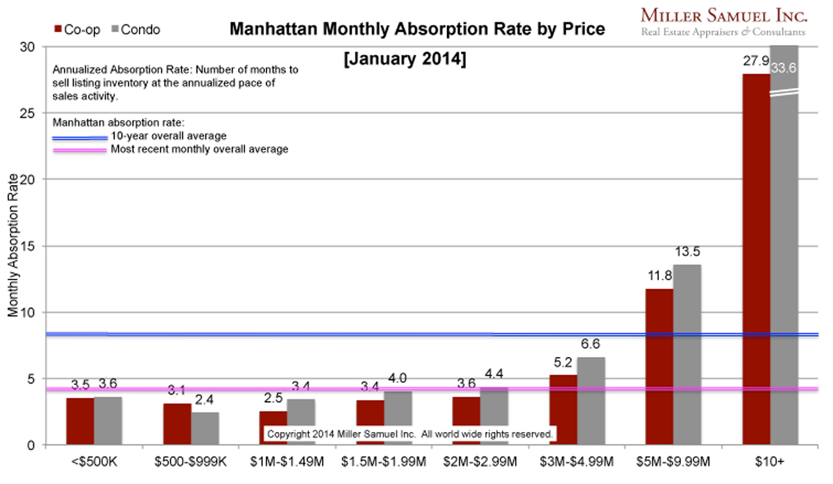
For the overall Manhattan Market, in fact for the “Bottom 99%” (I love saying that) of the market, the absorption rate is well below the year ago period. Record high sales and record low inventory has pressed the absorption rate to the floor. For the $10M+ market (top 1%) the absorption rate has slow sharply from a year ago. While this segment has always been a LOT slower than the market overall (see archives below), it has slowed considerably. The next highest segment $5M-$10M has essentially remained the same with the remainder of the submarkets seeing much more rapid absorption rates over the same period. All regions saw similar changes from the year ago period.
Side by side Manhattan regional comparison:
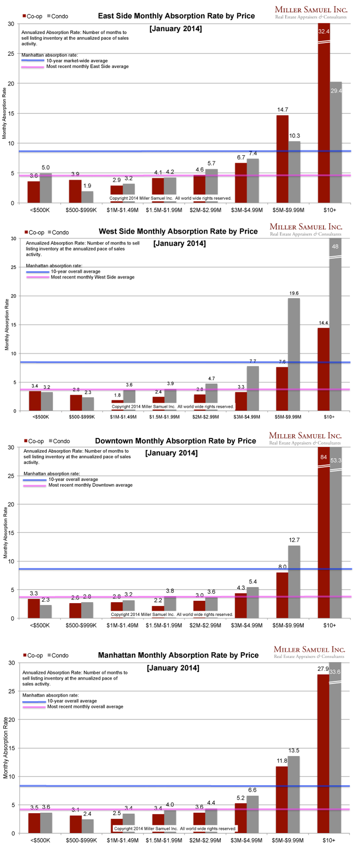
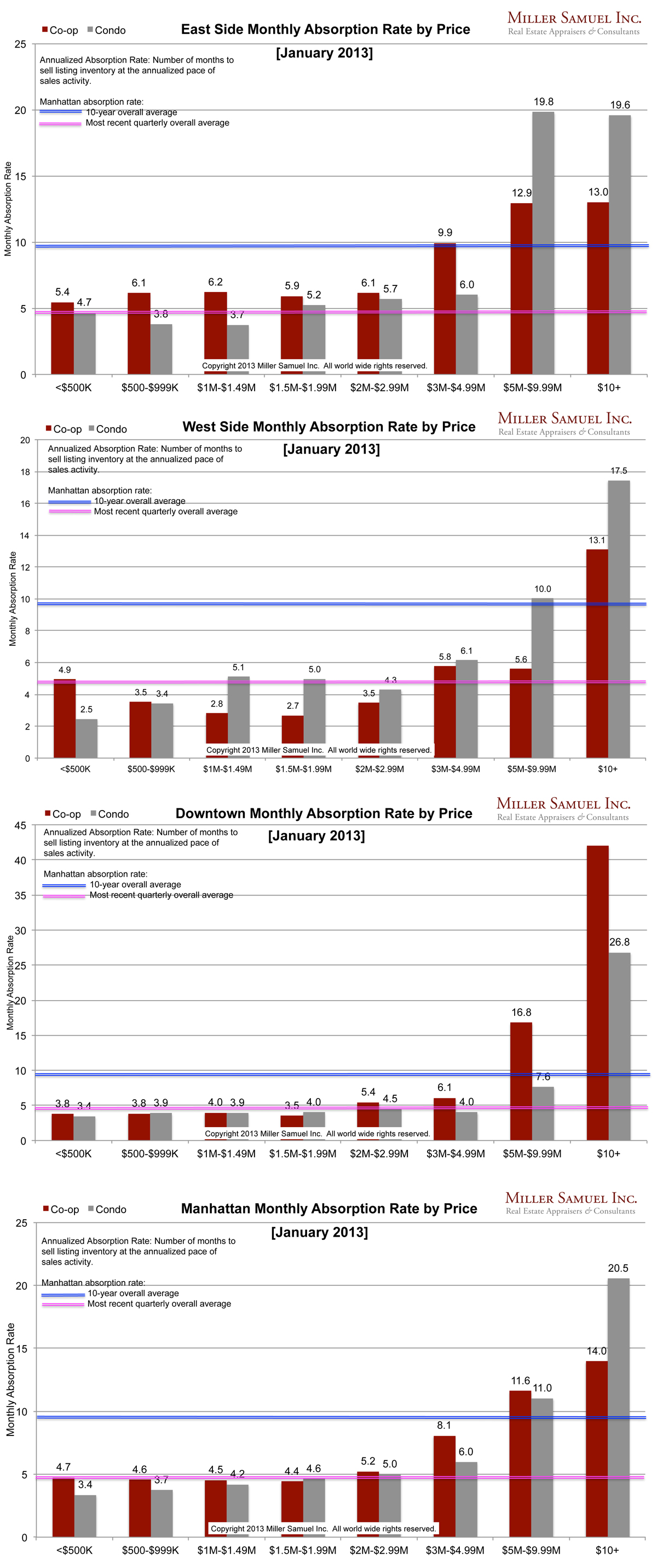 [click images to expand]
I started this analysis in August 2009 so I am able to show side-by side year-over-year comparisons. The blue line showing the 10-year quarterly average travels up and down because of the change in scale caused by some of the significant volatility seen at the upper end of the market. The pink line represents the overall average rate of the most recently completed month for that market area.
Definition
Absorption defined for the purposes of this chart is: Number of months to sell all listing inventory at the annual pace of sales activity. (The definition of absorption in our market report series reflects the quarterly pace – nearly the same)
_______________________
Manhattan Market Absorption Charts 2013 [Miller Samuel] Manhattan Market Absorption Charts 2012 [Miller Samuel]