Getting Graphic is a semi-sort-of-irregular collection of our favorite BIG real estate-related chart(s).
Click here for an interactive graphic.

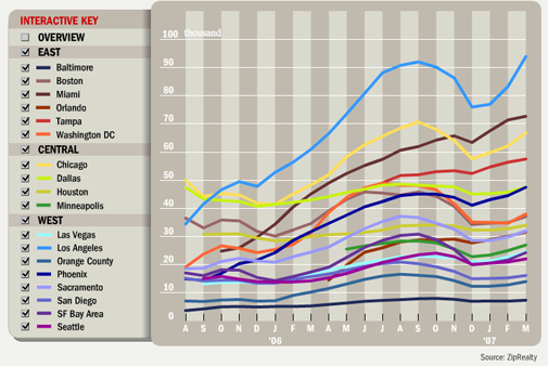
In the national market, inventory increased this month [WSJ] (free version) according to ZipRealty, which is normally “normal” except that this time, the increase was unusually high. Of course, I have no idea what the actual inventory levels are from ZipRealty because there are no numbers in this article. The reader has no sense of the size of the sample or how representative ZipRealty is of the market.
These stats are 100 percent, ahem, percent-driven.
NAR reported 3.748M houses for sale in February, up 5.9% from January so 6.5% in March by ZipRealty doesn’t really seem that inconsistent with what we are already seeing.
If we accept that ZipRealty represents the market as a whole (which I am pretty sure it doesn’t), the reasoning was given that consumers feel it may take longer to market a property with higher inventory (very logical) so the houses are coming on the market a little sooner. However the Credit Suisse 22 year average of 1.7% increase over this period would contradict this theory since there have been plenty of periods with excess inventory over the past two decades. Something has got to be wrong with the CS stats – they strike me as severely understated.
Of course the other side of the coin to this argument is that sluggish sales levels are allowing inventory to back up. I am on the fence on this one, perhaps leaning toward the former and “buy” into the argument that sellers are anticipating longer marketing
times.
In Manhattan, the situation is the opposite as of late as indicated in my market survey, with inventory levels slipping, despite the fact the market is entering the spring selling season.
3 Comments
Comments are closed.
If you take a look at the WSJ graph and mouse over each geographic area, the actual # of homes for sale is displayed for each area.
In my local market there has been a SURGE of new listings on the market. As an ex-realtor, I surmise that hungry realtors have been busy getting listings. However, without the cash rich Californians, sellers are looking at local buyers, and affordability is still an issue. Over the past 6 months the sales price to list price ratio has averaged 85%, appreciation has been mostly flat, and there’s still 12 months worth of inventory to work through. Realtors may have been busy getting sellers to list, but they may be disappointed if they can’t bring the buyers in.
The number of listings are going up in Minneapolis and St. paul but just like last year the number of sales are down. I have some chars of my own. A red line for listings which it headed in an upward direction and a blue line for sales which is flat or going down. The gap between the two lines says buyers market.