Getting Graphic is a semi-sort-of-irregular collection of our favorite BIG real estate-related chart(s).
Click here for full sized graphic.
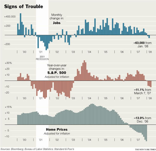
In David Leonhardt’ page 1 NYT front and center was an awesome chart which shows the trouble the economy is in. Jobs, financial markets and housing – that pretty much sums it up.
>Most American households are still not earning as much annually as they did in 1999, once inflation is taken into account.
>Over the last year, the number of officially unemployed has risen by 500,000, while the number of people outside the labor force — neither working nor looking for a job — has risen by 1.3 million.
>Employment has risen by 100,000, but even that comes with a caveat: there are also 600,000 more people who are working part time because they could not find full-time work, according to the Labor Department.
David’s article is based on the premise that the good times weren’t really of substance. Consumers as a force in the economy were driven by tapping their home equity. Their home equity was increased artificially because of easy credit. Ready credit enabled greater corporate revenues, mergers, etc. which made the financial markets happy.
Without liquid credit markets, employment weakens, housing slips and the financial markets are in turmoil.
Case in point:
>The median household earned $48,201 in 2006, down from $49,244 in 1999, according to the Census Bureau. It now looks as if a full decade may pass before most Americans receive a raise.
Although housing is generally considered a trailing economic indicator, it is in sync with jobs and the financial markets.
One Comment
Comments are closed.
Wow this data is startling. I have been looking for a good chart / graph that shows clearly where we are headed.
Thanks for the post.