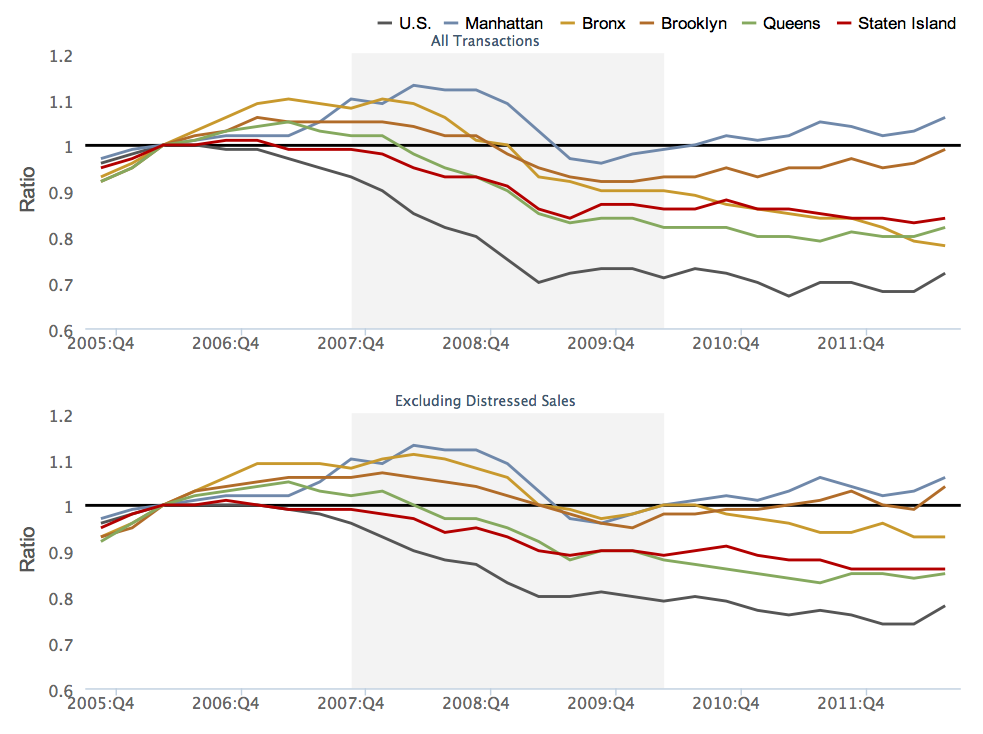
The Federal Reserve has been relying more on CoreLogic housing data these days, rather than Case Shiller or NAR and I’m down with that. The New York Fed has put the CoreLogic data for New York, Connecticut and New Jersey to good use in a very easy to use interactive County format that I highly recommend you check out. They even present a two-fer: all sales, without distressed sales.
My only criticism of the presentation (and it’s really me just being petty) is the orientation to market peak in 2006 as the benchmark. I see the 2006 peak as an artificial level we should not be in a hurry to return to since it reflected all that was bad with the credit/housing boom.
But I digress…
The top chart shows that Manhattan and Brooklyn after removing distressed sales, have “recovered” using the Fed’s methodology. In fact all 5 boroughs are out-performing the US housing market.
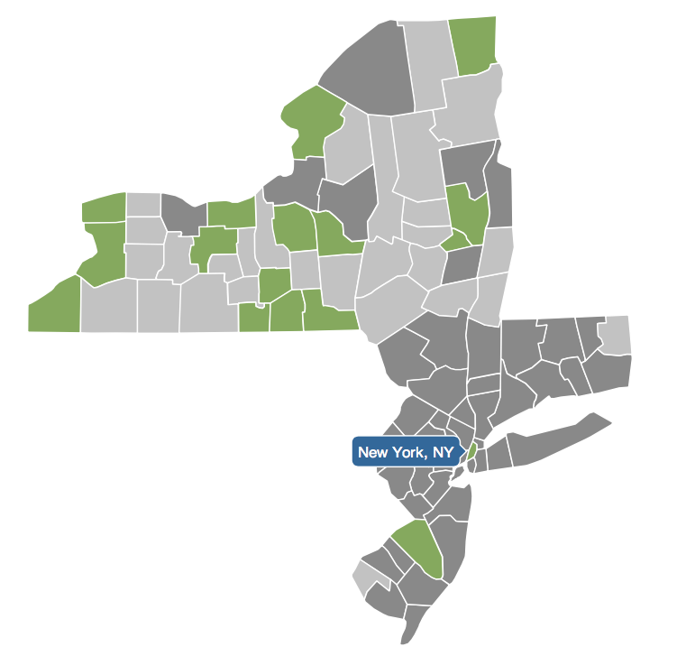
Manhattan is clearly one of the top performing locations in the region or at least it is ahead of the region. The map below shows the counties (green) that are now equal to 2007 price levels. Not many in close proximity to Manhattan are doing as well.
_______________
Housing Market Recovery in the Region [Federal Reserve Bank of New York]


