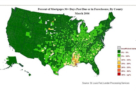
The WSJ presented a series of charts on US distressed properties based on information from the St. Louis Fed (most proficient data generators of all Fed banks) and LPS.
Here are the first and last maps of the series. To see all of them, go to the post over at Real Time Economics Blog at WSJ.
A few thoughts:
* The distress radiates out from New Orleans 7 months after Hurricane Katrina hit. There was relatively tame distressed sales activity in the US in 2006, the peak of the US housing boom.
* The article makes the observation that distressed activity is seeing some improvement in 2010. However the “robo-signing” scandal hit (late summer 2010) and distressed activity entering the market fell for the next 18 months as servicers restrained foreclosure activity until the servicer settlement agreement was reached in early 2012. This is likely why the distressed heat maps show some improvement.
* The music stopped when people couldn’t make their payments en mass circa 2006, the US national housing market peak. It’s quite astounding how quickly credit-fueled conditions collapsed across the US.


