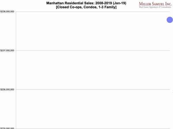
With all the hubbub about the new Manhattan residential price record of $238 million and potential ramifications, I wanted to create a chart to give readers a sense of how disconnected this sale is from the prior records, and from housing prices for mere mortals in already one of the highest priced housing markets in the U.S.
I have done this before, first in 2012 when the famed $88 million penthouse sale at 15 Central Park West launched the global “super luxury” “aspirational pricing” phenomenon and the subsequent 2014 Michael Dell penthouse sale at One57 of $100.5 million.
But this time, given that this new sale would require a chart that was more than double the height of the 2014 chart, I could not find an affordable graphics app that could capture my Excel chart but create an image (png, jpg, etc.) with small enough resolution to be legible, yet still be small enough in size to be accepted by WordPress.
My solution? Make a screencast video.
To watch this, first, pack a lunch. Then, click here or on the snapshots below of the top and bottom segments of the tall chart to play the video.
Then relax and watch me start scrolling. It provides some useful context and is pretty cool despite the poor audio quality:
/////////////////////////////////////////////////////////////////////////////////////////////////////////////////////////////////////////////////////////


