Visual Capitalist created a terrific infographic of 41 cities around the globe comparing the outbreak trend against the commuter activity trend. Incredible
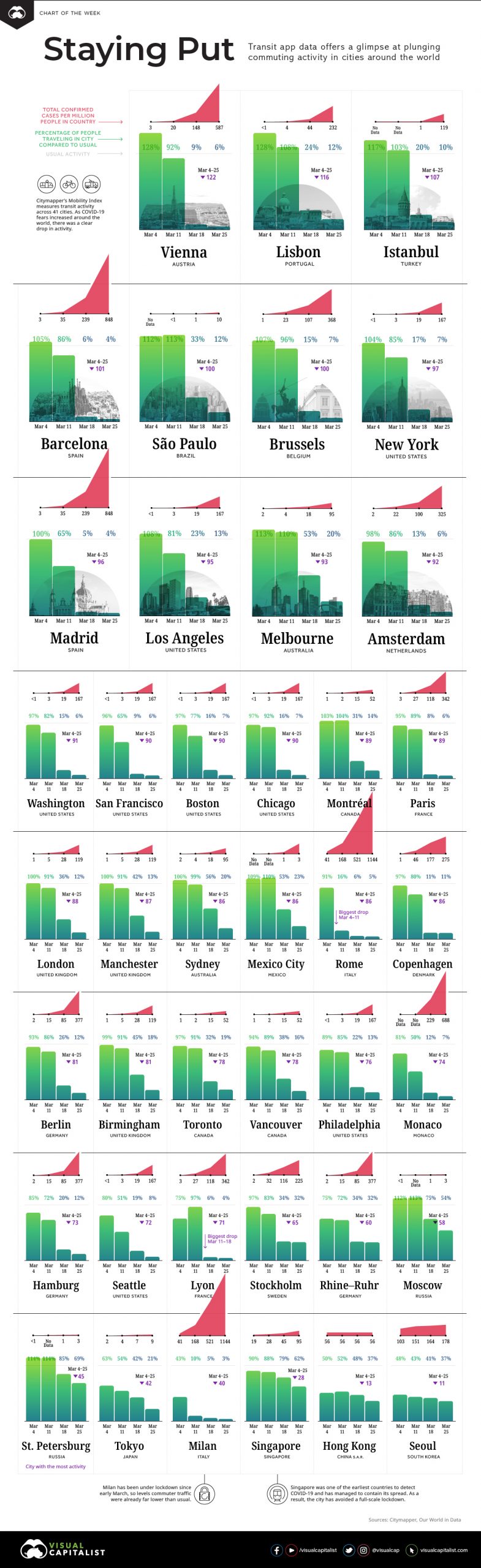
Visual Capitalist created a terrific infographic of 41 cities around the globe comparing the outbreak trend against the commuter activity trend. Incredible
21 West 38th Street, 15th Floor New York, NY 10018
© Miller Samuel Inc. 2024 • All Rights Reserved • Website by BlankSlate