My first rotating gif!
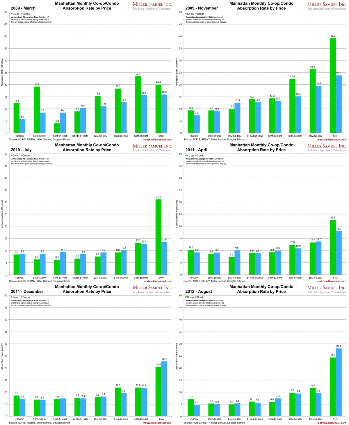
Geekcitement aside, I placed 42 months worth of charts into one graphic to show the ebb and flow of the market. The chart is based on the ongoing absorption releases here on Matrix. The charts reflect the number of months to sell all active listing inventory at the annualized pace of sales (closed) activity.
I deliberately did not make the GIF a loop so you can tell when it starts (3/09).
Refresh your browser to see it again.


