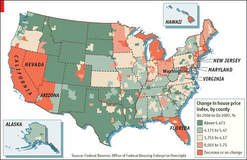
The Economist magazine appropriately named Map of misery article on US Housing showcases a map of OFHEO data that chronicles the change in housing prices by County/State.
>The pain of America’s housing bust varies enormously by region. Hardest hit have been the “bubble states”—California, Nevada and Florida, and parts of the industrial Midwest. The biggest uncertainty hanging over the economy is how red will things get.
Yesterday I joked about Bernanke using heat maps and The Economist saw the humor in it as well.
>Sounding more like a cartographer than a central banker, Ben Bernanke this week showed off the Federal Reserve’s latest gizmo for tracking America’s property bust: maps that colour-code price declines, foreclosures and other gauges of housing distress for every county. His goal was to show that falling prices meant more foreclosures, and to urge lenders to write down the principal on troubled loans where the house is worth less than the value of the mortgage. His maps—where hotter colours imply more trouble—also make a starker point. The pain of America’s housing bust varies enormously by region. Hardest hit have been the “bubble states”—California, Nevada and Florida, and parts of the industrial Midwest. The biggest uncertainty hanging over the economy is how red will things get.
But can a “bottom” be projected?
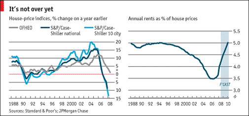
One of the most favored ways to measure a housing market by The Economist magazine is to track the ratio of rental prices to sales prices. From 1960 to 1995, rent/price was 5% to 5.5%. When prices soared over the last decade, the ratio is 3.5%. In order to get the ratio back up to 5%, prices have to drop 10% to 15% assuming rents are flat. It’s lookin’ like at least 2010 before this happens.
In terms of projecting when we will see an end to the weak housing market, try correlating it with handgun accuracy. NYC police officers hit their targets roughly 34 percent of the time. Of course, when they fire at dogs, roughly 55 percent of shots hit home.
5 Comments
Comments are closed.
Anyone care to correlate red/blue states with dumb mortgage holders? I think I see that the more blue a state, the more likely it has a mortgage delinquency problem.
Wouldn’t buyers be happy if prices dropped? Wouldn’t this make the map the opposite – green meaning lower prices, “good”, and red meaning higher prices, “bad”?
The map shows Eastern Massachusetts as “red”, or no price appreciation.
Prices within the city of Boston have stayed pretty constant.
What everyone wants, I think, is stable prices – so they feel more comfortable knowing what’s ahead.
To the commenter above, I don’t see how this has anything to do with “delinquency rates”. Maybe I’m misreading it?
And, I think no matter what the chart, it will always show Bostonians as “miserable”. It’s our constant mood.
Hey John – good to hear from you. There is a direct correlation between default rates and the level of appreciation. Default rates rise as the pace of appreciation cools, even if they are still rising.
Well, your sports teams are doing well, so perhaps that will elevate everyone’s moods!
So you are telling me that NYC cops shoot dogs!? gasp
I have to confess I found your site when i was looking for “Map of Misery” but actually i was looking for Missouri (misery/missouri – get it?? ) lol
Nevada has been turning around. So have parts of Arizona, although a large part of that is due to foreign buyers.