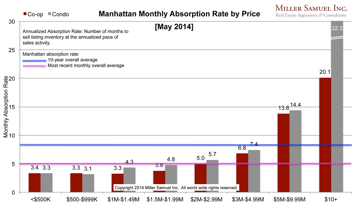
 [click to expand] Thoughts Not a significant change from a year ago. The absorption rate is generally a little faster than the year ago pace when you are talking about the sub-$3M market and a little slower from an already cooling rate above that threshold. Hi end condos – over $10M – are seeing a 32.3 month absorption rate which is extremely slow largely because of the new product entering the market.
Side by side Manhattan regional comparison:
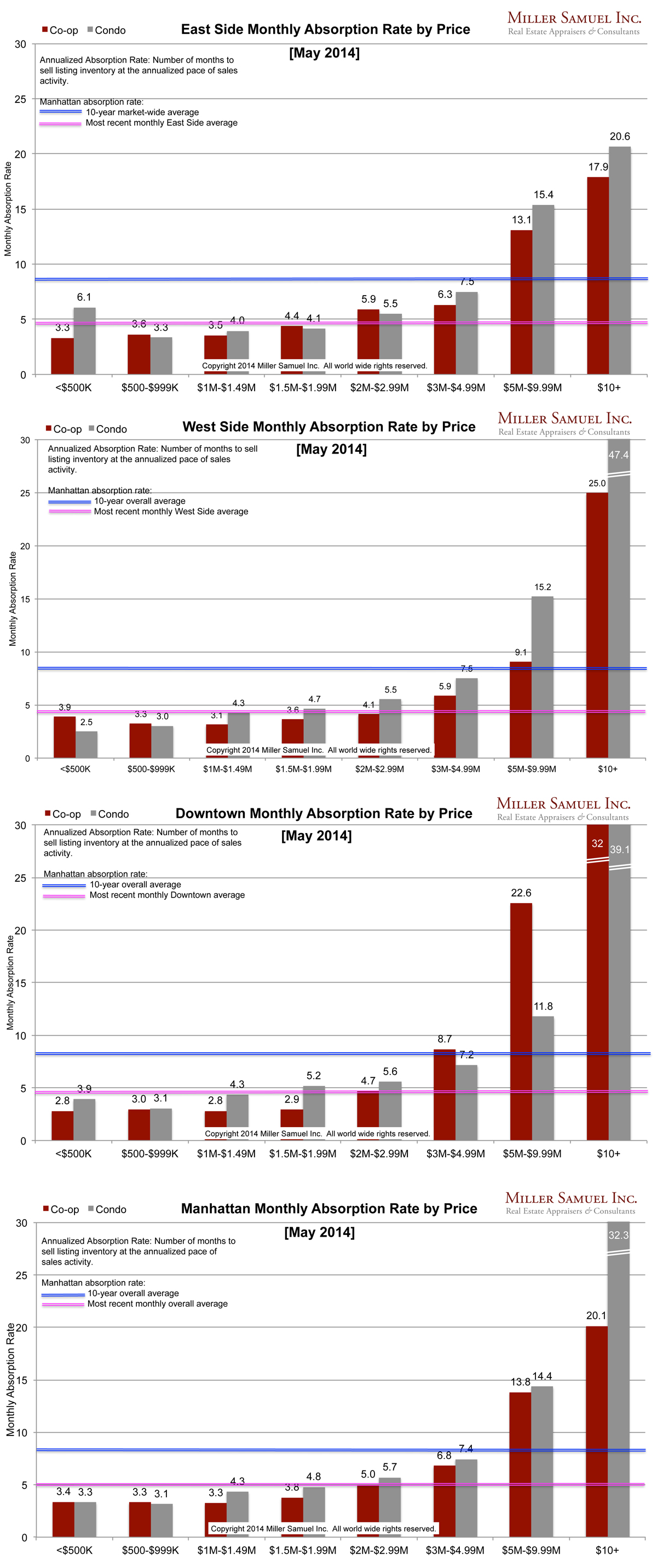
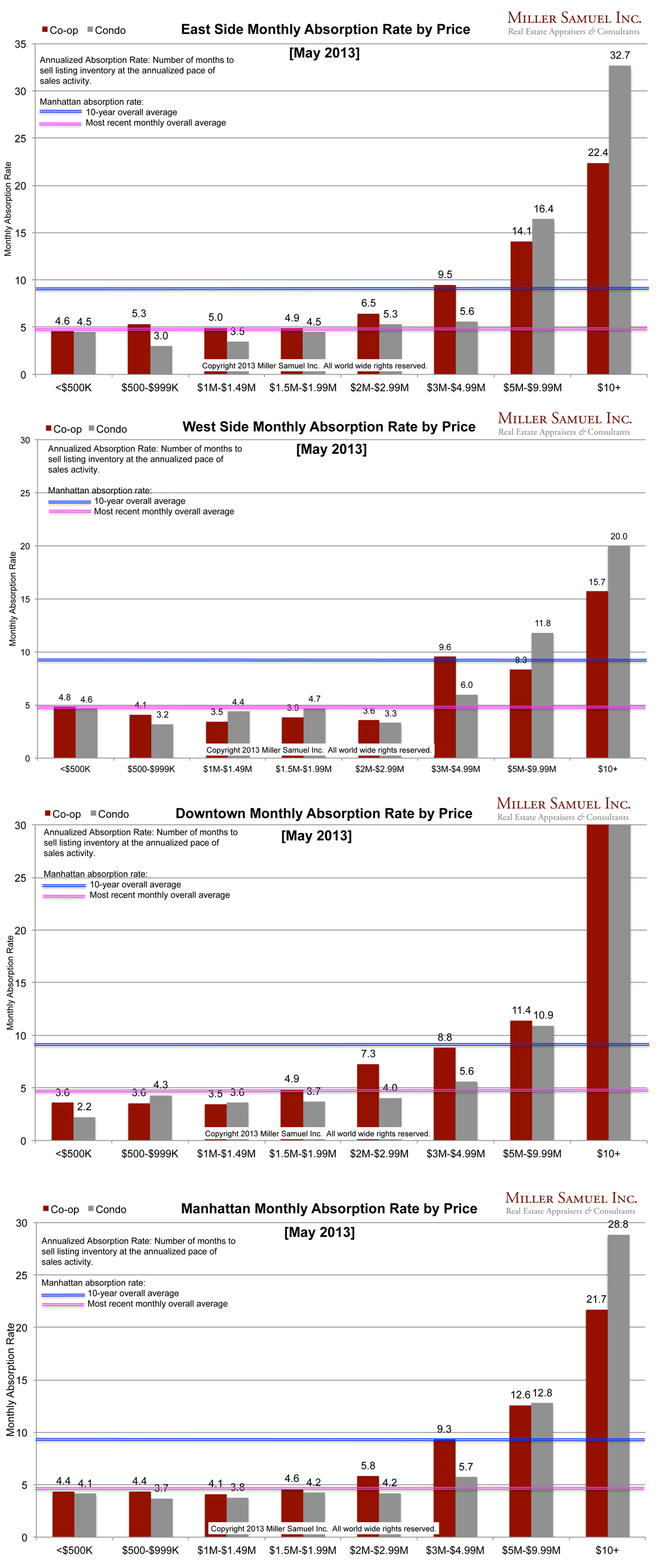 [click images to expand]
I started this analysis in August 2009 so I am able to show side-by side year-over-year comparisons. The blue line showing the 10-year quarterly average travels up and down because of the change in scale caused by some of the significant volatility seen at the upper end of the market. The pink line represents the overall average rate of the most recently completed month for that market area.
_______________________
Manhattan Market Absorption Charts [Miller Samuel]