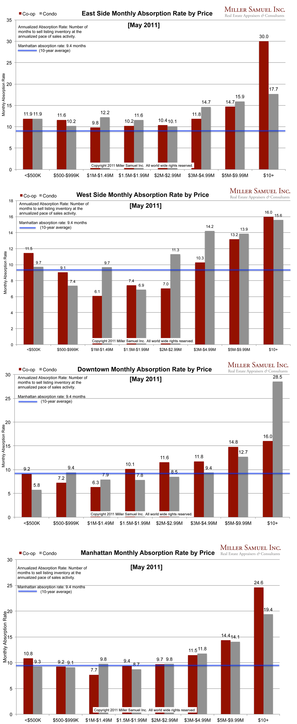
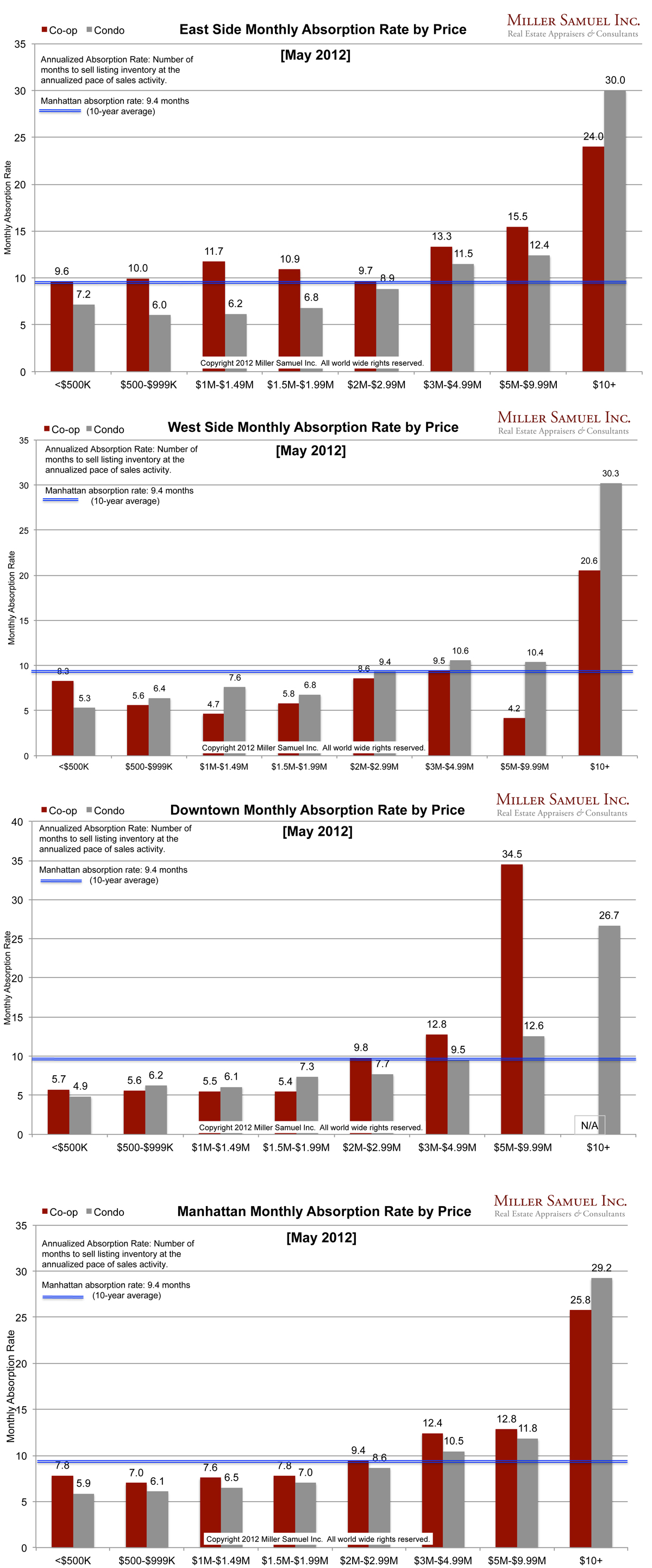
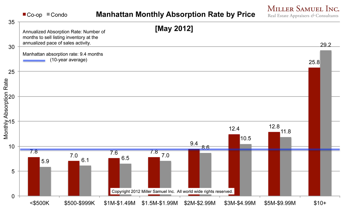
Absorption defined for the purposes of this chart is: Number of months to sell all listing inventory at the annual pace of sales activity. (The definition of absorption in my market report series reflects the quarterly pace – nearly the same)
I started this analysis in August 2009 so I am able to show side-by side year-over-year comparisons. The blue line showing the 10-year quarterly average travels up and down because of the change in scale caused by some of the significant volatility seen at the upper end of the market. The “blue” line for average changes very little year to year but the scale of the chart does frequently.
Side by side Manhattan regional comparison:


[click images to expand]
Thoughts on the year-over-year comparisons
* Manhattan All price segments below $3M experienced noticeable increases in pace of absorption – the lower the price segment that faster the pace.
* East Side Condo market continues to see faster pace.
* West Side Virtually all markets below $10M continue to accelerate pace.
* Downtown Below $3M moving faster, $5-9.9M
Note: This chart series does not include shadow inventory (properties ready for market but not yet listed for sale) so this analysis somewhat understates the pace of condo absorption. The Uptown (Northern Manhattan) data set is too thin for a reliable presentation.
_______________________
Manhattan Market Absorption Charts 2012 [Miller Samuel] Manhattan Market Absorption Charts 2011 [Miller Samuel]


