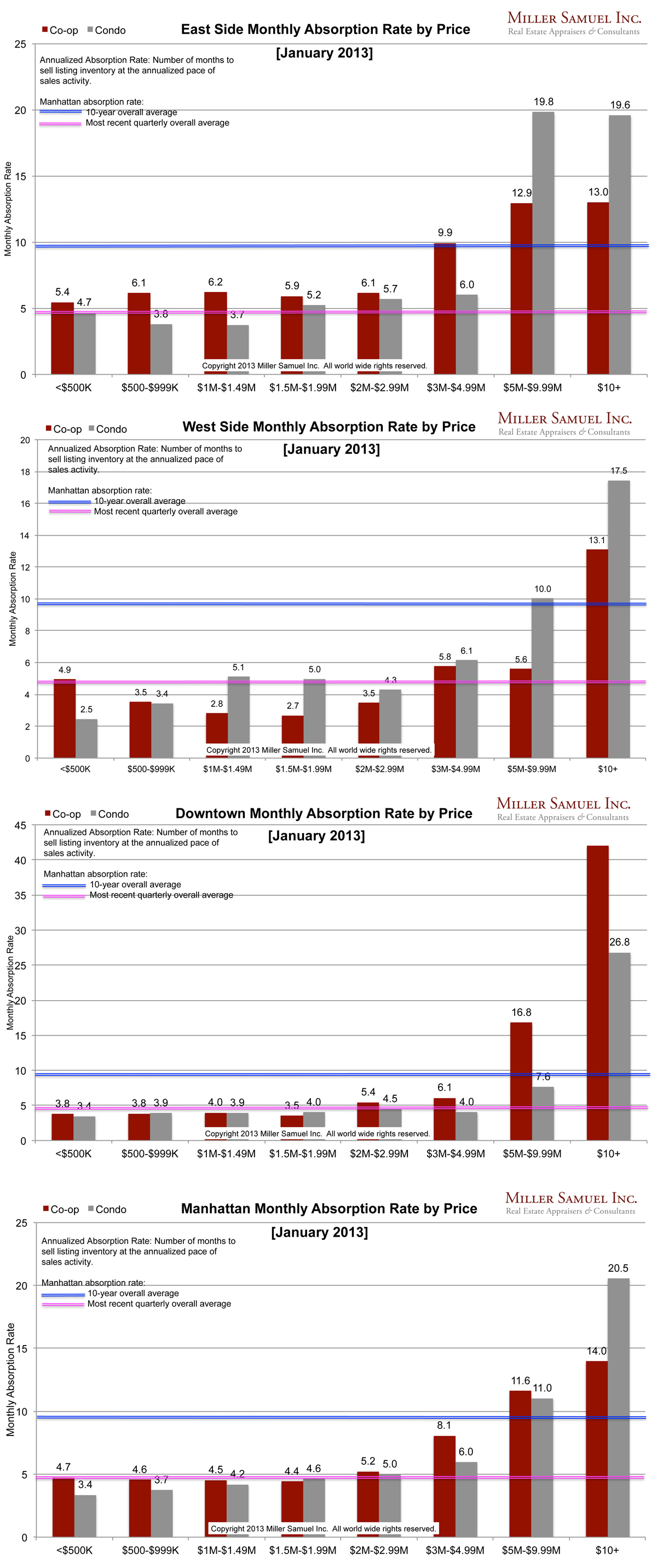
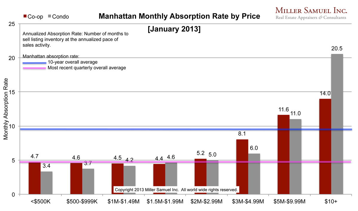
Absorption defined for the purposes of this chart is: Number of months to sell all listing inventory at the annual pace of sales activity. (The definition of absorption in my market report series reflects the quarterly pace – nearly the same)
I started this analysis in August 2009 so I am able to show side-by side year-over-year comparisons. The blue line showing the 10-year quarterly average travels up and down because of the change in scale caused by some of the significant volatility seen at the upper end of the market. The pink line represents the overall average rate of the most recently completed quarter.
Side by side Manhattan regional comparison:

 [click images to expand]
All market segments below $5M, which is roughly 95% of the housing market are seeing their fastest pace (lowest absorption rate) in the 12 years I’ve been tracking listing inventory.
_______________________
Manhattan Market Absorption Charts 2013 [Miller Samuel] Manhattan Market Absorption Charts 2012 [Miller Samuel]
One Comment
Comments are closed.


[…] the same time, buyers have been soaking up supply with renewed vigor, at the fastest pace in 12 years, Miller’s figures […]