Thoughts
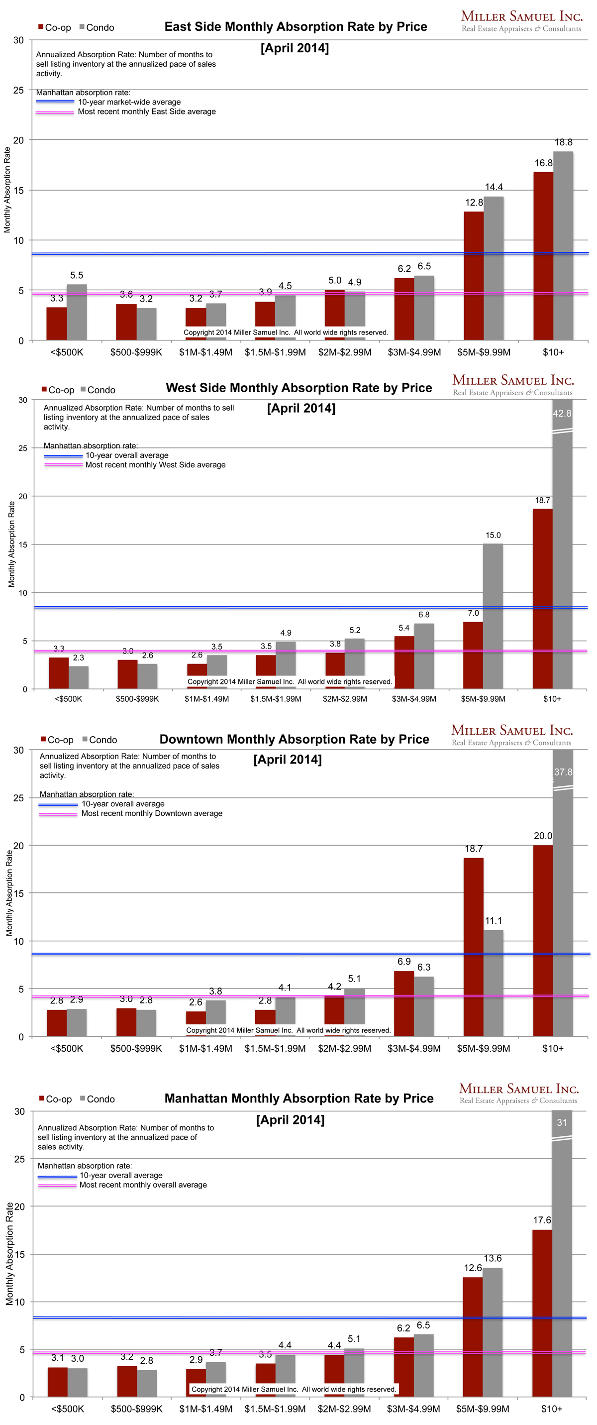
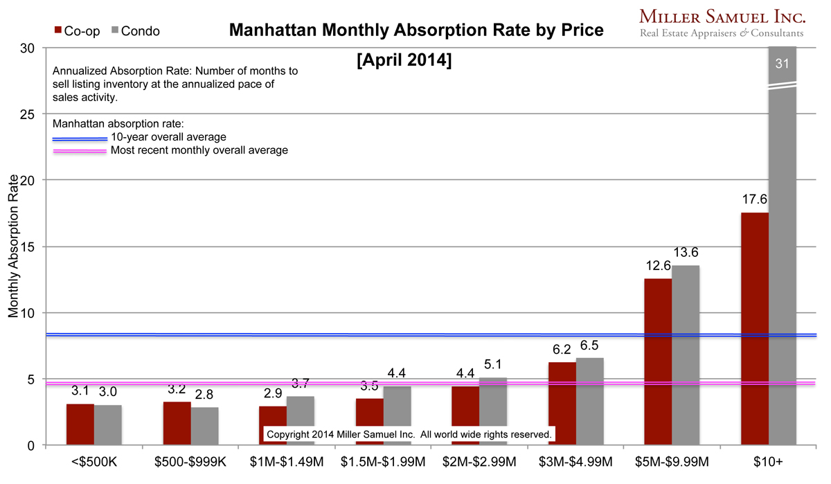
You can see a slight slow down in the pace of the market at or above $5M while the remainder of the market continued to accelerate as evidenced by faster (lower) absorption rates. It makes sense since there is no new development entering the market to ease the supply shortage of the “lower 90%” of the market.
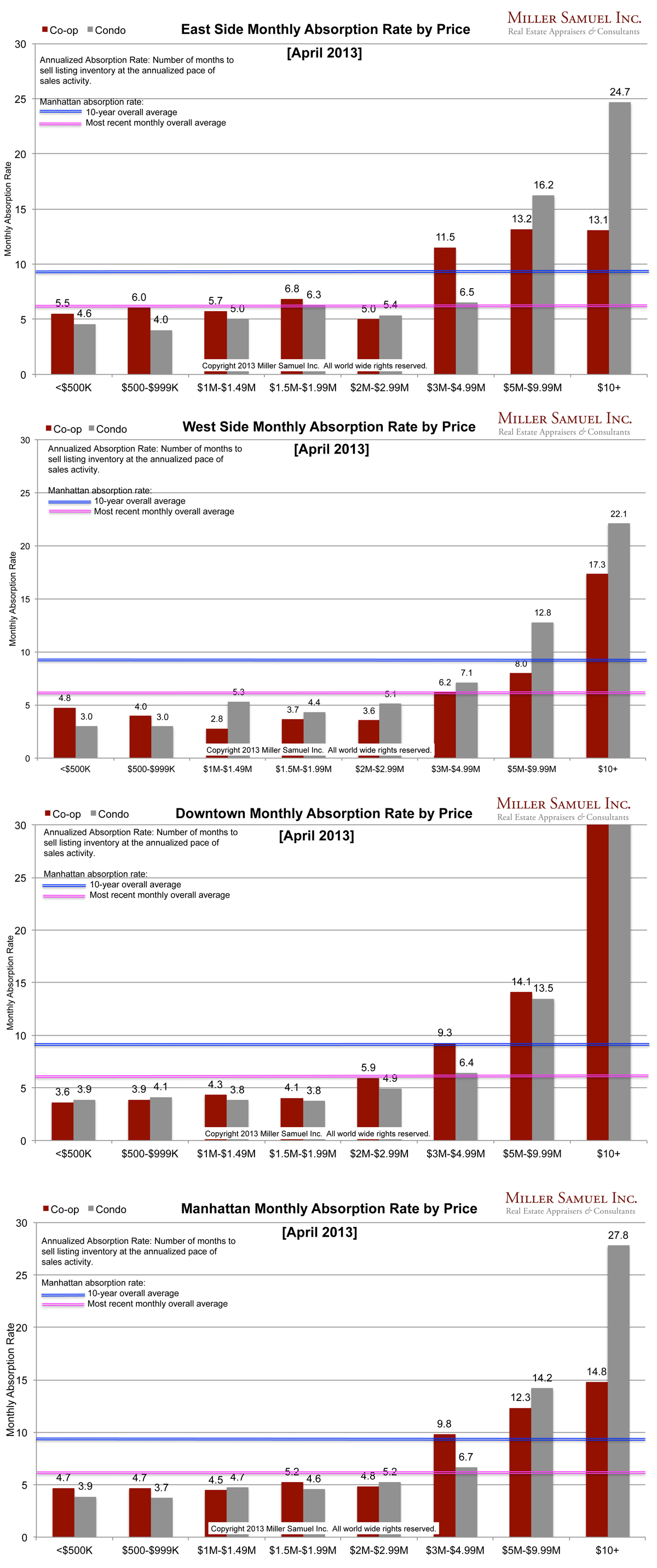
Side by side Manhattan regional comparison:

 [click images to expand]
I started this analysis in August 2009 so I am able to show side-by side year-over-year comparisons. The blue line showing the 10-year quarterly average travels up and down because of the change in scale caused by some of the significant volatility seen at the upper end of the market. The pink line represents the overall average rate of the most recently completed month for that market area.
Definition
Absorption defined for the purposes of this chart is: Number of months to sell all listing inventory at the annual pace of sales activity. (The definition of absorption in our market report series reflects the quarterly pace – nearly the same)
_______________________
Manhattan Market Absorption Charts [Miller Samuel]
One Comment
Comments are closed.


[…] Miller, who maintains a great blog as well, today put out some data about the lower 90% of the market- the non-luxury, is still accelerating. He was theorizing the […]