Getting Graphic is a semi-sort-of-irregular collection of our favorite BIG real estate-related chart(s).
In the December 2006 issue of Finance & Development, the quarterly publication of the International Housing Fund, there is an exellent series of graphs that illustrated the The Slowdown in Global Housing Markets.
Source: International Monetary Fund
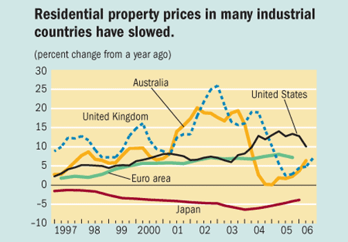
I have always been interested in the notion that housing markets in industrial nations (on a macro level) seem to move in sync yet we (me) always downplays the meaning of national housing statistics in the US. On the other hand (thinking out loud), national housing stats are often used incorrectly to define a local market, which is not what we are referring to with the market stats of other industrial countries.
I would chalk up the consistency between countries as being influenced by low global interest rates (except Japan [WSJ]). Housing is a lagging economic indicator and followed the influence of low interest rates.
Also, actual price levels achieved in the nations tracked in the studies exceeded fundamental factors used to predict them. This suggests that fundamentals as a measurement tool are incomplete, or that a global housing bubble is indicated. I’d probably go with the former since fundamentals are a topic I touched on last week.
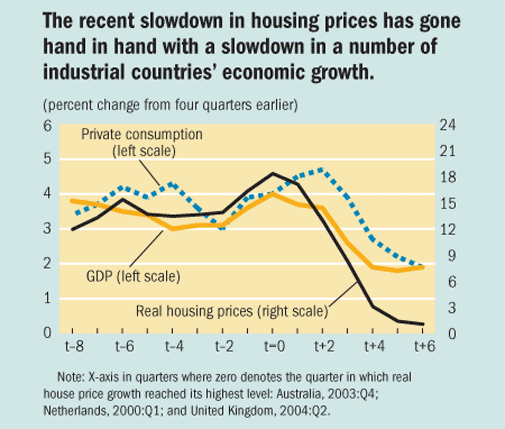

>Previous housing market cycles in the United States have been associated with vastly different economic outcomes. In the 1979 cycle, real house prices fell, and consumption, residential investment, and GDP growth all slumped. Of course, economic conditions then were very different from those today: real interest rates were very high, as was the unemployment rate. The 1987 housing cycle was associated with a limited growth impact, and the IMF forecasts that the current housing cycle will do the same for 2007 growth. But there are downside risks. First, the slowing in house price appreciation could be more pronounced than expected—a drop in prices cannot be ruled out. Second, the wealth effects of slower house price growth on consumption may now be larger than in the past because of the greater exposure of households to asset price movements.
6 Comments
Comments are closed.
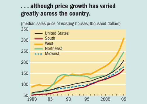
I don’t know how one can look at that bottom chart and not think prices are going down. simple supply and demand
Did you say low rates “except for Japan”? Japan has now raised their overnight lending rate to a whopping 0.5%. That’s the lowest of any industrialized economy. We are at, what, 5.25%? Japan is suffering from the gigantic asset bubble of the 90’s and still hasn’t fully recovered. That’s deflation you see in that chart…
Dave – thats not what I meant – sorry if I was not clear. I meant Japan isn’t following the same housing price pattern as the other industrialized nations. You can see that in the first chart.
Canada? Zoom!!!! But, I don’t know if that’s everywhere, or just in Calgary & BC, where they have benefited from oil prices.
Thoughts?
I didn’t realize Japan was still that bad– if I am reading that chart correctly, ever year since 1997, prices are lower than the year before– not a single year where prices were even flat! In general, it’s a really interesting chart– the boom/bust in the UK and Australia makes the US look like nothing. And Europe is so comparatively stable. I would love to know more about why…
It looks the U.S. is following the UK and AU markets by 18-24 months. Both of which are in the end of a year upswing after approximately 2 years of “bubble”