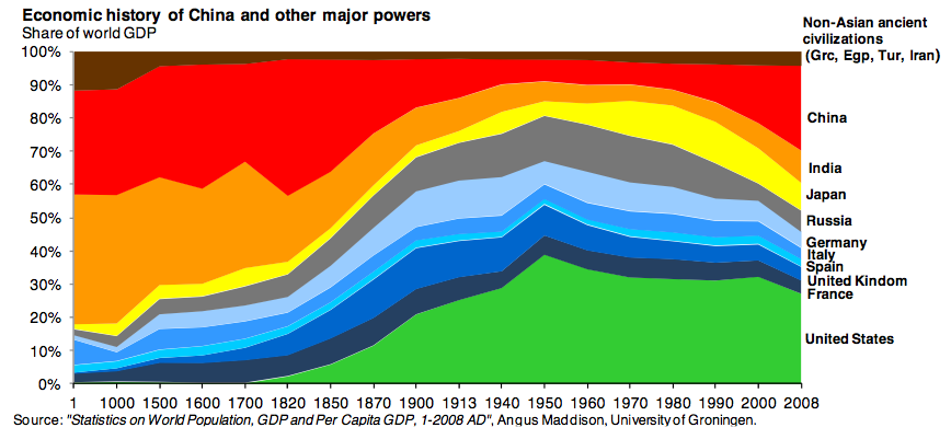
I was sent this chart via my friend who saw it in The Atlantic who sourced it from prolific blogger Paul Kedrosky. Given all the US real estate demand coming from foreign buyers I really liked the context this chart provides.
…dive into 2000 years of economic history, this time through the lens of GDP per capita around the world. This metric helps us identify where growth in wealth occurred, as opposed to just growth in population (e.g.: India and China had thee-quarters of world GDP in 1 AD because they had three-quarters of the world’s population).
Developed countries are taking market share from the US but I like how it illustrates how large the US economy really is. Was surprised to see the Russian share so small, especially over the past decade.


