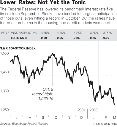
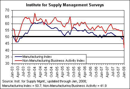
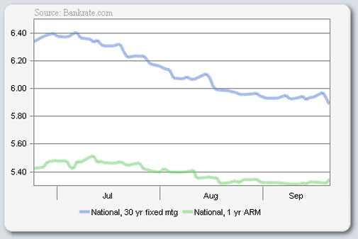
Getting Graphic is a semi-sort-of-irregular collection of our favorite BIG real estate-related chart(s). Here’s several econ charts I culled from my weekend reading. They all point to weakness (shocking!).
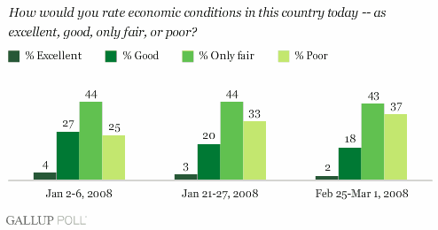
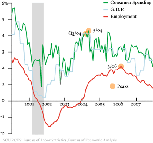
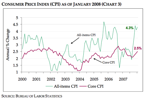
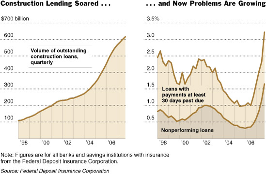
Are we talking ourselves into a recession? I don’t think we need to talk when we have charts:
Click here for full sized graphic.
Click here for full sized graphic.
Click here for full sized graphic.
Click here for full sized graphic.
Click here for full sized graphic.
Click here for full sized graphic.
Click here for full sized graphic.
One Comment
Comments are closed.


[…] The always-brilliant Jonathan Miller was posting some great economics charts at virtually the same time I was writing this post. All point to weakness in the general […]