_Getting Graphic is a semi-sort-of-irregular collection of our favorite BIG real estate-related chart(s)._
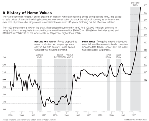
[Click here for full graphic [NYT]](http://graphics8.nytimes.com/images/2006/08/26/weekinreview/27leon_graph2.large.gif)Here’s a pretty intimidating chart on housing prices over the past 116 years adjusted for inflation by noted economist Robert Shiller. I missed this chart when reading my copy of the New York Times but luckily [I caught it in Curbed](http://www.curbed.com/archives/2006/09/05/curbed_roundtable_september_state_o_the_market_report.php).
Its a pretty wild chart but something doesn’t seem right. Or is it? Matrix readers, can you share your thoughts?
8 Comments
Comments are closed.


While the chart may be accurate, it doesn’t tell us much, in my opinion.
The implication is that housing has gotten really expensive.
I’m unclear on what he means by “adjusted by inflation”. Just the actual price of a home?
What about incomes, interest rates, the national economy, the secondary mortgage market, etc.
It is quite amazing, having said this, that it looks as though housing cost as much in 2000 as it did in 1890, adjusted for inflation.
I think the students who put this together for Dr Shiller made some errors. It is a strecth to believe that housing prices appreciated in real terms during the Great Depression as compared to the roaring twenties.
To me that is a huge miss on the reasonableness test. There is obviously a problem with the data or the inflation adjustments.
None the less, the current run-up is dramatic, and I expect to see a hard landing in many markets.
BTW, by Shiller’s chart the surge from 1942 to 1947 was comparable to the latest surge. Yet only minor dips followed that surge.
The chart may be right. I’d say housing in the NY Metro is as overpriced as in 1987. But the big price run up affected more areas this time than it did in the 1980s.
Some of the recent run up is explained by lower interest rates. But those could rise if MBS investors realize they aren’t getting all their money back.
“BTW, by Shiller’s chart the surge from 1942 to 1947 was comparable to the latest surge. Yet only minor dips followed that surge.”
I think the point of the chart is that real estate prices return back to the “norm” or benchmark.
So yes, there were no drops from the surge in ’42 – ’47 but that was because prices returned close to the benchmark as they did in the ’70s and ’80s.
There is a definite distortion in Shiller’s graphic, but I think the error is in the gov’t inflation numbers. Ever since Greenspan instituted the “substitution principle” in the inflation gauge we have had a false reading of true inflation. I think inflation since 2001 has been so under-reported, that by using the official numbers, we are seeing this skew in Shiller’s graphic. Looking at real world examples where I live (central Florida), housing is up 110% since 2001, milk has gone from $2.20 to $3.40/gallon, and we all know what gas prices have done in the last 5 years. Even Disneyworld tickets have gone from $40 to $67. About the only places I have not seen major price increases would be automobiles and consumer electronics/computers, but those are from production efficiencies. I imagine most of the HELOC growth has been because people are needing the extra income to keep the same lifestyle they had in the ’90s because incomes have been flat while inflation has been much higher than reported.
The 42-47 run was due to pent up demand from the fear of the great depression you had 2 and 3 generations of families living in a single home. you had people who waited an extra 5 or more years to get married. then after 10 years of hording money under the bed we had rationing in wwII…finally the end of a war people feared was going to change the world and it did. These people came home and people celebrated with spending some of the money they had horded for 10 years. Industry was good due to the war time econemy and we moved into the period of husband and wife working while it took many years we once again began a massive expansion at this point. As for house prices rising….they are inflation adjusted i.e. if you have deflation and you home maintains its price it looks like it is going up on a chart.
As for credit. we have created credit ontop of credit why wouldnt this drive prices up. It’s no different then the fed printing money. Except it just robs future purchases and slides them forward in time. Unless of course you create more credit. Like say mortgages..then mortgage back securities…then credit cards…then securitization of credit card portfolios… It sure sounds like a house of cards to me. But as long as we can create more credit in more unique ways prices will continue to escillate. Read the House of Namura and see how the house of cards fell in Japan. Or just go right to the basics and read a short book by Ludvig Von Misis “The Austrian theory on trade cycle” especially the section on creation of credit. Then read about mortgage backed securities, CDO’s, And securitization of debt. Then read about how the Utility industry couldn’t refinance any debt in 2002 after Enron collapsed. Even if you had clean accounting no one wanted debt of utility companies. This was just a taste.