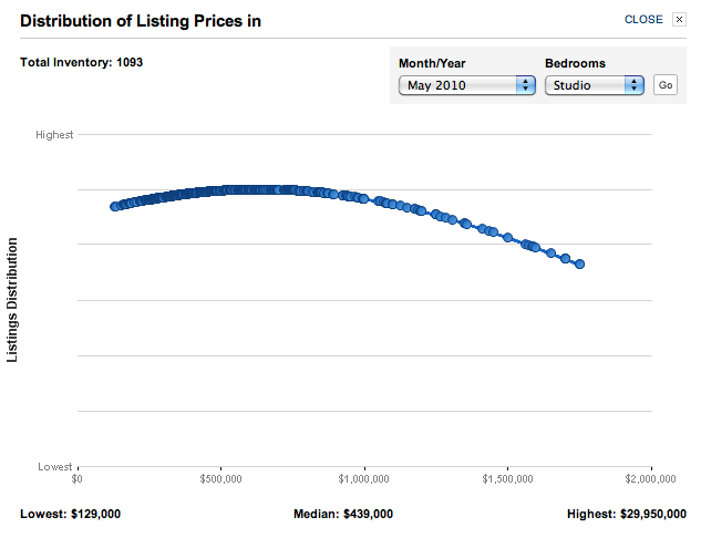
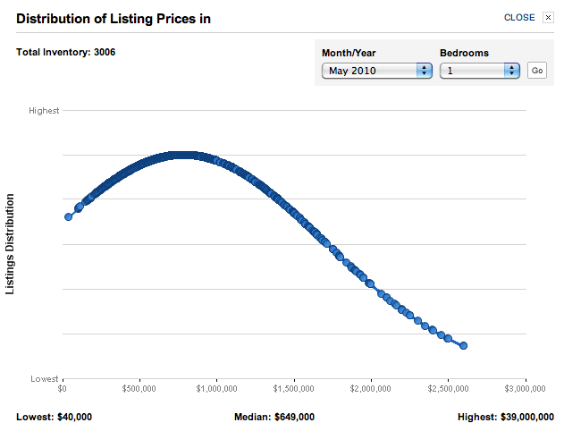
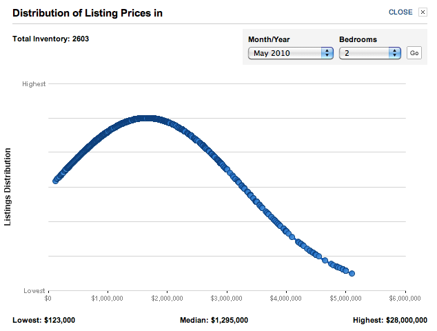
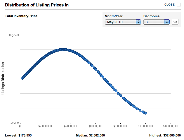
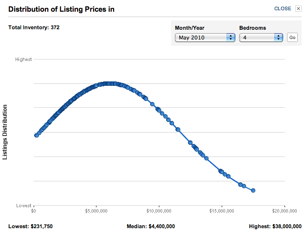
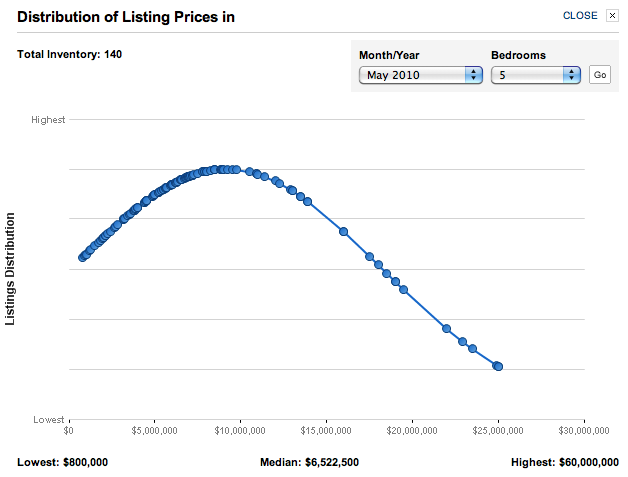
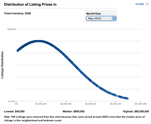
One of the tools I just discovered on the NYTimes.com/realestate is pretty cool, especially to a chartcentric person like me. The user can build distribution charts by apartment size, neighborhood and boro. When narrowing down the market segment, sellers are able to see how their pricing compares to competing properties. The peak of the arc shows where the majority of the listings are priced.
These are screen shots of the Manhattan May 2010 distribution charts.

