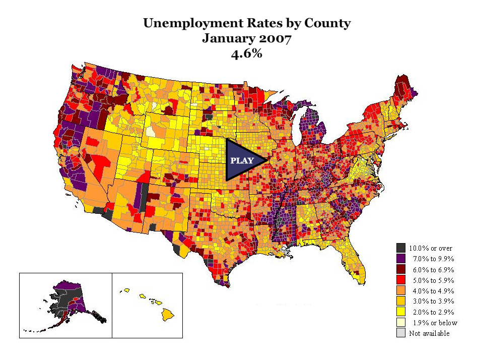
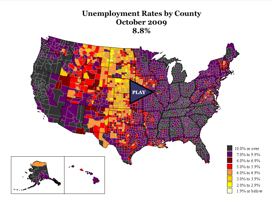
This is a month old, but I never got around to posting it. An amazingly beautiful effort.
I was reminded of this today and it sets the stage for something I will post later today which uses a similar mapping presentation.
Watching the video version or this version paints a compelling picture of US unemployment. Notice how high the levels are in the west, rust belt and southeast and how strong the “sand state” unemployment situation was in 2007.
Next – try to imagine a US housing recovery with this sort of employment situation.
2 Comments
Comments are closed.


Move to the country’s mid- section where you can find a job and buy a home with the greatest price reductions. Looking at both the Trulia chart and the Geography of a Recession chart one might come to that conclusion.
The graphics are beautiful but when you play the Recession chart all those pretty colors start to look scary. I agree that with so much of the country in those darker hues a robust housing recovery seems more like wishful thinking than positive thinking.
[…] to that notion the fact that unemployment still remains high, with no sign of recovery on that front, at least from a private sector that is bracing for higher […]